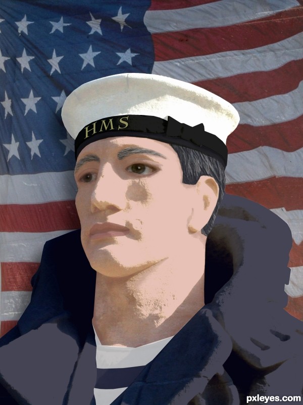
My first participation in the Photoshop Contest :) (5 years and 3313 days ago)
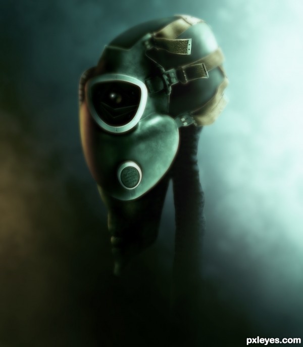
Friend or foe? (5 years and 3431 days ago)
Good transformation of the source, good mood & color.
I like this a bunch, the title took me a second to get, but it's very clever, and I like how you did the dof here, well done = )
I really like this...Well I really like aliens hehe. This is really very well made, and love the mood of the image. Nice imagination. 
Very very cool !
 !
!
tight!
Fantastic Work!
The mood of this work is awesome. Well done and nice transformation of the source.  good luck!
Nice alien 
very very good work author...with perfect mood...well done
Very dark!! GL
Congrats for a great third place!
congrats...
Congrats..., 
Congrats!!
Howdie stranger!
If you want to rate this picture or participate in this contest, just:
LOGIN HERE or REGISTER FOR FREE
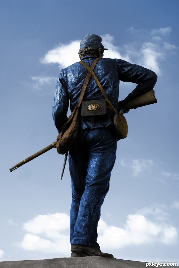
Thanks to Markmiller
All Part copies using pen-tool and then used Hue & saturation to colour and Curves to give metallic look were needed
CS3 & tablet (5 years and 3458 days ago)
I'll have to say that is a fantastic photo you found 
real good!
clever and well executed 
it is realy fantastic work and nice photo ,good luck
Nicely done .......... 
I like the fact you chose a statue and gave it the color you did. This one is very nice. I like the crispness!
very well done!
Howdie stranger!
If you want to rate this picture or participate in this contest, just:
LOGIN HERE or REGISTER FOR FREE
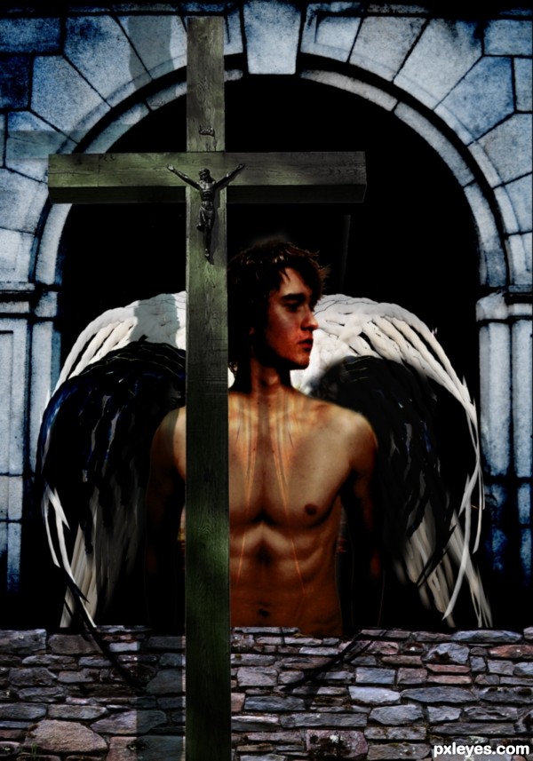
Made the wings by warping, rotating and duplicating the rope source several times. Most work done by hand matching the colours, lightning, shadows etc. from other pictures. (5 years and 3463 days ago)
Very cool piece. My only suggestion would be to eliminate the shadow on nthe archway from the cross. The light source is from above(note the shadows on the chest). Nice use of the source too.
Interesting, but would be more so with an SBS which might help explain the lighting on his chest. I personally don't get the point of the stone fence and would just delete it. I think the title overdescribes the image IMO. (I could see an angel as a soldier of God, but as a soldier of abstract 'faith' seems too much to me.)
I went to very abstract lightning as we can see here, that's why the shadow of the cross (more dramatic imo that way) and also the "minor angel of light" on the chest. And what comes to the title, I personally believe many people have (and fight for) a faith that has no God behind it. I didn't make it overly political or anything, just a simple young man fighting for (his own) faith.
Thanks for the comments, Pingenvy and Dan, highly appreciated.
Howdie stranger!
If you want to rate this picture or participate in this contest, just:
LOGIN HERE or REGISTER FOR FREE
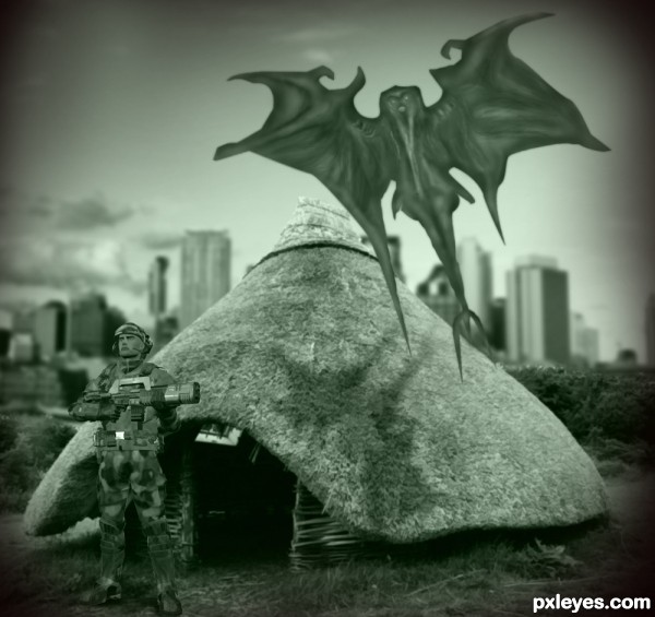
Thanks to shoofly-stock.deviantart.com and eschu1952 (5 years and 3629 days ago)
Awesome work 
put some more detail on that monster,overall nice effort.
Thanks mehul. I have added some detail on monster.
watch out soldier!!!!! 
very nice 
good luck ! 
good luck
gl
Howdie stranger!
If you want to rate this picture or participate in this contest, just:
LOGIN HERE or REGISTER FOR FREE
Nice work for first entry. The drop shadow on the flag should be on the left side of the sailor.
Good Luck, and welcome, keep coming back!
Thank you for the advice, sgc! I hope is better now...
Seems to match his shadow much better. Good Luck!
cool work...gl
Howdie stranger!
If you want to rate this picture or participate in this contest, just:
LOGIN HERE or REGISTER FOR FREE