(5 years and 1489 days ago)
- 1: source1
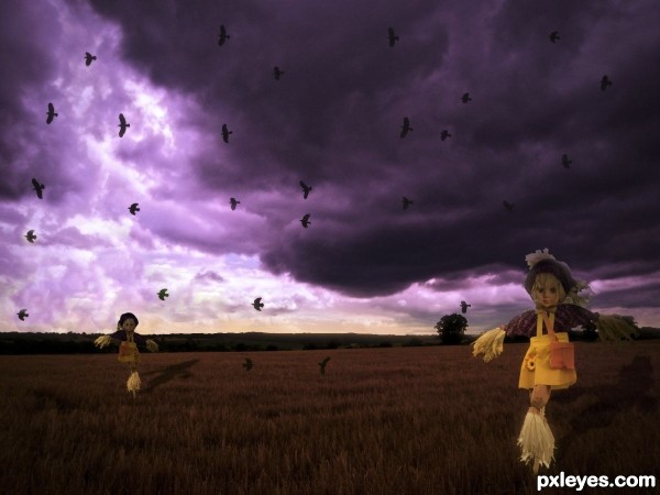
Eerie children guard the fields. (5 years and 2650 days ago)
Looks like the light source is from upper right...you might want to adjust the shadow.
Ah - I used a portable flood light 
Just flip horizontal the background, and the lights will be in the right place. The perspective of the shadows have to work with the light source. The image will look better if you do so.
Thanks - I've tried to reverse the background now
The shadows shoud be in the front. As a suggestion for your future work. Whenever the light source is behind or to the sides of an object, the shadow will always be on the back of the light, if your object is behind the light, it should be darker with a shadow at the front. If your light source comes from the right side, your shadow should be to the left, and viceversa if light comes from the left side, your shadows will be to the right. But try to work with perspective.... It is kind of difficult to understand, but if you check this link... you will understand.
Link: http://www.youtube.com/watch?v=oajh9Lgm8FE
Link: http://www.youtube.com/watch?v=60vHSFlKu3c
Here are two different ways to cast your shadows....hope this help! 
Howdie stranger!
If you want to rate this picture or participate in this contest, just:
LOGIN HERE or REGISTER FOR FREE
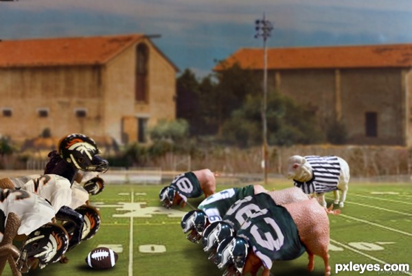
Fantasy Farm Bowl playoffs, 3rd and 49, 2 minutes left in the game, horses lead by a hair. (5 years and 2687 days ago)
lol lol lol nice
Funny idea
Fun idea. Might of had the pig team be the Ark. Razorbacks 
Howdie stranger!
If you want to rate this picture or participate in this contest, just:
LOGIN HERE or REGISTER FOR FREE
(5 years and 2753 days ago)
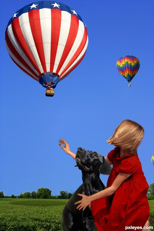
Looks pretty good. To make it even better, just a few things in hi res: The top edge of the girl's foreground arm is transparent, there's a white smudge behind her head, and white edges on the background trees. GL author. 
Thank you again. That's the second time you've helped me. I really do appreciate it.
Very unexpected! Nice job.
Congrats!!
Howdie stranger!
If you want to rate this picture or participate in this contest, just:
LOGIN HERE or REGISTER FOR FREE
(5 years and 2772 days ago)
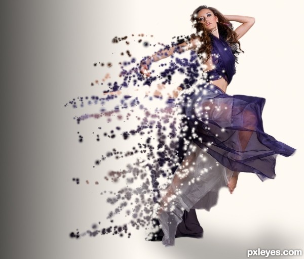
Fragments are too blurry.
Howdie stranger!
If you want to rate this picture or participate in this contest, just:
LOGIN HERE or REGISTER FOR FREE
PS: I think the thickness of the lines you used is just about right.
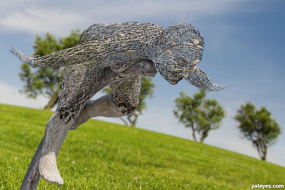
I really like the technique Maybe adding a different background will make it stand out! Good luck author!
Tried it with a different BKGD.
I think it works ☺
Your image shows me the work you went to achieve a wonderful result. Your SBS are informative. Something different and very well done. Good luck.
Reminds me of the Mesh Sculptures down in Key West during the late 80's and early 90's. Creeped me out and fascinated me at the same time. We wanted to carry them in our gallery but they were too big! hehehe.. AWESOME WORK!!!
Thanks guys!
verry cool!
That's one of the craiest Shops I have ever seen.
Congratulations again....nice work...
Congrats once again!!
Congrats
Congrats!
Thank you all
Congrats!
Howdie stranger!
If you want to rate this picture or participate in this contest, just:
LOGIN HERE or REGISTER FOR FREE