(5 years and 3863 days ago)
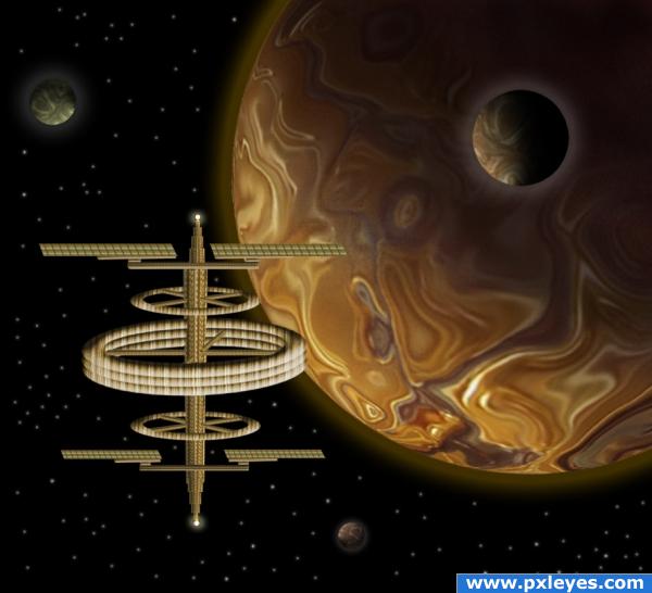
Space scenes are beautiful, filled with mistery. I got this idea by watching one of the programs on Planet Mars on tv. Of course this is not Planet Mars, but I wanted to do something nice. I built this space station using the Image source only. No other images were used. (5 years and 3867 days ago)
cool!
Very nice!
Original use of source. Nice job! Great SBS too.
the middle ring is a little crooked
Very good! I like the hue around the planet.
Howdie stranger!
If you want to rate this picture or participate in this contest, just:
LOGIN HERE or REGISTER FOR FREE
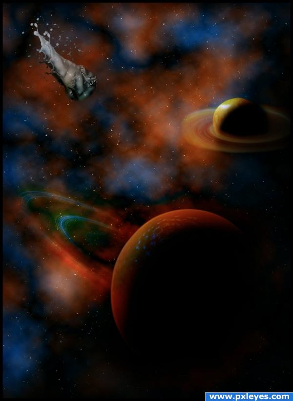
Apple, orange and milk - a simple milkshake.
Credits and thanks to:
- H-D-STOCK (http://h-d-stock.deviantart.com)
- daphne01
- chris27
- narendrasv (5 years and 3887 days ago)
It must be clear in the finished piece what food was used. 
O_o the milk splashes are so obvious... the orange skin is not hard to guess too  only the apple is harder.
cool looking picture 
well this image is very spacey and that is why i love it!
Howdie stranger!
If you want to rate this picture or participate in this contest, just:
LOGIN HERE or REGISTER FOR FREE
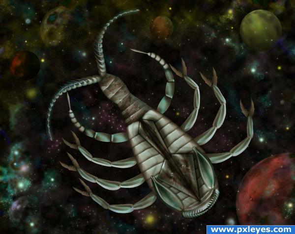
All objects- the beast and the planets are from the source image; for the space background please see the sbs. (5 years and 3894 days ago)
you're a stinker LOLOLOLOL great job
Interesting image, well put together but the source is hard to see, but then again, entries like these are loved by a lot of people, including me.. good luck!!
yup hard to see the source but nice work, I still have to get myself to make such a work... anyhow I seem to miss some depth compare with the bg then again o.o; i wouldnt know how to make depth in space XD
very nice peice, these kinda images i used to hate down to the burning bones, but now, ima beginin to...love em! this image is very nicely done and the creature chosen was a superb creature to manipulate into a work of art!
wow!! 
Thanks to all for the comments and for support 

And congrats again for your second place, talented lady 
congrats 
congratulations again 

Congrats!!
congrats!. Great 1st and 3rd in same contest 
congrats again
Congrats!! Impressive, first and third!!
Congratulations for 3rd too
Howdie stranger!
If you want to rate this picture or participate in this contest, just:
LOGIN HERE or REGISTER FOR FREE
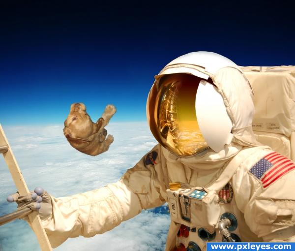
In the space, the astronaut lost the dog for ever!! (5 years and 3903 days ago)
Dog needs a reflection in visor...
I think you would see the reflection of the dog in the helmet head.. you can see the astronauts arm... good luck.. very nice image
It's a pretty strange idea, but i agree with the others, a reflection of the dog is missing on his visor
coool
the reflection of dog doesnt can be viewed because the perspective dont permit... the reflection is the other side...
Nope, sorry...if you can see the ladder & the astronaut's arm, you would see the dog. It doesn't matter anyway, because we'd see the dog's belly in the reflection, and you can't show that.
no, author, your perspection is bad... if the dog is at any positive angle to the surface of anything in front of it that can reflect, it will be in it. if it was a foot more to the right you may be correct, but its not.
Howdie stranger!
If you want to rate this picture or participate in this contest, just:
LOGIN HERE or REGISTER FOR FREE
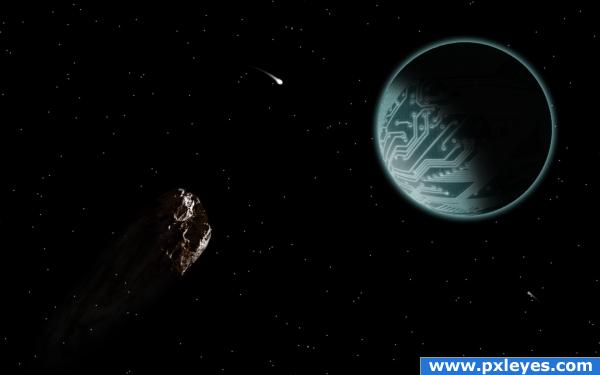
Looks much better in high res. Stars are so tiny they sometimes get lost in the upload. Good trick is to upload your starry image and if the stars are weak go back to your orginal and copy only the stars to a new layer, do the copies so they register in the same place. Set layer to screen or lighten till they get brighter, just keep adding layers till the show up well in your upload. You should lighten up the asteroid a bit too so we can see it better.
Nicely done.
Very nice concept.But the overall image looks a little empty.U can make the planet bigger or add some meteriods
Howdie stranger!
If you want to rate this picture or participate in this contest, just:
LOGIN HERE or REGISTER FOR FREE