(5 years and 1119 days ago)

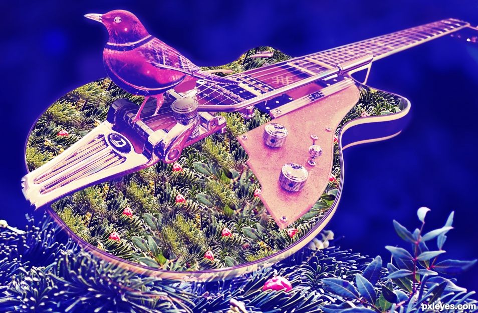
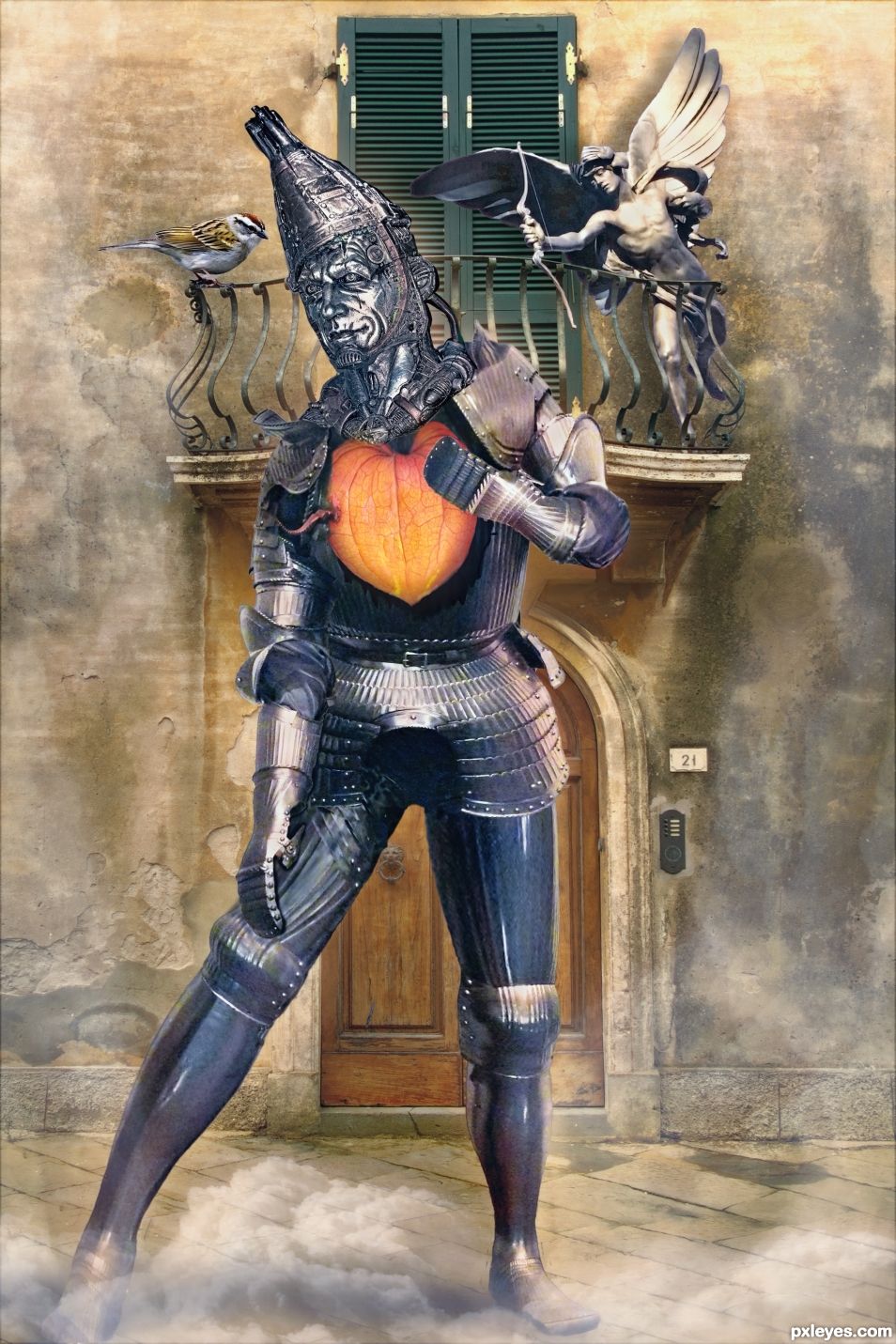
Inspired by the lyrics of the song.
"If I only had heart.
I'd be tender - I'd be gentle and awful sentimental
Regarding Love and Art.
I'd be friends with the sparrows ...
and the boys who shoots the arrows
If I only had a heart.
Picture me - a balcony. Above a voice sings low.
Wherefore art thou, Romeo? I hear a beat....
How sweet."
http://www.metrolyrics.com/if-i-only-had-a-brainheartnerve-lyrics-wizard-of-oz.html (5 years and 1208 days ago)
He said "Oil can".
Yes he did. I thoroughly oiled him before I bent him 
I had no idea Tin Man was a giant. He looks so normal in the movie.
My fantasy version is an obvious giant with a giant heart. Normal hearts are not big enough for him. 
Giant hearts have giant sentimentality regarding love and art. 
Howdie stranger!
If you want to rate this picture or participate in this contest, just:
LOGIN HERE or REGISTER FOR FREE

(5 years and 3889 days ago)
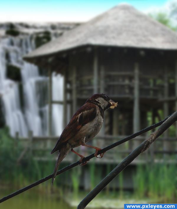
Such a peaceful image  I really like your composition, but maybe you can try it with a little less blur on the waterfall? Cause right now it is almost impossible to recognize the waterfall, without looking at your SBS. And don't forget to add the links to the images you used. Only naming the author in the SBS isn't enough. Good luck!
Edit: The background looks much better now! 
very nice n simple
Nice image, very nice in fact - but why not try blurring it a little less?
Thanks alot Lelaina!!! That really does look alot better now hey 
Nice chop
personally, I think the blurring brings out the bird clearly this is done on purpose
You didn't cut out the space between his foot fingers and i cans ee some white edges around the bird.
you should contract the bird and the branch a little bit because of the white and blue edges (probably of the original background) 
the edges need blurred a little
Howdie stranger!
If you want to rate this picture or participate in this contest, just:
LOGIN HERE or REGISTER FOR FREE
A very 60's 70's feel to this.. good luck author
Thankyou..
Howdie stranger!
If you want to rate this picture or participate in this contest, just:
LOGIN HERE or REGISTER FOR FREE