(5 years and 3593 days ago)

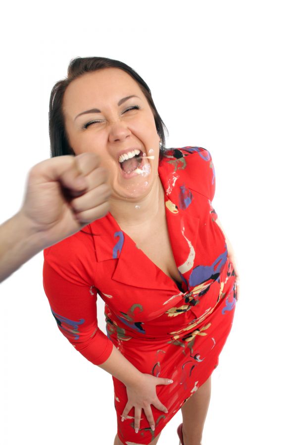
Never Punch A Woman!!!
credit to "robby_m" for water (5 years and 3649 days ago)
:lol::lol: that's super funny !!! 
The fist should really be in contact with her face.
agrees with the gamer
ok thank you!!  i'll change the fist. how do you do thumb up on people's comment?
my stuff / my contests...
Or you can enter the code...  !
!
Well, I agree with Game too... but NEVER do that, even with a feather! 
LOL well done 
Hmm... if she had two teeth broken... you could show us where do they come from! 
ouch....... that was hard..!! GL
Very nice...poor busty lady...lol
thanks for comments
hahahhahahaha funny
lol that's so funny 
whappakkkk! you hit the spot in me funny bones!
lol hammer down  good chop Author.

that spit flying from her mouth is so gross!! LOVE IT! GL!
Howdie stranger!
If you want to rate this picture or participate in this contest, just:
LOGIN HERE or REGISTER FOR FREE

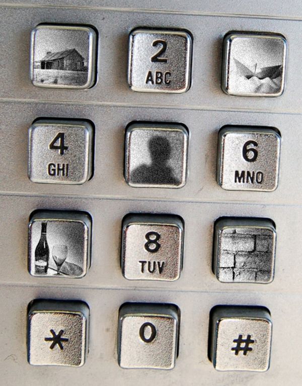
This is a phonedialpad own by someone who has speeds to
1. The countryhouse
3. The boat
5. VIP person
7. Favorite restaurant
9. Work (bricklayer)
SBS on monday, until then I´ll describe it here:
I made a path on every button so that I can turn them into selections when I had copy, paste and resized the sources.
After fitting them into the button I did some blending and added noice.
(5 years and 3664 days ago)
Hehe pretty clever!
good idea ... Wish Life Grants Everything on Speed Dials 
Maybe it'll lack buttons for speed dials! 

...great one!
...great one!
Like the idea very much...gl
Smart work....And i must say great creativity and imagination....GL..
Thank you all for the nice feedback  (and SBS is coming soon...)
Nice idea and good execution...perhaps rotate entire image to finish this off. 
Nice idea and good work 
very original yet simple concept. Nice work. GL
this one was my favorite
Thank you so much mary!  (Actually - I was a little suprised by the result, but but...)
Howdie stranger!
If you want to rate this picture or participate in this contest, just:
LOGIN HERE or REGISTER FOR FREE

No outside sources used. (5 years and 3853 days ago)
Might want to try darkening the shot but holding the lights a bit to give more impact to the beams of light. The beams of light look as if they need a different blending mode than what you're using currently in this image. Interesting shot!
http://us.st12.yimg.com/us.st.yimg.com/I/yhst-48855163505466_2014_4319505
base idea is wonderful..but I look at the world in a different light.. good luck
Howdie stranger!
If you want to rate this picture or participate in this contest, just:
LOGIN HERE or REGISTER FOR FREE

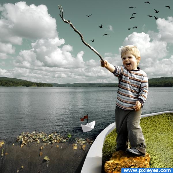
made the flag and the pole using standard shapes and the border using pen tool. dodged and burned for shadows and highlights. (5 years and 3862 days ago)
Author, my hat is off to you...this is a wonderful image! Not just well chopped, but you've captured a fabulous little boy moment...I love this image. My only suggestion would be to make the grass greener. High vote from me. 

very nice work and idea.. the only suggestion i have is play a lil more with the brightness contrast and check the kids hair.. perhaps my tutorial puss in boot is helpfull for you also theres some lines from cut out on the arm that holds the stick it seems with a soft blur brush you might be able to soften these..
nice! deffinately a top 3 entry! but try lowering the saturation on the grass and bringing up the lightness... it will make it more natural looking over all... looks pretty sunny, but the grass still looks shaded...
Author.. wonderful job..but add the source for the birds so you don't get in trouble.. great feeling in this.. good luck (just covering for ya... GREAT JOB)
edit ; WHEW.. thank god for the source save.. GREAT JOB
Nice work, sweet image! The outlining around the head seems as if it should be softer...imo. 
thanks for your comments and suggestions. will be making the changes sometime tomorrow.
I think I took too long to do the voting and it logged me out; now my comment is as a guest.
It looks very nice, but the boy holding the stick has a black outline from the previous source around his head and arm. Remove that and your entry will be more or less perfect! Good luck!
beautiful work!! the color tones are awesome!!
made the revision, removed the lines and lightened the grass. thanks for the suggestions!
Nice sources
I think real grass would be more effective, but still nicely done.
Aaaah... This is SO lovely!  You did really a wonderful job! Good luck
Congratulations for 1st
Congrats for your well deserved first place!
congrats
Congrats, this is beautiful 
thank you all!
Congrats!
congrats
Congrats Yahidith!!
Congrats! Well deserved 1st place!
congrats for first.
thanks, this was a treat to make! reminds me of my nephew, that handsome devil!
Howdie stranger!
If you want to rate this picture or participate in this contest, just:
LOGIN HERE or REGISTER FOR FREE
Very nicely done. He has such a look of determination on his face. Good Luck Author.
Great idea author...best of luck
good luck
Howdie stranger!
If you want to rate this picture or participate in this contest, just:
LOGIN HERE or REGISTER FOR FREE