
(5 years and 3718 days ago)
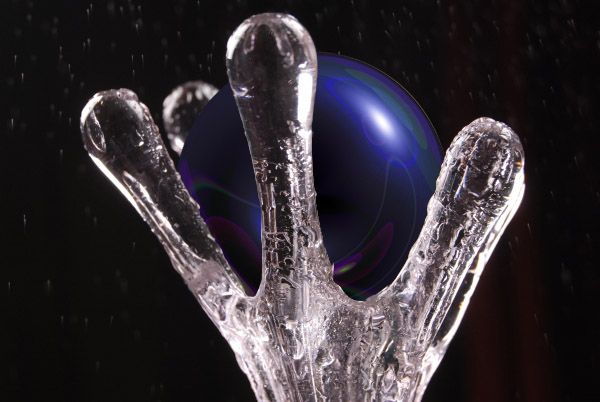
i took lense flare and manipulated it with polar coordinances to form a circle. then i cut out the front 'fingers' of the hand to make it look interlocked or held. (5 years and 3743 days ago)
simple and neat.. but I guess you need to add reflection of orb in the fingers of holder and the reflection of fingers on the orb.. as I guess it is made up of glossy material..
nice apart from the fact that 4 other people have tried this concept =S
its k dando.. the execution matters..
I'm sorry but this shows a minimal amount of work. You haven't done much with the source at all. Try to think of something unique about the image and have some fun.
Thanks people, this is my first day doing a photohop thing but i understand your suggestions. the reason it is so basic is that i thought the contest entry ended Today and it was 11:00 so i wanted to try this contest but i only had like 20 minutes before i fell asleep (somehow rendering clouds) Thanks alot and i will put more effort in my work, (and check the date better)
I like the way you did the sphere! One more tip I learned... 
nice masking.... well done
nice masking.... well done
I sort of like the simplicity of this, it's not a bad looking picture.
Howdie stranger!
If you want to rate this picture or participate in this contest, just:
LOGIN HERE or REGISTER FOR FREE
Khalus Ivan-http://www.sxc.hu/profile/khalus
Gabriella Fabbri-http://www.sxc.hu/profile/duchesssa
Manu Mohan-http://www.sxc.hu/profile/leocub
David Ritter-http://www.sxc.hu/profile/dlritter
~General mayhem ensues~http://comfy-bed-stock.deviantart.com/
Art-Photography & Resources-http://tammysue.deviantart.com/
Ashlea-http://ashzstock.deviantart.com/
Mila Vasileva-http://milavasileva.deviantart.com/
Thanks guys for the great resources...
Check High Resolution before voting...thanks (5 years and 3784 days ago)
Pretty cool
Very nice image the tire spots bugged me a little though they seem to down play the rest. ; )
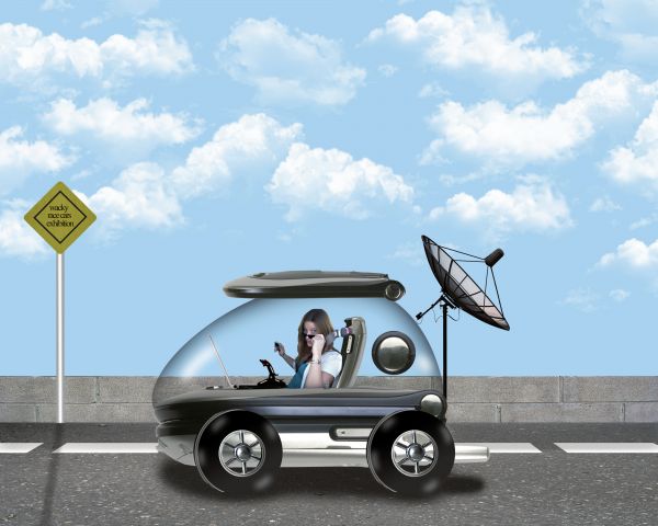
Cute. But the road needs to be scrunched down significantly (probably roughly to the bottom of the tire rims) to make its vanishing point match that of the vehicle (which also needs to be matched by the crease in the vehicle's front bumper thingee). The shadow where the wheels touch the road needs to be much darker to eliminate the floating look (more evident in hi-res). The forward edges of tires are odd and don't seem to match the perspective of the car body.
Thanks guys for the advices.@Dan i made some changes on the road and fence.I think is better now.Thanks again for very resonable suggestion.
It would be better changing the perspective of the road, considering the view of the car...
And congrats for another great third place, Erathion!
Congrats on 3rd!
Howdie stranger!
If you want to rate this picture or participate in this contest, just:
LOGIN HERE or REGISTER FOR FREE
Ashlea-http://ashzstock.deviantart.com/
Elisabeth-http://lunanyxstock.deviantart.com/
James-http://fatalpoisonwhisper.deviantart.com/
Enzo Forciniti-http://www.sxc.hu/profile/pseudoxx
Thanks guys for the great resources
SBS coming soon
Look High Resolution before voting (5 years and 3795 days ago)
Cool image 
cool stuff going on, GL!
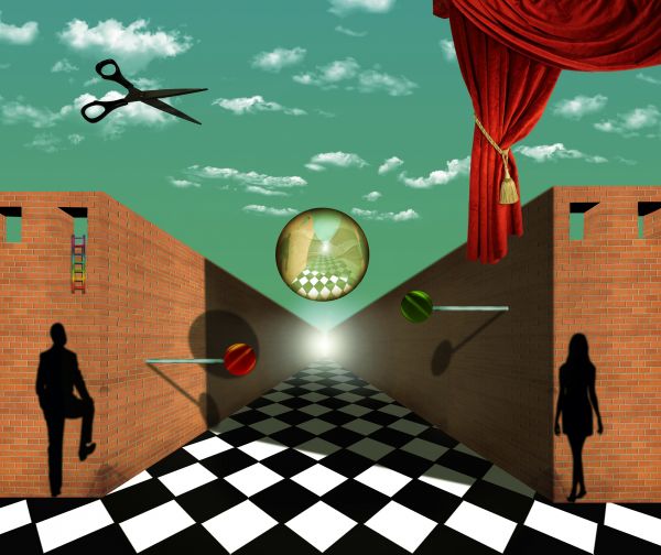
There's another image in this contest that uses a checkerboard floor. It's a great idea and you will find that the vast majority of renaissance paintings use some type of checkerboard pattern in the floor/ground to give the illusion of depth. Called an orthogonal grid. The problem with this image is that the angle of the checkerboard is such that you don't get that illusion because the vanishing points of the checkers is to the left and right of the vanishing point of the rest of the image. However, if this is your intention the image is fantastic. I am particularly fond of the lollypops.
In my art class professor of modern painting tell us this story about the some technique's.Salvador Dali was big fan of orthogonal shapes and that give's me inspiration for this entry.And because of Dali i wanted to create some distortion.At this all is in symmetry,ladders have curtain at opposite side,wall have wall,2 windows at left 2 at right,man at left,woman at right two lolly's,and sphere have scissors.Floor is only non fully symmetrical thing,and this was idea,to crash symmetry and to give some distortion.Thanks again for the fantastic comment.Its probably one of the best that i ever get.
Cool.....
THis could have been done by Magritte, though perhaps he wouldnt have used a lens flare and rainbow colored ladder. For the rest pretty good on theme. Good luck!
Author: Cool. I wasn't sure if you'd done it on purpose. I think that it's great! Good idea throwing off the symetry with that.
Howdie stranger!
If you want to rate this picture or participate in this contest, just:
LOGIN HERE or REGISTER FOR FREE
wants cookies-http://mimose-stock.deviantart.com/
Anja Ranneberg-http://www.sxc.hu/profile/zenpixel
Robert Badgley-http://www.sxc.hu/profile/rb94teg
Thanks guys for the great images... (5 years and 3812 days ago)
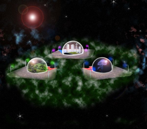
hahaha kinda reminds me of another contest i seen pn another site where they had to put citys in flying saucers  but i like yours too
  its different
Thanks runsterboi...
Howdie stranger!
If you want to rate this picture or participate in this contest, just:
LOGIN HERE or REGISTER FOR FREE
Great work
Very nice...especially with purple nebula...good luck
nice
Different in a nice way.
good work
cool
Howdie stranger!
If you want to rate this picture or participate in this contest, just:
LOGIN HERE or REGISTER FOR FREE