(5 years and 3246 days ago)

(5 years and 3599 days ago)
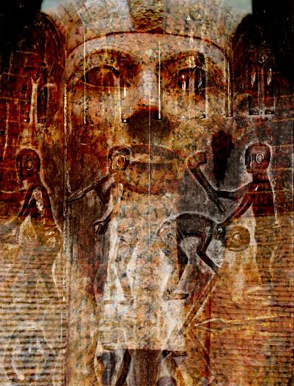
I confess I'm not sure I get how the violent-subjugation silhouettes relate to the sphinx face. It may in fact be apt political commentary, but I think the image would be more compelling if the subjugation elements were less transparent (i.e., a stronger presence) and positioned on the lower third (i.e., not overlapping the sphinx face).
cool
w0w! great stuff ;D
Great picture. take no notice of the first comment that was put on here,,, obviously someone up their own arse who has nothing better to do! I love the picture.
Howdie stranger!
If you want to rate this picture or participate in this contest, just:
LOGIN HERE or REGISTER FOR FREE

(5 years and 3995 days ago)
Cool!

umm what's with the bacon? 
wow cool
very nice 
Here, kitty, kitty!
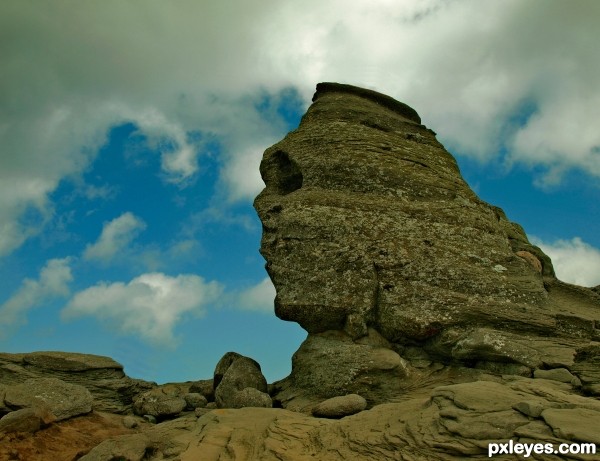
One ugly Sphinx hey, lol... GL 
Howdie stranger!
If you want to rate this picture or participate in this contest, just:
LOGIN HERE or REGISTER FOR FREE
Needs an SBS. Without seeing the original, it looks like the large rock has been way over textured - It doesn't match any of the surrounding rock at all...Too much contrast.
Nice work on this.
Great cleaning work.. damn tourist LOL.. always sneaking into pictures
Howdie stranger!
If you want to rate this picture or participate in this contest, just:
LOGIN HERE or REGISTER FOR FREE