A spider created from the source, different areas are used to create the spider.
All source. Shown in SBS (5 years and 3998 days ago)
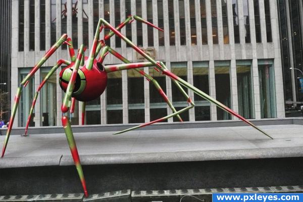
All source image (5 years and 4007 days ago)
great!!
Great job. Love the tile at the bottom where the spider's leg is moving it.
hm.., nice., and good work with even smaller things in this pic. also Great to c tat u have used the same pic as background., Amazing., 
really good job! great cleanup, good idea, also the reflection in the windows, the tile moving, .... impressive. the only thing, i would blurr the "conectionedges" of the frontleg. it looks a minimum to separatet, or (like a forgotten layer) in my eyes. great work author!! 
what a wonderful creature.. GOOD LUCK!!! (Now get the masses of Japanese running for their life LOL) SPIDERZILLA!!!!
(Breaking the bottom step is absolutely brilliant) throws the image over the top
fantastic job!!!. I feel shadow can be more darker. Good SBS
Very nice good luck!
very good! but the joints on (some of) it's legs are too sharp i think so some minor adjusting would fix everything 
Lookin good the second time around  ...good to see you back author
another classic one  )
)
Thanks all. I made a few changes with the blur and shadows. I think it looks better now. Thanks for the input 
Past is never past.............Good job Author.......G/L.
Awwwwww...forget it. I'm in the middle of a spider right now. Time for plan "B". Great piece, author.
greate work sir keep rocking
very scifi
one of the best work here......no match for this....GL
This is what I call excellent creativity and excellent photoshop skills in one package!
GREAT!! very cool 
sweet!!!!!!!!!!!!!
Is it okay to fall in love with an image?? Well i hope it is, cos i'm not changing my mind!!!
Outstanding!
Great to see this entry back again, really very cool! Good luck!
Great image except for the reflection...I still love it, though! 
nice work 
I think you did an excellent job on this. The only suggestion I can make is that you should change the perspective on the leg hinges. From the perspective the object the pole is going into should be at a different angle.
original 
master of this sputnik must be drunk or very crazy - all legs have different dimensions!  i love screen-effect here! cheers!
Nice work
Fantastic entry Author. Well done indeed 

Excellent idea 
Super!!!!! Shadows should a lil more defined near the ground but very cool work 
great 
again its a grt wrk......................................
Data recovered  Awesome work
Congrats very nice!
Congrats! Well Done!
Congrats for your second place!
Congratulations for 2nd
congrats
Congrats!
Congrats on 2nd!
Congrats!
Howdie stranger!
If you want to rate this picture or participate in this contest, just:
LOGIN HERE or REGISTER FOR FREE
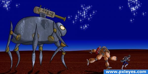
Made three characters based on steampunk genre... Well I didn't go for full steampunk influence...
The character seen here are the technician Ab, his robot partner Al and a giant spider robot created by Dr. Golem( p.s. I know arachnids has 8 legs... this 6 legs are on purpose)
The game revolves around the antic of Ab and Al with the creation of Dr. Golem... Dr. Golem is not supposed to be an evil character but sorta mischievous one...
Watch in full res...
(5 years and 4007 days ago)
Dr. Golem??? hehehe. looked on the web.. he's kinda cool.. author.. I don't understand why in the world you have sources.. your drawing ability is much better than any texture you could gather.. (Still have to give HUGE marks for wonderful creativity) good luck on this.. (It is strange how the etching of the mechanical golem creature is softer in the pencil sketch.. almost like soft shape twinkies/playdough combination..GOOD LUCK HIGH MARKS
EDIT: Well I think you do quite well with or without sources 


He he he thanks Golem... Well I am using source coz I wannna try out things...
the image is pretty cool!
good charectors
hehe.. i love steampunk!!
very nice 
Howdie stranger!
If you want to rate this picture or participate in this contest, just:
LOGIN HERE or REGISTER FOR FREE
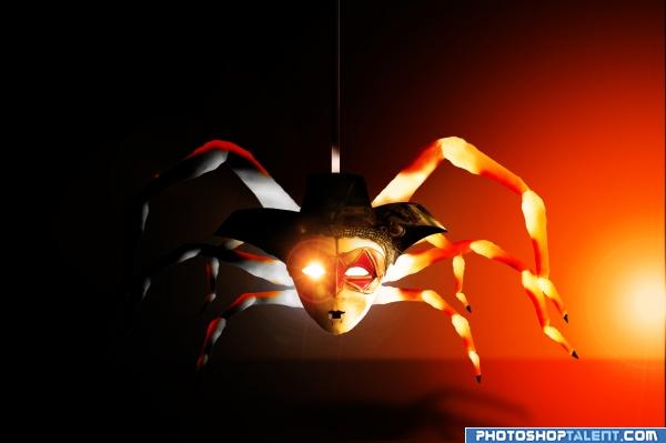
-only source- (5 years and 4017 days ago)
great!!
Nice work! Really awesome lighting as well, very dramatic! Good job, author!
very nice Spider.. the shadow work is awesome on the left side.. a suggestion, not that it is needed.. the right side light source is very bright (as it should be) but the legs on the right side could use a dash more shading I think.. DON'T DO IT IF YOU DON'T THINK IT NEEDS IT.. it's just in high res it's looking a tad flat, but with a mystical/fantasy piece like this.. it's all up to the authors choice GOOD LUCK
(love the teeth 
very nice
nice concept. you did well on the left side, but the right legs need shading. darken the inner parts of the legs. 
sorry i like the idea and the concept but i dt like so mutch the work, may be u could go farder, depends of your chop experience important is do and start so good luck and ni... work
i saw your name after comment and vote i with your reputacion and talent i just have to say that u could do better, sorry
I like the image and the effort - but I am wondering on the lightsource and the shadow? Would it be on the ground?
mariosilva: I know... ;p 
animmax: If you mean the light of spider?...I wanted just do it...light comes from spider body and on the right site is another light, but the shadows make only the spider light...It's fantasy work!! hehe
good colors. lighting issues are there(source light direction). and light coming from one eye looks odd.
good theme
very nice work 
that's great
to me the flare ruins it. sorry.
Unique approach. 
very nice 
Good Luck 
very creative
Howdie stranger!
If you want to rate this picture or participate in this contest, just:
LOGIN HERE or REGISTER FOR FREE
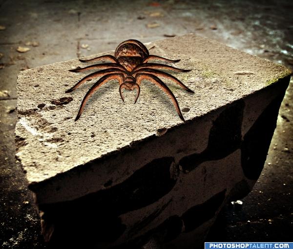
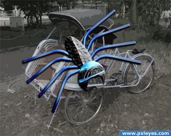
My attempt at a spider.
Not the most accurate but an honest effort. LOL ;)
(5 years and 4034 days ago)
Not bad, but why not use a background?
nice work... gl 
simple accurate and to the point.. good job author.. very impressed at it's simplicity.. AND THANK GOD you figured out that spiders have EIGHT legs.. you'd be surprised how many peeps stop at six for some reason 
Nice work, well done, and one of the few people to make spiders to remember they have 8 legs, lol 
a web at back would make it better
looks great
That is great..... good luck
good work
Great Attempt...Has me itching just looking at it!! Best of Luck
nice 
Strong entry.. good uck author!!!!
Love the idea! WELL done!!!  !
!
nice little spider... well done!
Congratulations for 3rd
Congrats!
Congratulations.
Congrats on 3rd!
Howdie stranger!
If you want to rate this picture or participate in this contest, just:
LOGIN HERE or REGISTER FOR FREE
very, very nice.. but try a different backround, or make the spider hang down from a web. Good luck!!
My origional intention was to make a web from the source using the tyre spokes, but the deadline was approaching so I decided to submit what I had.
great job!!! it's a really neat spider.. good luck
Ahh sorry i wasn't thinking about that. It's a great entry, the background is just a little disappointing, but people will be voting for all the work you put into the spider itself, and so will I! Good luck!
Love it.... good luck
Get rid of the PXL source pic & make a background.
cool image
Howdie stranger!
If you want to rate this picture or participate in this contest, just:
LOGIN HERE or REGISTER FOR FREE