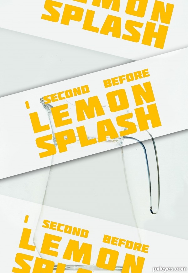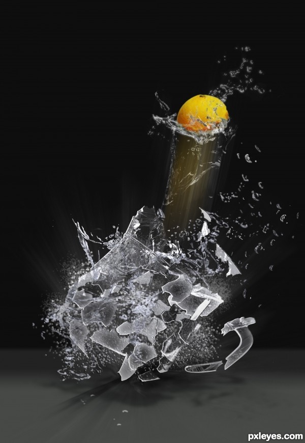
typo poster
eraser tools
no sense ...
in french: Pas d'idée, ni de message en particulier, juste une image ou j'ai travailler la gomme ...
(5 years and 3412 days ago)

BOOOOMMMM!!!! (5 years and 3413 days ago)
Awesome idea! But i think the middle part of the motion blur should be fading away more then the edge, cause right now it looks almost like a solid not a motion shadow.
SUPER LEMON! Love it! I agree to VERY slightly blur the motion in the center. Maybe even give it a little "super cape..." Nice work!
Very cool! Creative and excellent use of the source image, author!
Lovely effects, good work on the broken flying pieces of glass 
Thanksss All...i'll do better the next...
Great work ... really like the overall effect!
Great crash effect author...well done
Congrats  really well done
Congrats for your first place!
Congratulations, great job!
Congrats.....
Thanks for All...
Congrats...
Congrats!!
wow thats cool! well done and congrats
Howdie stranger!
If you want to rate this picture or participate in this contest, just:
LOGIN HERE or REGISTER FOR FREE

(5 years and 3486 days ago)
Stunning entry. Well done. Would love to see a high res version!
Sources are copyrighted. Please read http://www.pxleyes.com/blog/2009/06/how-and-where-to-find-legal-source-images/ to find usable sources.
Cool! 
@CMYK46 - They all say "You are free to make derivative works" - The author just needs to give the original author credit. ? As I understand it that would be ok?
That's weird...when I looked, they were all ©.
Well, nice entry, then. 
BEAUTIFUL!
New glasses CMYK.... lol.... shoot I don't know.... we must be suspect of all entries with incorrect sources... and give advice on the correct way to post......
Great job CMYK and Author for getting the job done!
Kudos to all!
very very nice...good luck
i like it!
Congrats... ...great work
Congrats!
Congratulations! 
Congrats!!
Howdie stranger!
If you want to rate this picture or participate in this contest, just:
LOGIN HERE or REGISTER FOR FREE

Thanks to eirian for the image of the boy, CorneliaMladenova for the image of the ball, and dewlittle for the splash! (5 years and 3536 days ago)
The kid should look like he's on the deck.
ummmmmmm, different...
the rail and rope has a shadow, the boy should have one too.
Will get back to the drawing board - later. Thanks all.
Agree with CMYK46 plus the light on the boy needs to be increased and shadows will need to be added.
Howdie stranger!
If you want to rate this picture or participate in this contest, just:
LOGIN HERE or REGISTER FOR FREE

One external source was used and thanks goes to sriimage of sxc.hu, for the rippled water and white wash both were created in photoshop, as for the dolphin the source image was used for reference. (5 years and 3565 days ago)
Parts are very pixelated, but not a bad idea. SBS would help.
I thought the idea was a bit cliche 

amazing!!
Howdie stranger!
If you want to rate this picture or participate in this contest, just:
LOGIN HERE or REGISTER FOR FREE
What font pack is that?
typo source = font pack = http://www.fontsquirrel.com/fonts/Molot
THANKS!!!
I like it.
Can barely see the image with the posters going down in front of it. Next time just leave the wording in the title or description so we can see what you created.
Howdie stranger!
If you want to rate this picture or participate in this contest, just:
LOGIN HERE or REGISTER FOR FREE