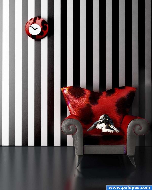
The stripes were so strong that I wondered how the picture would look with some equally strong spots.
Thanks to the wonderful contributors at sxc.hu. (5 years and 3957 days ago)

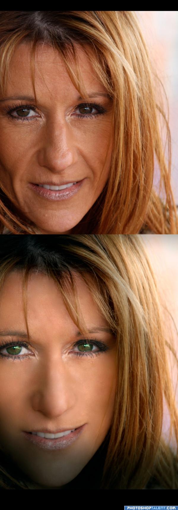
She's Alexis, a very good friend of mine...
I did a lot of Spot, patch and healing brush... also color correcting and addedsome sparkle to her eyes... ( 3 to 4 hrs ) But, She was happy ! So, it was worth it...
:)
(5 years and 4027 days ago)
great job
This is really well made, the lighting effect is very nice, and the eyes are bright and youthful. Well done!
she is looking much younger now, lips still dull, give nice lipstic.
I'm wondering how many times Alexis said WOW..hehehe (and she looks A LOT like a very YOUNG Barbara Streisand) they could have been sisters (Alexis's nose is much cuter ..hehehe.. not that Babs was ever bad)
This looks quite good but I don't get the dark band at the bottom of the pic.
Nice work, except the lips, try and work on them 
very nicely done author
 !!
!!
great job. very well done 
Nice job overall,maybe desature the eyes a bit more to look more realistic.
wooow i swear i stared at this for a long time b4 i was able to tell which is the original one, very very good job -the mouth gave it away  - good luck
Nice oldering! In fact it's perfect, amazing work!
you did a damn good job here!!!
Aw... Thanx Guys !! 


I'm sure your friend is very happy with your job
Good job author, excellent 
Beautiful...she would be even more stunning with her natural eye color, brown...IMHO
high marks from me! ^_^ The change is wonderful! a real tranformation ..
nice 
i like sparkle in her eyes a lot, the wrinkle retouching was nice, but its too blurred now i think
Howdie stranger!
If you want to rate this picture or participate in this contest, just:
LOGIN HERE or REGISTER FOR FREE
strong image, very well contrasted. To me, though - the light source is PREVELANT - reaching all the way to the arm chair, casting a shadow on the dog . . .the clock does cast a shadow . . . but the intensity of the light at that point, would wash it out some on the left (IMHO) Really great work here, author.
Great idea and a well presented image. Good luck!
look out for Cruella Deville... EEEEKKK.. neat Idea (I can't really tell.. you might need some shadow under the puppy.. but all around great image
Dog is way too small.
or the chair is way too big
Howdie stranger!
If you want to rate this picture or participate in this contest, just:
LOGIN HERE or REGISTER FOR FREE