(5 years and 3200 days ago)

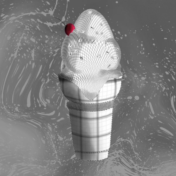
A photo shop Ice cream with sprinkles and cherry on top :)
Bon apatite
Thanks to
http://www.flickr.com/photos/stevendepolo/3796415185/
for ice cream cone reference
Thanks to
http://corelila.deviantart.com/art/Splatter-Brushes-60718934
for the brush splatters
(5 years and 3716 days ago)
nice.......bt y is the selection visible here??????
Nice work, but your selection is visible.....
yep it's ment to look visable a part of photo shop element, wanted to use any element I could. Thanks 
I'm sorry, I really like the image. But I don't get the clue of it. What is it supposed to be, Metal or something. Anyway It's nice and good luck  !
!
ooo sorry I already see it now  !! I didn't see the pictures in the ice cream !
I don't see why everyone is confused about the selections being visible. I understand the joke quite well and I digg it. Using the toolbar icons as "toppings" is a nice touch, and the backdrop is very appropriate. I'd do something about the "Adobe Photoshop" text in the cone, though (it's too hard to read and I almost missed it). Good luck!
Very nice work...idea is great...good luck author
This is great thinking 
definitely different. GL!
Selection is bothering me xD but I know where you're coming form so I really like this XD
Howdie stranger!
If you want to rate this picture or participate in this contest, just:
LOGIN HERE or REGISTER FOR FREE
wow!
Lovely work and very detailed sbs
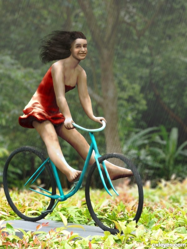
this is so disturbing in so many ways, but is good The only thing is the size of the head...I think it should be just a tad bigger.
should be more rain splashes on the girl maybe something like on bike wheels, also hairs should look a little bit wet, but still.. good work
Great entry and thanks for taking the time and including the SBS!!!
Howdie stranger!
If you want to rate this picture or participate in this contest, just:
LOGIN HERE or REGISTER FOR FREE