(5 years and 3433 days ago)
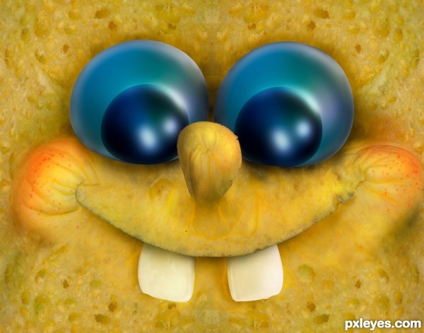
The sponge and the crystal ball photos are mine (see SBS).
Thanks to Simplifica for the teeth image
The Sponge Bob Square Pants character was used as reference :) (5 years and 3493 days ago)
hehehehehe... super great use of own photos.. AWESOME
 Great job!
I would have liked to have seen more of the character rather than a close up of his face... it's not really capturing the sense of bringing the character alive, but that's just my opinion...
Cute, but not exactly on theme.
I like the close up ... I knew who/what he was immediately so it worked for me ... chuckle, giggle and chuckle!
Howdie stranger!
If you want to rate this picture or participate in this contest, just:
LOGIN HERE or REGISTER FOR FREE
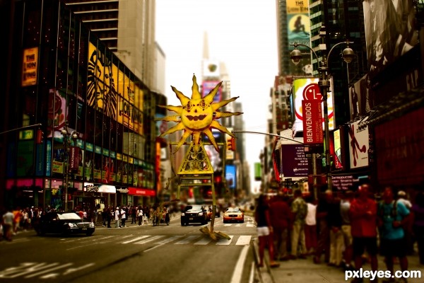
Sun is on the trip in New York or is it some kind of Sundzilla? (5 years and 3639 days ago)
Good luck. Nice job, btw 
good luck
Would be funny if a person actually would wave to the sun ("Good morning, Sunshine!!" and the Sun waves back
  . Good luck!
Ow author, please check your used source. It's copyrighted. If you want to know how to search for legal sources, see this page http://www.pxleyes.com/blog/2009/06/how-and-where-to-find-legal-source-images/ Good luck!
Oh, nice  Funny title and good idea.
@wazowski why source is copyrighted? It's cc - free share, free Remix
very good work !
very well done, author. GL
GL on this
I like the colors here, looks like a toy land or something. It would be nice to have some folks reacting to this huge sun guy walkin down the street. 
Howdie stranger!
If you want to rate this picture or participate in this contest, just:
LOGIN HERE or REGISTER FOR FREE
sorry this is my first attempt
droste effect (5 years and 3694 days ago)
kind of lame...? Put some creativity into it 
Ummm...it's a rectangle.
optical art..really nice
waaaay too simple, sorry.
The space between the rectangulars don´t follow prespective.Why don´t you add something on the frames - like a pattern or a figure so it would be more effort behind the work?
First attempts are always difficult. Don't give up!
Wait how is this your first attempt? You did a ton of other entries...?
this is my first attempt at droste effect
Oh okay...
Howdie stranger!
If you want to rate this picture or participate in this contest, just:
LOGIN HERE or REGISTER FOR FREE
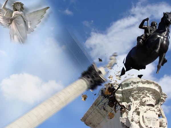
I have used two external sources
Thanks to http://www.sxc.hu/photo/907528 (Author: sebba8)
http://www.sxc.hu/photo/705862 (Author) saygonka
(5 years and 3754 days ago)
I enjoy the whole idea behind this with the breaking free horse. A little more detail on the crash would be nice though.
The horse pieces seem unrealistic and suggest more detail.
very nice 
Howdie stranger!
If you want to rate this picture or participate in this contest, just:
LOGIN HERE or REGISTER FOR FREE
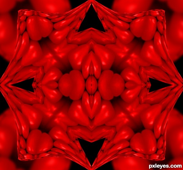
I appreciate your effort- posting 12 steps is not an easy thing ( at least for me), but when you make a Symmetrical abstract picture, people won't stare at it more than 5 seconds.
Hope you won't take this the wrong way.
Is there pure Black ? I am asking this question all the entire entries. Please tell me if there is pure black & tones of red not black.
@shankarsadamate299, I just took a picture of Tomatoes and hued into pure red, I wanted to create a square Mandala with tomato hearts, but as you can see by greymval comment, people will only look at if for 5 seconds.. (I used to designs bricks to be repeated into fabric or back grounds, and a symmetry pattern worked best, especially in Microsoft Word (the super old version)) but with all the PS prefab patterns offered free on the web, it is kind of pointless to create your own unless you are striving for pure artistic possession.
Good Luck
Dude, a square Mandala is the perfect thing to start from. But why do you limit yourself to this? Why not making a wall or a floor with something going on. I just think that the entry and the Mandala will be more appreciated if it would be in a context where something happens rather than standing alone.
Ps: If you get this the wrong way too and thumb me down, I swear I won't comment on abstracts ever again !!
I'm sorry greymval if I've offended you. You said that people would not STARE at this for 5 seconds yet you've returned to this piece several times, it shows that the frustration you are having with the design that doesn't follow your tastes does have some power,


I work in giant poster art, I've printed images 6 feet by 6 feet ... and this image would be beneficial front and back printed hanging from suspension wire in the shopping area of a Swap Shop or placed on a back wall at a nightclub. It's a decor thing, not everything has to be "Sunday Afternoon on the Island of La Grande Jatte"... sometimes Grandma's crocheted afghan throw blanket works just fine...
as to limiting myself? 12 step SBS is very limiting..
I have a comment watch, that's why "me" returns.
I do not wish to pursue a polemic with you author, on this matter, maybe some people stare more than others, maybe some even less, we could do a poll (LOL). I'm sure you're good in what you do and i wish you goodluck in your future endeavors.
It's kaleidoscope art! And yes, there is pure black. If you stare at this a few seconds, you may see some very 'interesting' shapes!
I agree with Pearlie,very cool kaleidoscope work...best of luck author
Howdie stranger!
If you want to rate this picture or participate in this contest, just:
LOGIN HERE or REGISTER FOR FREE