All from source image (5 years and 3935 days ago)

only used my own images. (5 years and 4035 days ago)
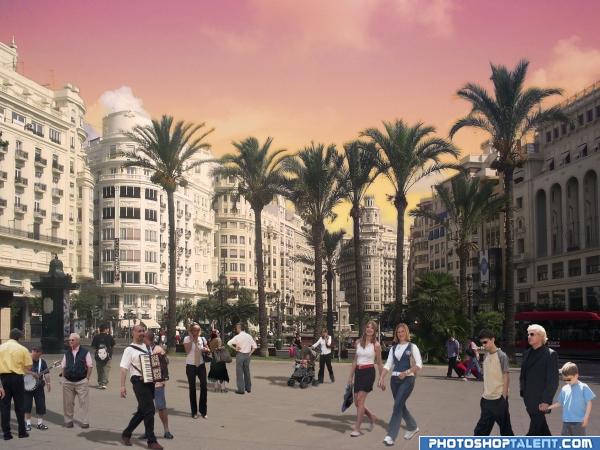
Nice work, the people look very cut out tho, try adding a colour on a new layer and lowering its opacity, I find this helps make things look in the scene. 
you did a good job, but slightly reduces the light falling on the child with Mr! gl.
good work
The accordian guy kills me LOL
The people look a bit flat... maybe you could use an overlay? I'm sure others could help you out better than me. GL
nice try, but ppl are unrealistic... the group in righthand bottom missing the shadow as well
the people don't look unrealistic to me? Nothing wrong with this picture! Well done!
nice job 
Howdie stranger!
If you want to rate this picture or participate in this contest, just:
LOGIN HERE or REGISTER FOR FREE

emboss/drop shadow/gradient (5 years and 4042 days ago)
Good Luck 
nice idea!! G/L
I don't understand the oval at the top left, like the rest tho!
very good work, goodluck 
unkskitty..it's suppose to be a pixel..hehehe.. sorry about that
Nice idea good luck!
Trying too hard author - what's with the round blob and the other thing? Not really working for me...
gl
Too many things happen here, text font is too fragile when you reduce it to final version I'd align the url on both sides with pixleyes. Good luck!
whats that Egg doing over "PX"....Nice design... Good Luck!!
Good one! 
Howdie stranger!
If you want to rate this picture or participate in this contest, just:
LOGIN HERE or REGISTER FOR FREE

wanted to make something simple and stopped before I ruined it :)
simple constructions but a nice effect I feel (and FILLE you are a WISE BUTT.. hehehe) (5 years and 4047 days ago)
Nice idea is very cool ..Good luck!
hahaha, shadows are not correct  very great! good luck!
nice Idea ....waiting for SBS....
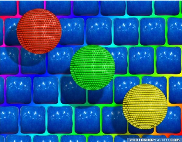
is it something like disco balls? or just balls? or neither? i like tho...GL
I like it! GL 
good luck and i like it =)
Nice background  . The spheres are not bad, but for some reason it still misses some kinda depth. If I see your step 1 the left part of the image looks way rounder than what you finally made. I think it has to do because you still see too much from each of the squares in the final image, while it should be more distorted. What you cà n do is take those original squares, make a sphere with them and ie with liquify push more of these squares together around the egdes, so you get a more distorted effect...if you'd like that. Good luck!
I can guess who made this one!! GL.
Interesting shapes. The lighting on the blue squares is a bit too uniform perhaps...and wouldn't be lit where the shadows from the spheres fall...
very interesting...im not sure wat exactly it is but it sure is eyecatching! Good Job!
nice one.. u got to work on the shadows, from the direction of the light u have used, the lower ends of the ball should be dark.. gl 
nice
Very nice!!
I like this, nice work 
giggle.. 
It's a cool looking image  If I can make a suggestion: The shadows of the balls (globes) on the background need a little adjustment - there would be no shadow in the gaps of the square blocks - I think it would make the background look less flat then. Just my opinion
Nice art.
creative and well done
I prefer the squared gum over the balls, so this is awesome, lol!! Good luck! 
Nice entry, to criticise a little I would suggest adding more shadow on the globes 
nice
I like this for its richnessof color...the little kid in me.
pretty colors
very nice
nice
Very striking! More daring shadows over the balls! Good luck!
Nice. Good Luck
Howdie stranger!
If you want to rate this picture or participate in this contest, just:
LOGIN HERE or REGISTER FOR FREE
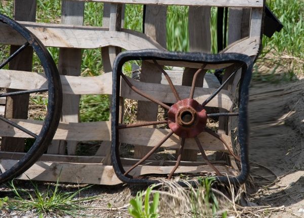
Nice idea... you should cut out the wheel...clone stamp the boards back in...then liquify the wheel and distort to the square... everything distorted is too obvious and distracting... g/l and keep on chopping!
I love the idea author but woodztockr is correct.. if you kept the back ground normal and only squared the wheel separately, you will have a much more powerful piece.. good luck
done using the liquify tool
I agree completely with what woodztockr and Golem say. Would be way way more effective if the background is "normal" (with the round wheel removed, of course). Good luck!
Make a dup. of the first then do your liquify on the second. The add layer mask and go around the saved area with it. I will help
Howdie stranger!
If you want to rate this picture or participate in this contest, just:
LOGIN HERE or REGISTER FOR FREE