Thanks to the following at flickr.com: hypergenesb for the planet photo; alternakive for the stairway to heaven photo; CharlesLamb for the flying bird;Also, to kconnors at morguefile for the aurora photo. (5 years and 3476 days ago)
4 Sources:
(5 years and 3512 days ago)
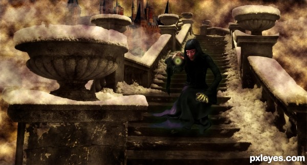
Folds on dress don't match angles of the steps. Ghostly figure in background detracts from overall image.
the green outside light on the lady is not usefull...
For me...it does have a purpose the green light. I visualized her as a witch.
Green is a cold color.
Too dark. Your colors are inconsistent with the sepia effect. The left hand of the witch is too green for the rest of the figure. The render clouds over the background just makes the image "noisy" looking and does not add to the mood, and the castle in the distant background steals the focus from your witch, and looks very cut and paste due to the sharp focus amongst all those rendered clouds and the color intensity. Colors lose saturation with distance.
This is an interesting concept, but there is too much happening without sufficient focus and cohesion, especially color-wise.
this image would have been wonderful without the cloud effects in the air...
Howdie stranger!
If you want to rate this picture or participate in this contest, just:
LOGIN HERE or REGISTER FOR FREE
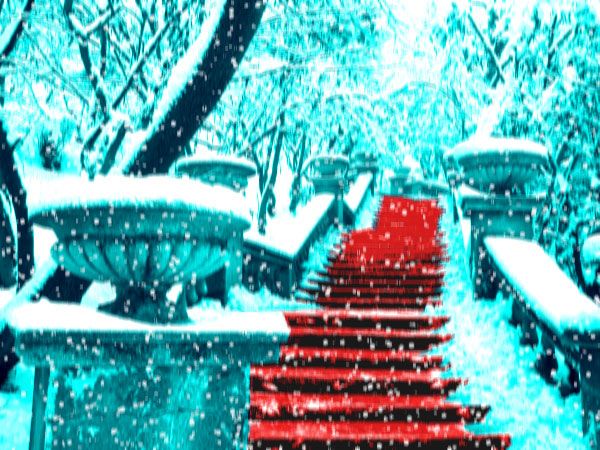
Symbolising Santa's red costume (5 years and 3514 days ago)
Sorry but this looks fuzzy and kinda hurts my eyes
It's really too blurry and it needs high resolution.
Very fuzzy & blurry...i have a headache..
So you feel brightness-contrast was a bit too much?
Yes author, this would work much better as a visually 'softer' image. The blownout highlights are too bright and not pleasant to look at. I also dont know if you have added some gausian blur to the image or manipulated it in someway to make it less crisp, but I would undo that.
I have added motion blur to create some movement effect for the snowfall.
The thing is that many of us can't look more than 3 secs at this without our eyes starting to hurt.
The brain tries to find a stable focus point in the view put since there is none is goes: "Error. Cannot Compute. Error" and it hurts  .
.
With the eyes only half oppened the contrast is really awesome 
Heehehe I looked at it with eyes half opened.
Honestly I really thing the overall blur to the image is just as disturbing as your color choices. I would have considered desaturating the bright blue/aqua to town it down and bring the red to a more deep hue instead of so bright.
I think you had a decent idea, but could stand to make a few changes.
Howdie stranger!
If you want to rate this picture or participate in this contest, just:
LOGIN HERE or REGISTER FOR FREE
(5 years and 3690 days ago)
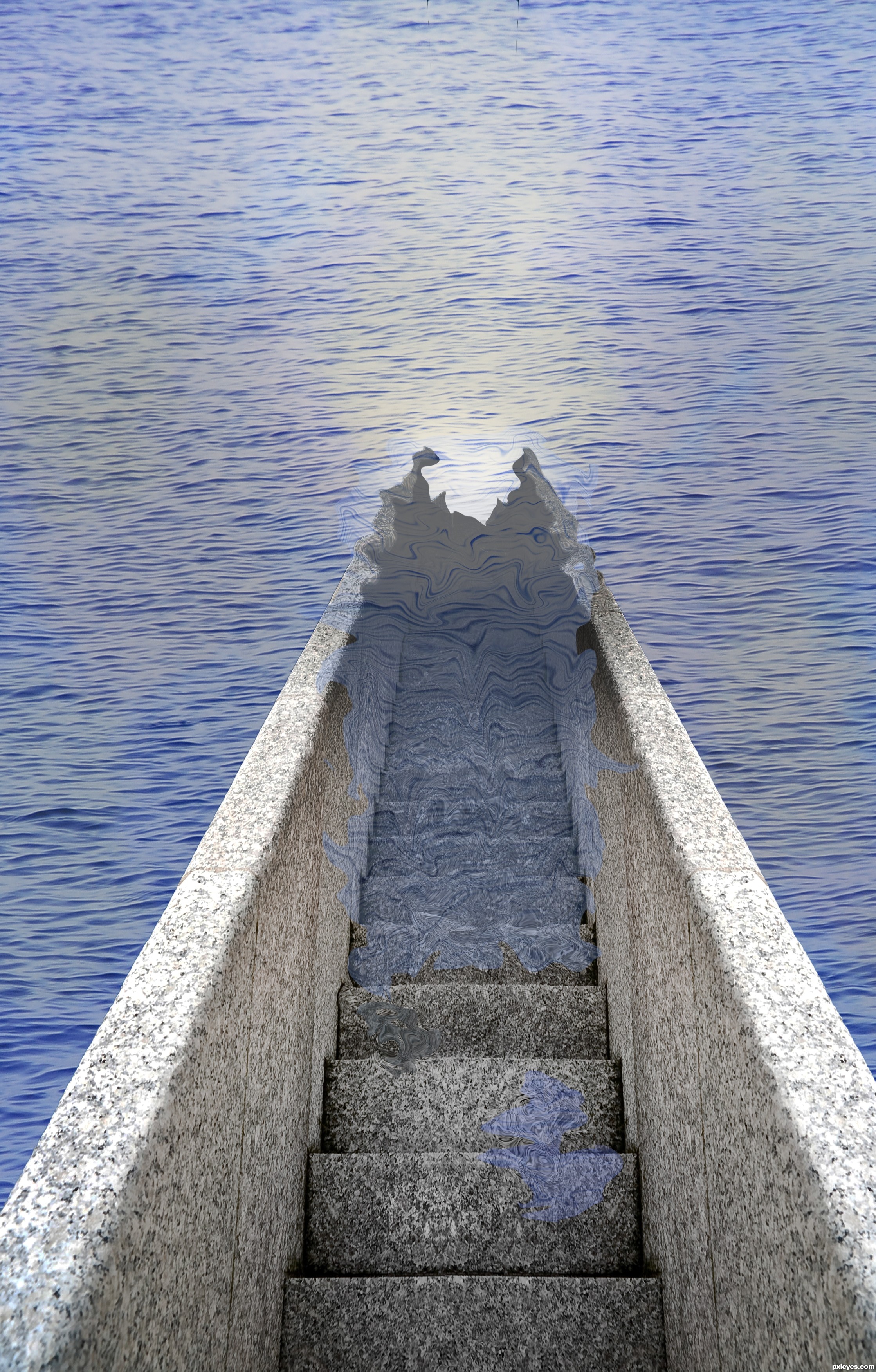
Interesting.. I do think that the stairs need a little bit more masking to get a more realistic result GL!
Really good idea. Water doesn't act like that though. With this perspective the water is really hard to get right. Trust me, I remade your entry so I could tell how the water would react. The water would actually travel further up the stairs than it would on the railings. Good luck!
The surface of the water should be parallel to the stair treads we're looking down at. If the water came all the way up to the second step down, then the edge of the water would follow the faint line that starts at the left edge of that step and continues up (literally up as you face the pic) the left railing. Note that the water would then touch the railing's top edge right where you show water lapping. Ergo, you should be showing water covering the stairs all the way up to the front edge of the second step.
You should also make the water transparant on the staps, the opacity is to high. Also the water would transform the stairs, create wrinkels in the stair part thats underneath the water. Good luck!
thanks for all your comments again, ive changed it the best i could, but couldnt use the same source so it looks slightly different. but thank you again for the help
Better luck next time.
Nice try on a difficult task you set out for yourself. It will certainly be something I will be experimenting with to see the most convincing way to achieve what you were going for. gl
Howdie stranger!
If you want to rate this picture or participate in this contest, just:
LOGIN HERE or REGISTER FOR FREE
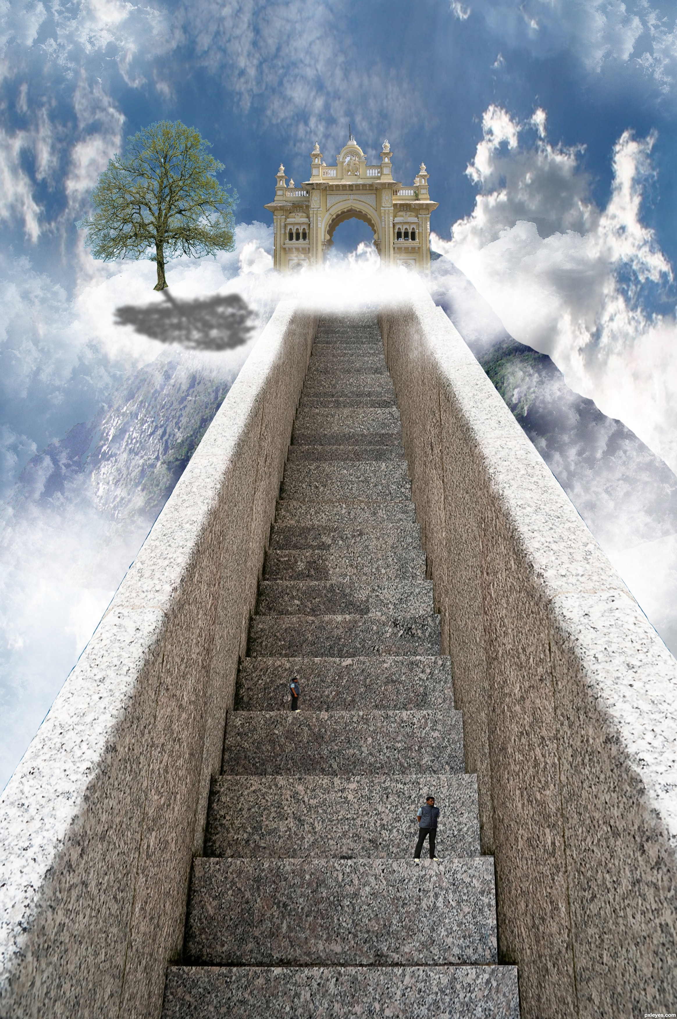
Well, this one took me quite a long time.. But it was quite simple to make..
I gave the stair a right side by copying and then transorming into shape..
I then took the gate and cut that out using the pen tool, did the same for the mountain.
I put it all together and at the end added some clounds and people which I cut out using the quick selection tool.
I also added a tree but I'm sorry but I cannot find the link to the image anymore..
Hope you like it and Thanks to asifthebes for images 1 and 2. (5 years and 3692 days ago)
GO WEST!!! pet shop boys.. hehehe..
I think if you move move the gate over to the left a little more and lighter the tree shadow it will look much better. Imo it feels like something is missing but I can't put my finger on it. Overal it is a well thought out entry. gl
I agree about the tree shadow. Maybe give it a gaussion blur and bring the opacity down. I'm a little confused at the clouds that follow the steps to the right? Also, I would get rid of the top guy that looks exactly like the bottom guy. Fix those and this will be very nice!
Thanks for the advice, it was taken on board
I agree with the shadow, but instead of lowering the opacity the shadow should be broken up with the texture of a cloud. I would also finish masking the arch way and soften the edge of the "mountain" on the right side. Great entry. Good luck!
The brightness of the right front of the tree seems inconsistent with a light source coming from behind the tree. There's an inexplicable notch in the right railing near the top. (Using the Clouds filter to create a mask for the tree shadow might help 'wispify' it.)
This looks great
not to many people getting into heaven lol... nice work author
lol @Keiley22 I wish I could favorite your comment
beautiful ....
Very nice job, only thing that I think of is that the person further up and away is taller than the stair, with perspective in mind, that person must be huge comparing to the person standing closest to us. IMO...Otherwise - really nice job!
sunzet, you are very correct, thanks for the notice ill change it
GL
Howdie stranger!
If you want to rate this picture or participate in this contest, just:
LOGIN HERE or REGISTER FOR FREE
Photography and photoshop contests
We are a community of people with
a passion for photography, graphics and art in general.
Every day new photoshop
and photography contests are posted to compete in. We also have one weekly drawing contest
and one weekly 3D contest!
Participation is 100% free!
Just
register and get
started!
Good luck!
© 2015 Pxleyes.com. All rights reserved.


NICE JOB! This is really unique
Very clever concept!
creative angles and a great new concept.. what clever author you be.. hehehe.. love the creation.. great WORK
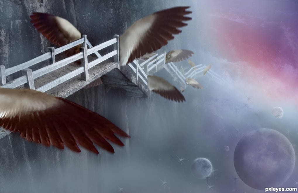
Since the stairs are attached to the cliff, what are the wings doing on the left side?
Awesome!!!
Stairs have just taken off in flight, so had better have wings on both sides - although I have no documentation to prove it. lol Test Flight, I guess!!
nice.......
Fantastic concept author...best of luck
Nice concept and composition, author.
Very nice idea and execution, author!
Good work
Howdie stranger!
If you want to rate this picture or participate in this contest, just:
LOGIN HERE or REGISTER FOR FREE