(5 years and 3772 days ago)
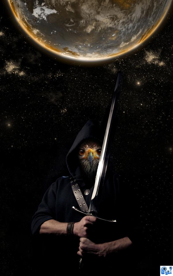
I created this protector of planets using the stock as mentioned.
Started with the adding of the eagle to the face of the man using masks. After that added the stars and earth and did some color changes to create the atmosphere I was looking for.
Hope you enjoy! (5 years and 3782 days ago)
Not bad, but a bit too reliant on DA images...
The only suggestion I would make is maybe make his arms more like the texture of the birdface.
I really like the idea, but i kind of agree with CMYK only in that you could find very similar sources in something like SXC, and it would've been a lot easier for you, author. Anyways, good luck, i really like it!
i too wonder what it would look like if the arms were feathered.like the sky and background images.
Howdie stranger!
If you want to rate this picture or participate in this contest, just:
LOGIN HERE or REGISTER FOR FREE
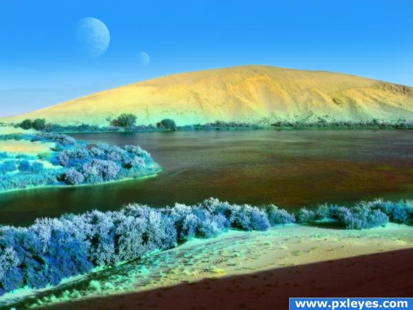
A planet similar to Earth. No outside source images used. (5 years and 3790 days ago)
nice 
Thank you

Howdie stranger!
If you want to rate this picture or participate in this contest, just:
LOGIN HERE or REGISTER FOR FREE
This was time consuming. (5 years and 3809 days ago)
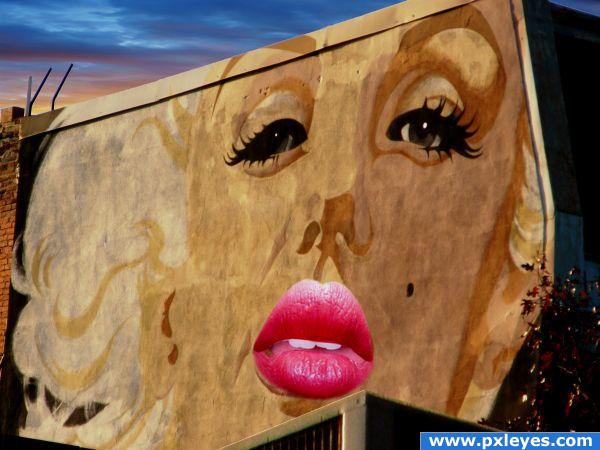
Cherries don't work, they just distract from the lips...
I agree with CMYK! Yeah......that's right.......I AGREE! Great idea Author! GL
I think its a great idea only the perspective of the lips are different then the face on the board. Cherries, I dont understand either unless there was some kind advertisement with it, like cherrie vodka or something.
Well, I made the changes that you guys suggested. Thank you.
Well, I made the changes that you guys suggested. Thank you.
i love it with out cherries
I LOVE TO SEE THE SBS FOR THIS, GREAT WORK 
like the changes you made.
Howdie stranger!
If you want to rate this picture or participate in this contest, just:
LOGIN HERE or REGISTER FOR FREE
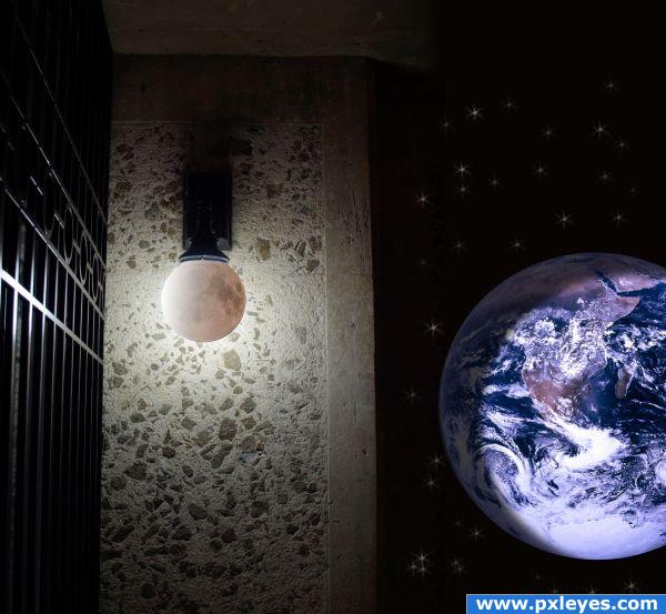
Starry night, a good light, what more can you ask for? (Maybe a good book, or Photoshop CS4.... ;) ) (5 years and 3824 days ago)
Good thinking! 

good use of texture.
Very creative. Simple but yet unique.
Thanks!
Howdie stranger!
If you want to rate this picture or participate in this contest, just:
LOGIN HERE or REGISTER FOR FREE
very clever
ROFL
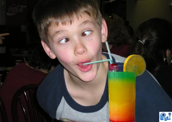
Pretty funny. Woulda been funnier if the other straw went into the kid's ear...
I find this quite annoying
i love this as i use to make a drink i called. a TRAFFIC LIGHT> for kids. this image reminds me of those days. simple but visually funny image.
Can you upload a high res version next time? I think the lighting on the glass is a little off but hard to tell in low res. Maybe make slightly brighter to match the kid.
jeje
Howdie stranger!
If you want to rate this picture or participate in this contest, just:
LOGIN HERE or REGISTER FOR FREE