thanks to Quasic @ Flickr for the photo i kicked the crap out of (5 years and 3575 days ago)
- 1: source1

(5 years and 3588 days ago)
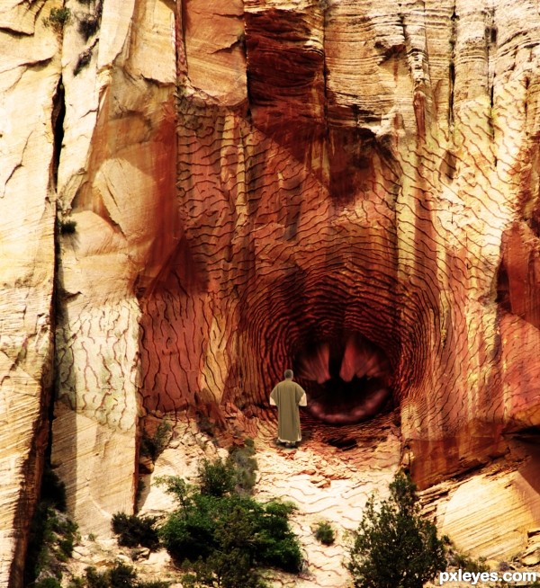
Very nice apply-ing of the texture at the some parts,left part needs a bit more color adjustment because sun is brightest there.But the guy looks too copy paste-ed.U could use some color adjustment layers or blur the edges and brown photo filter maybe.My advice with the original color is to create one dark brown color layer,with maybe 40-50% opacity,and one dark gold color or soft color layer...Good luck author
Thanks erathion, I had applied some blur to the man, but I've now blurred his edges a little more and applied a brown photo filter to him, I think he looks better. I'll fiddle a bit more with the texture too. 
Nice , I like it ... Good job =)
omg, that triggerfish makes a great center for this! 
nice work ................. ..............he looks like a warlock to me, and he is saying some mantra to open the door ................. how is that ......... ha ha ....... all the best to u ...........
  :
:
Howdie stranger!
If you want to rate this picture or participate in this contest, just:
LOGIN HERE or REGISTER FOR FREE

finally found out what typography art is. (5 years and 3799 days ago)
simple and looks gud
at lest one of us know what it is HEEEE. good luck with your entry. NIce colour choices. the Blue looks great with the black background
Howdie stranger!
If you want to rate this picture or participate in this contest, just:
LOGIN HERE or REGISTER FOR FREE

(5 years and 3845 days ago)
lol very funny
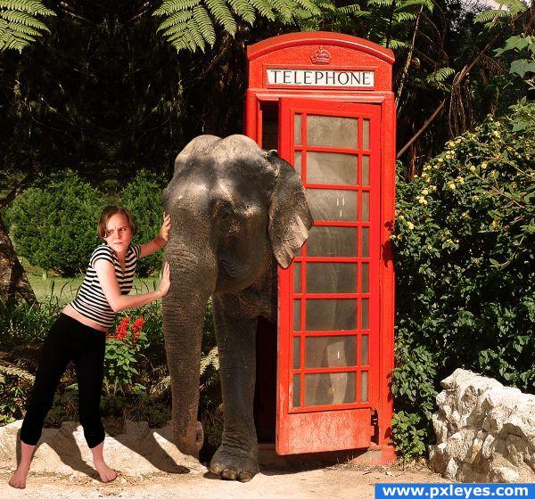
Conflicting light sources, but funny...
Very cute!
Creative and funny! The red British phone booth sets off the elephant.
ditto...CMYK...but love the expression of woman. 
Very good blending and choice of sources! Her face expression is really prizeless  Good luck!
Howdie stranger!
If you want to rate this picture or participate in this contest, just:
LOGIN HERE or REGISTER FOR FREE
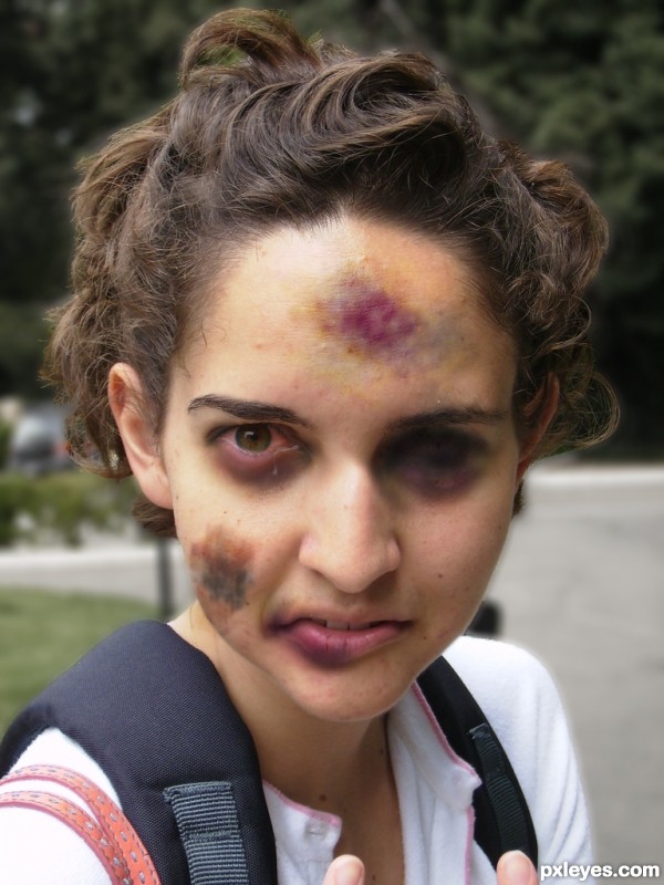
I think you blackened her eye a little too much. It doesn't look very realistic. I would try just using a closed eye source and making it blend to the face but the rest looks pretty good. GL!
was trying to make her eye like it isn't there anymore.. ya know.. like it had to be removed
Nice colour.. I like the way it blends into the face... GL
The tear seems to drip from the wrong way, and if you do a darker line by her "lost" eye so it appears to be closed and badly beaten that would make the whole pic more realistic. IMO
Howdie stranger!
If you want to rate this picture or participate in this contest, just:
LOGIN HERE or REGISTER FOR FREE