(5 years and 2629 days ago)

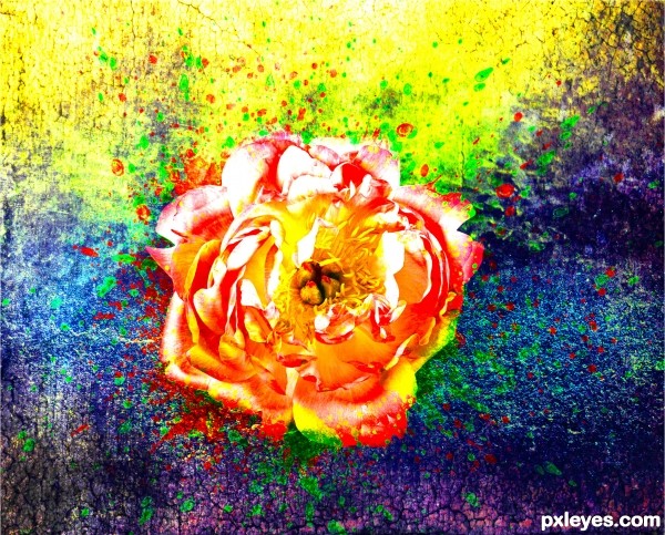
Very Colorful, Vibrant rendition of the flower. Hope you enjoy :) (5 years and 2679 days ago)
Love the colors 
Thank you 
Howdie stranger!
If you want to rate this picture or participate in this contest, just:
LOGIN HERE or REGISTER FOR FREE

(5 years and 2934 days ago)
Great find of picture... but that is all it is, right now, a great find... background and picture found on internet... I think you can do something more with this, maybe atleast make it into a yin/yang zin/zang symbol...
Gimme a break! The Yin/Yang symbol is the most trite thing you could come up with in a contest like this. The meat of the contest is: "create a contrast of opposites based on the oriental theme". The concept of the pairs of opposites is fundamental to all philosophies, and many of the entries in this contest reflect that without using the Yin/Yang symbol.
I concur with what you are saying and would totally agree if you had made the mechanical arm yourself; or if you added something additional to the background you created! (people fighting robots or something like that!)
I faved in advance hoping you would tweak it just a bit... not to my personal suggestions... but just look inside and give it the extra boost it needs to be super duper awesome! 
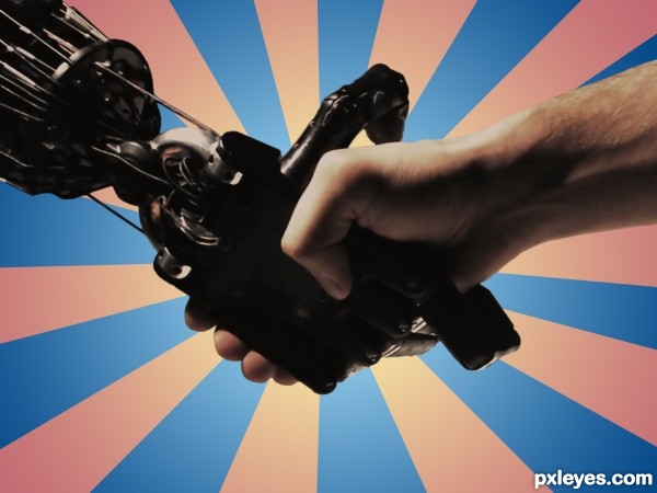
Sometimes a good find is all it takes. I've seen it work many times, and all this one needed was some graphic impact in the background. Something like people fighting robots wouldn't fit what I had in mind anyway...I see this as a friendly handshake between the creator & the creation. That's why the title isn't Flesh vs. Steel.
I see your point! Sometimes the idea or creative imagination goes along way... 
as stated earlier.. really a great picture and concept!
great picture ..Hate your background... my artistic bias..LOL
good luck
Howdie stranger!
If you want to rate this picture or participate in this contest, just:
LOGIN HERE or REGISTER FOR FREE

(5 years and 3002 days ago)
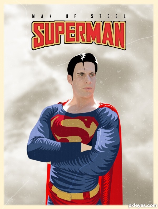
Great Job! may want to equalize the letters PER so that the Stroke equalizes (clean line over the top) and the letter E should be symmetrical and the R is a bit weird. (It's still awesome, I'm just pointing out what a client would zoom into.. and they do.. over and over and over again) hehehe
Love the yellow border and the aging process (a blur scrub over the scalp line might soften a bit)
Good luck and good job, and always IMHO, fun image 
The text has been changed, I also added a bit of blur to the top of the head. Thanks Driven!
MUCH CLEANER!!! when I do poster art I get hammered by clients for nasal passages looking to venty LOL.. great fix and good luck 
Links don't work.
I just tested all the links and they seem to be working okay on my end. Thanks for bringing that to my attention. I wonder if anyone else is having that problem?
Weird...they just worked for me now, and I checked them twice before commenting...Sorry! 
That's alright CMYK, sometimes weird things just happen in the computer world. 
super!!
Nice job integrating the model with your painting!
Howdie stranger!
If you want to rate this picture or participate in this contest, just:
LOGIN HERE or REGISTER FOR FREE

My Photo (Eye Censor black bar) combined with source image (5 years and 3031 days ago)
Howdie stranger!
If you want to rate this picture or participate in this contest, just:
LOGIN HERE or REGISTER FOR FREE
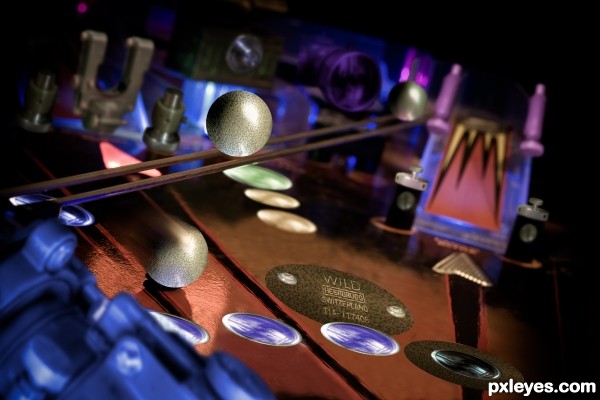
Fun idea, and I like how your SBS is kind of a where's waldo of machine parts.
Thanks for the great comment!
Howdie stranger!
If you want to rate this picture or participate in this contest, just:
LOGIN HERE or REGISTER FOR FREE