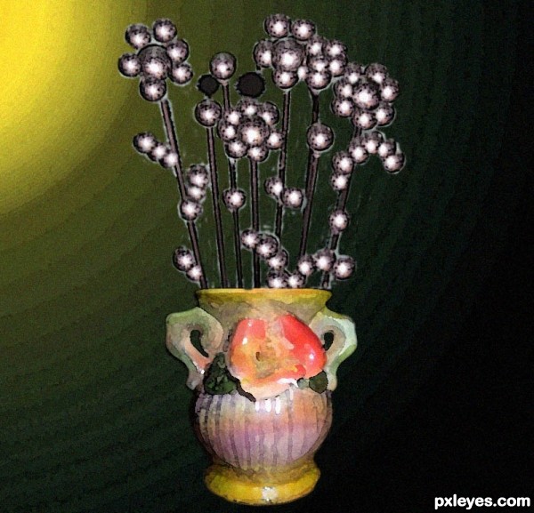
i made this wisk into a steel flowers in a vase using cs5. (5 years and 3321 days ago)

(5 years and 3434 days ago)
very nice 
LOVE the deep color palet on this. 
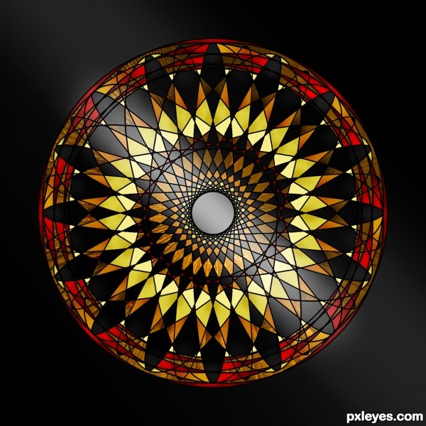
good job, it would make a great looking piece of stained glass
Thank you guys for the comments!
I would love to actually make this one into a stained glass piece, if I do so I'll post a picture of it just for you Ichappell!
I thought stained glass also, and it reminds me of the crayon scribbles I did as a child. Very nice work, author. 
very nice colors author
Howdie stranger!
If you want to rate this picture or participate in this contest, just:
LOGIN HERE or REGISTER FOR FREE

In the future maybe robots will be marketed like new cars. "Be the first in your neighborhood to Rule the World!"
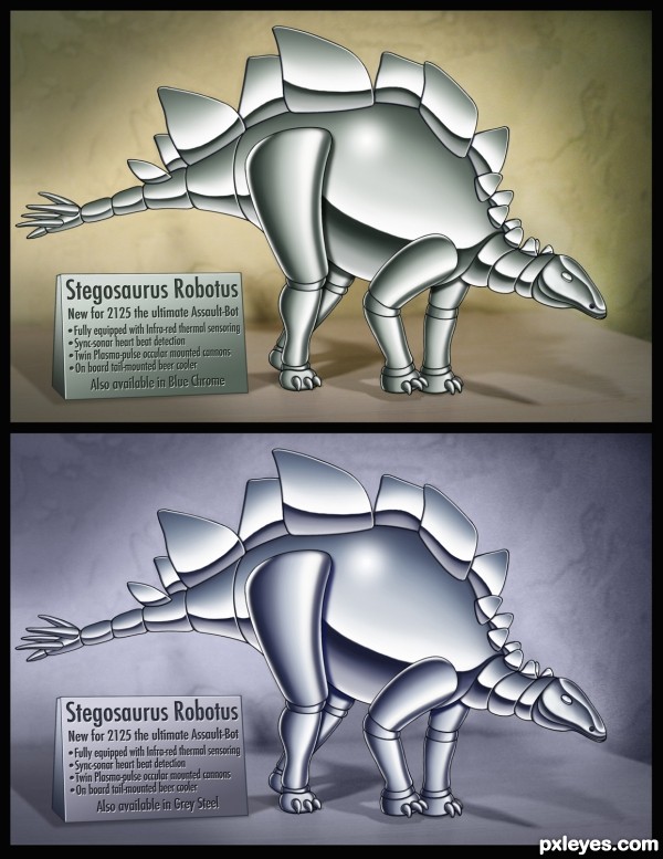
This illustration style is similar to comic book techniques. I first created a black outline then filled the color inside. Backgrounds are two versions of the source background.
These are basically Duotones, black plus one color. I wanted to show two different approaches to coloring in this style. Each plaque mentions the alternate color available. Each version was adjusted within it's palette of color. (5 years and 3450 days ago)
vroom vroom.. scree scree...  I WANT THE BLUE ONE!!!!
metal effect is nicely done
I think you're pro in illustrating comics. What I like best is the complex shadows, and then the metal effect. I prefer the top one, even though the color of the dino is not as good as the blue one, the color tone of the whole piece is not neutralized (or uniformized) to the level of the bottom one. This dino is more stand out from the background. I want to see more this kind of image in Pxleyes, really unique 
Good images! Would have been nice to see how the shading was done in the SBS.
Okay CMYK46 I've added more steps to the SBS showing more detail as to how it was rendered. Thanks for the comments!
great work and nice detailed SBS 
Soooo cool ... incredible work. I want one ...please!
good luck!
Howdie stranger!
If you want to rate this picture or participate in this contest, just:
LOGIN HERE or REGISTER FOR FREE
(5 years and 3673 days ago)
very good job 

awesome
this is is perfect...
Great work...good luck
wow... it looks like a na'avi and Edward Cullen had a baby.. good job author 
good job 
Howdie stranger!
If you want to rate this picture or participate in this contest, just:
LOGIN HERE or REGISTER FOR FREE

(5 years and 3771 days ago)
Well done!! I like it very much 
Nice idea & blend.  Source for sky & sea?
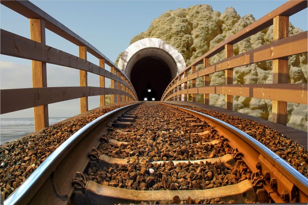
Sky and Sea are from original source  ... thx for the comments
great masking ,nice image . G/L
cool work
It's a really good blend and one of the best I've seen but... The lights don't look real in high res. But like I said only noticable in high res.
cool idea.
great blend work author.. nice use of source.
nice
Thank you all for the votes 
Congrats for your third place, Numbsock!
Congrats!
Congrats!
congrats!
Congrats!!
Howdie stranger!
If you want to rate this picture or participate in this contest, just:
LOGIN HERE or REGISTER FOR FREE
Nice concept, but the background leaves a bit to be desired...
Howdie stranger!
If you want to rate this picture or participate in this contest, just:
LOGIN HERE or REGISTER FOR FREE