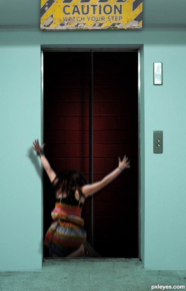
the cable was done with the line tool (5 years and 2761 days ago)
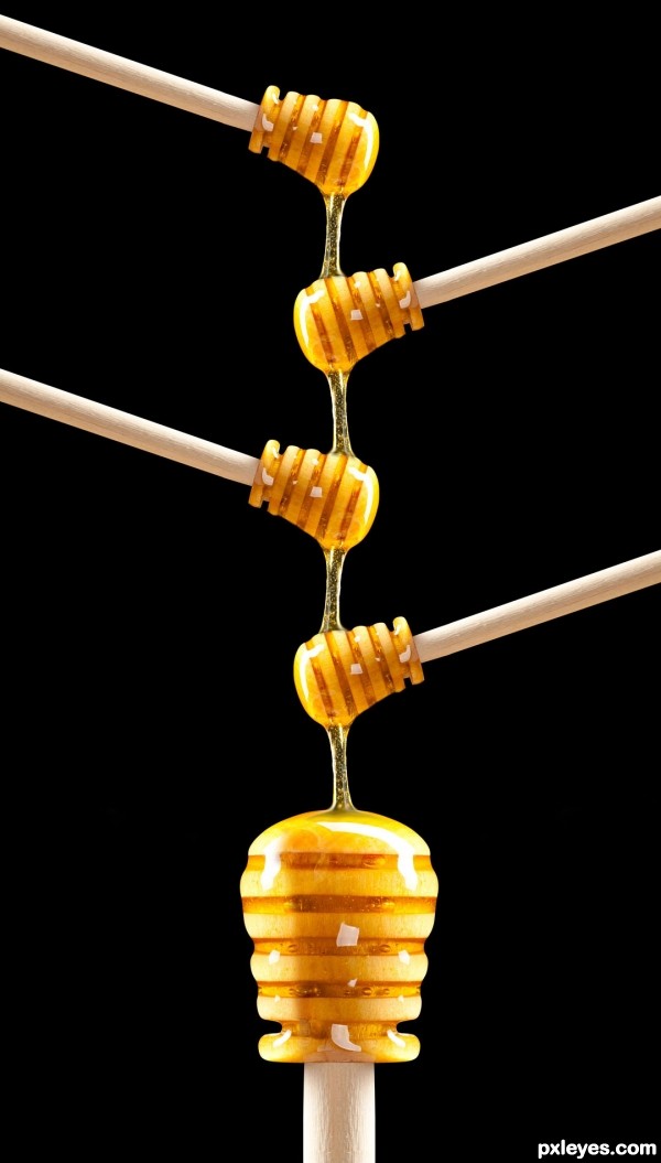
(5 years and 3069 days ago)
nice simple but efective work.
Nice blending. I would love to see this as a large, hypnotic poster!!!
In school, I was told to always find something good about an entry and also something that could be improved and sometimes that is hard to do. In this case it is really hard but I do see something minor. Author, this is technically close to perfect in my opinion but to really make it over the top I'd suggest adding a bit of dripping honey coming off the very bottom "thingy" (whatever this thingy is called). Otherwise, I think I want to frame this one but there's no Hi-res (?!)
Thanks.......Pshoudini, pixelkid & rsguetre........for like it! Sorry Rsguetre....i do it in small size!
This entry could probably earn you income in print sales if you had a high enough resolution image.
Howdie stranger!
If you want to rate this picture or participate in this contest, just:
LOGIN HERE or REGISTER FOR FREE
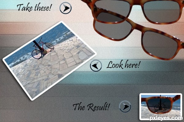
(5 years and 3143 days ago)
Really weird English...
Since they are called "sunglasses," "Take these," would be better.
"Look it" should be "Look here,"
and "To become this!" would mean you turn into the picture..."The result!" would work better...
But that's just the way I "see" it... 
The chop itself is quite nice, I like the variegated colors of the background, and the blending is quite smooth.
Thanks very much MossyB, I am not too good at English, I will fix it.
Thanks MossyB for correcting my English. I added more sunglasses too, now is it ok?
i love the back ground
i love the concept
i love this entry
Thanks very much, designed.
Good work author..... 
Thanks you, mounirupa.
Great idea, good job.
Thanks you, JoaoN.
Nice and clean, great concept! 
Thanks you Pearlie.
Howdie stranger!
If you want to rate this picture or participate in this contest, just:
LOGIN HERE or REGISTER FOR FREE
(5 years and 3391 days ago)
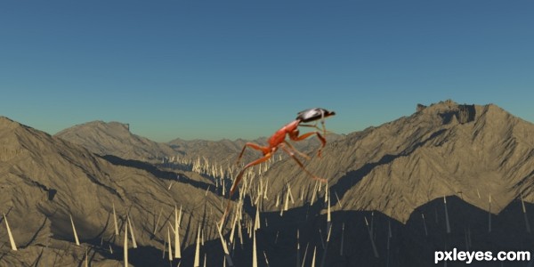
Well the ant is blurry- the high-res version of the source should be enought to make it look good in your pic. If you plan to make it look like it moves, add a new layer on top and motion blur it. Play with it's oppacity.
Also add a clipping layer with a blue overlay, over the ant - the colors reflect on shiny surfaces, and so should the sky. Again play with oppacity.
I can see you have some skills of how shadow works since you made that spikes with their tops lightened ( so... good for you  ).
).
I wont lie that this looks good, but i can say that it can look better. Good luck!
great thanks greymval...
great idea but the distortion blurred the object...extra points for the idea...gl
u r right erathion, great thanks 4 the comment
Howdie stranger!
If you want to rate this picture or participate in this contest, just:
LOGIN HERE or REGISTER FOR FREE
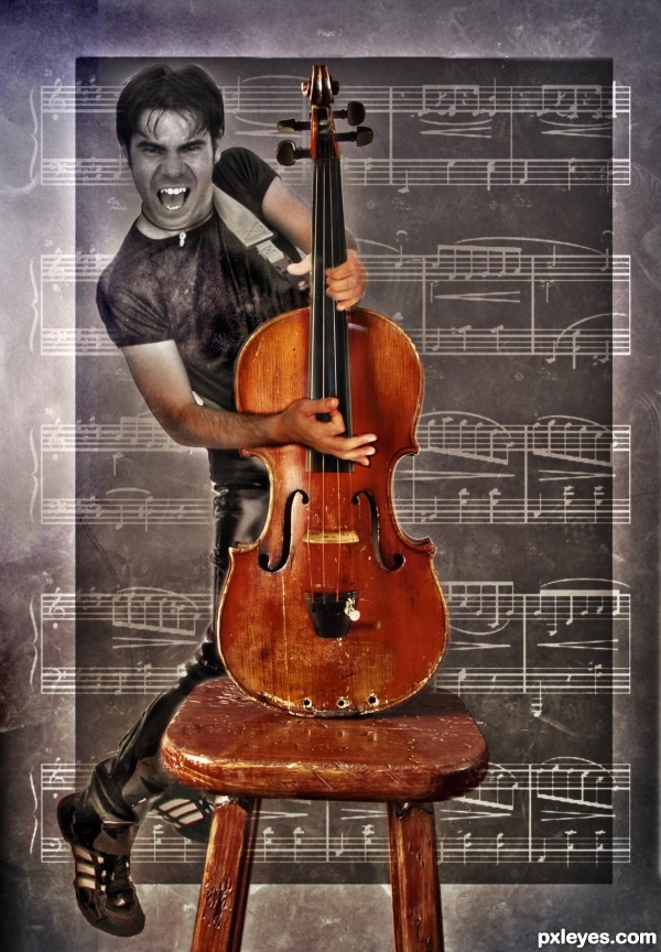
I'm pretty sure the original instrument is viola (kind of heavy built alto violin) but anyways, I took some artistic liberties with the proportions as well as with the idea of a rock star playing oversized viola like a guitar.
Notes used are from my own notebook, Chopin's Waltz, opus 64, n. 2
(5 years and 3468 days ago)
I like the transition from BW to color, nice work and fix on the violin. And you're a musician, too! 
Howdie stranger!
If you want to rate this picture or participate in this contest, just:
LOGIN HERE or REGISTER FOR FREE
Howdie stranger!
If you want to rate this picture or participate in this contest, just:
LOGIN HERE or REGISTER FOR FREE