Photoshop Pictures: Stick (page 2)


results 6 - 7 of 7

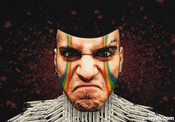
Stick dude - created by arnold


Stick dude
Favs: 0SBS: n/aHi-resRank: 7/15Score: 53.5% (0)4882 views


1.what I did is just use the filter -> poster edges for the face
2.duplicate the matches then filter -> ink outline
3.use the matchbox cover in the face then set the blend mode to multiply
4. color overlay with the particles with the color of red.
5. last apply a some texture. make opacity ,20% (5 years and 3515 days ago)

3 Sources:

avatar ricky777
ricky777 says:

you must remember the link =( try to search for it again.

avatar gamemastertips

Author, if you don't post all the source links, your entry could be disqualified.

author says:

its ok now

Howdie stranger!
If you want to rate this picture or participate in this contest, just:

LOGIN HERE or REGISTER FOR FREE


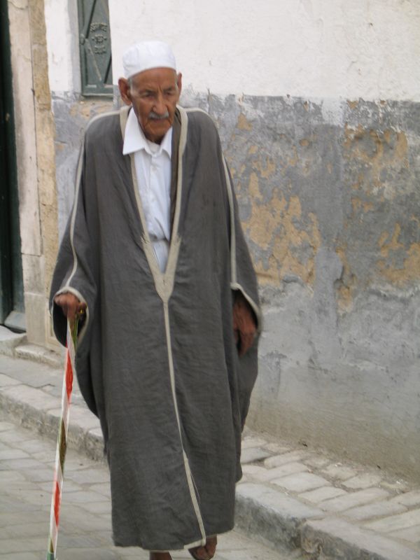
walking stick - created by JEN750


walking stick
Favs: 0SBS: 2Hi-resRank: 15/15Score: 48.8% (0)6295 views

(5 years and 3591 days ago)

1 Source:

avatar divair
divair says:

The idea is good, but your source is blurry and the stick is sharp. Besides, I think you should get rid of the white edges you left after cuting the cane out. Reducing the vibrance (or luminosity, depending on your PS version) and adding some shadows will help to give your work a natural look.

no avatar

I'm sure that this man is egyptian,lol!

avatar jawshoewhah
jawshoewhah [banned] says:

Agrees with Divair

author says:

Have changed luminance as suggested, haven't added shadows as there are no shadows of the stick on the original source picture.

avatar JamesD
JamesD says:

the stick is too blurry... imo

avatar JamesD
JamesD says:

much better!

avatar petersheep

too simple man.. and need more work to realism......more time to work too thx

Howdie stranger!
If you want to rate this picture or participate in this contest, just:

LOGIN HERE or REGISTER FOR FREE