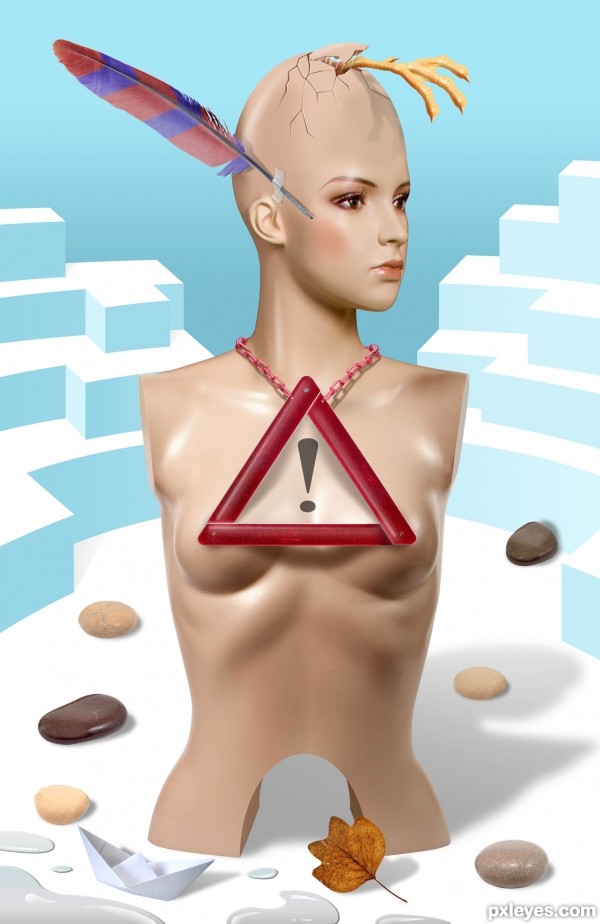
Apart from the photos, some parts are drawn. (5 years and 2939 days ago)
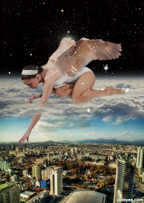
(5 years and 2965 days ago)
This would be great if I could believe the attachment of the wings. 
PS: I'd also offset the star cluster in the background so it's not right at the top of the wing. Author, with some tweaks this could be a great image.
Nice idea, but I recommend to have a closer look at the masking of the girl/angel. The edges can do with some softer and more subtle edges here and there. Good luck!
ok i have fix some things
Really have to say that I love the blending of arm through the clouds. Perhaps take a bit of 'coolness' blue color out of the arm below the clouds to allow the flesh to be warmer from the 'sunlight'. Nice job.
Howdie stranger!
If you want to rate this picture or participate in this contest, just:
LOGIN HERE or REGISTER FOR FREE
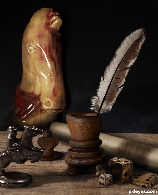
One more (own) source in the SBS, background is selfmade. (5 years and 2978 days ago)
Great compilation but what's the thing on the background?
LOL Akassa.... I was wondering the same thing, it's in the sbs though and is a knight chess piece, once I'd seen the sbs pic I found it hard not to recognise it. A lovely composition author 
Nice job, author! Really appealing composition of the sources you used. I had the same question about the knight piece in back. Perhaps make it more recognizable somehow...
I had the same thought about the chess piece, its base is not visible, perhaps that would help. Author, what are the source links for the two wooden pieces - the one the feather is in and the smaller one behind? Nice composition overall, tho.
Thanks for the advice all but I leave it the way it is, let's say your confusion just adds to the meaning this piece has for me. Cryptic, I know, but I will not explain.
@Pearlie: the source is there: both are made out of the chess figure in source 1
Oooohhhhh, I see them now, author. Nice chopping and disguise! 
I like the dice within a dice part, very cool :P
Howdie stranger!
If you want to rate this picture or participate in this contest, just:
LOGIN HERE or REGISTER FOR FREE
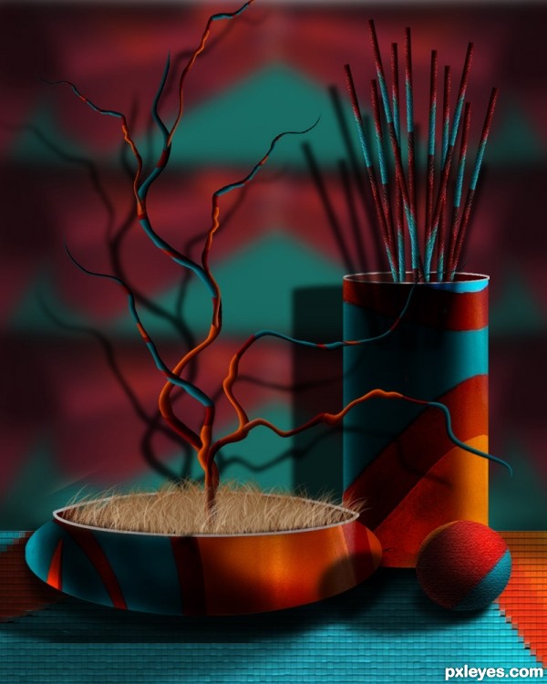
Only source image used for this entry, provided by pxleyes. (5 years and 3142 days ago)
Very cool! Great use of the source image, and wonderful shading!! Just a thought, the blurriness of the background suggests that it is far away, and your shadow tells us that it is very close, so your losing depth. Also there would have to be a light coming from where the viewer is for the shadow to be there...so long story short I would drop the shadow all together, and maybe blur the background a bit more, you could also desaturate the background a bit to make everything else pop! But either way this is a great entry. good luck 
....sorry to bother you further, but just in case that was confusing at all, I was just talking about the shadow of the tree and the sticks
Thank you Robart. Desaturated and blurred more the background. Shadows lowered. 
Wonderfully creative use of a difficult source. My only nit pick is the ground, which looks too flat and face on. You should skew it, so that it angles back to give this a stronger sense of realism and depth. Very nice work!
Mossy: I made the changes, skewed the ground, and the image looks better, sorry I was not able to load the changes. I really appreciate your suggestion.
this is cool work author i like it
Awesome still life 
Howdie stranger!
If you want to rate this picture or participate in this contest, just:
LOGIN HERE or REGISTER FOR FREE
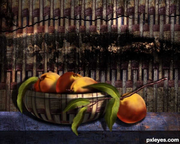
Thanks to ppdigital from Morguefile, for the pic of the concrete texture, used as my background.
The rest is PS and lots of patience.
UPDATE: I had to go for the realistic leaves...sorry Mossy. Background, desaturated. (5 years and 3159 days ago)
Peaches are very well made, and realistic looking. Can't say the same for the leaves. I'd suggest modeling them after a realistic leaf to keep your image consistent. GL author. 
CMYK: Thanks, I have to go out to the yard and look at a real leaf of a peach tree we have. I did this just thinking of a peach, and leaves, kind of hard to do this by heart. No reference used. Good idea! 
Noooooooo!!!! 
The surreal leaves are my favorite part after the beautiful shading on the peaches.
The background is a bit too intense for my taste, I'd soften it by decreasing the contrast very, very slightly, but leave the leaves be!
~M
Thanks MossyB: I just finished drawing more natural leaves, and look nice, but I will wait. I think you are right. Will soften the backgroud.... maybe desaturating it...a little?
Author.. if you put a gaussian disk in faded black underneath the bowl and burn it's bottom edge it will help with grounding the bowl .. another disk under the isolated fruit will help as well (IMHO), Overall, FANTASTIC image! Good luck
Beautiful image author...Whole creation is top notch...High marks from me and i wish u good luck...
STEP 19....Shows my first final image. The leaves were changed to the ones I have in my final now. So, you'll get an idea of what the image looked before.
Mossy, I am sorry I had to go with the realistic look leaves. The image looks better, I think, thank you for suggesting about background, it is desaturated now.
CMYK: You got it! Leaves look nice. Driven, the basket / peach are grounded now.
Erathion: thanks.:-
GL author! 
Great job on the peaches (they almost look fuzzy) and the new leaves , author!
Beautiful work author! Looks like a painting!
Howdie stranger!
If you want to rate this picture or participate in this contest, just:
LOGIN HERE or REGISTER FOR FREE
nice..but not your best work.
Surreal and cool. I think I would have enjoyed seeing the triangle less straight...more on an angle as if it's actually being worn.
Congrats with a spot in the next round
Good luck on the next round!
Howdie stranger!
If you want to rate this picture or participate in this contest, just:
LOGIN HERE or REGISTER FOR FREE