(5 years and 3583 days ago)
I'm just a hunk, a hunk of burning love
Just a hunk, a hunk of burning love
Just a hunk, a hunk of burning love
Just a hunk, a hunk of burning love
Just a hunk, a hunk of burning love
Just a hunk, a hunk of burning love.
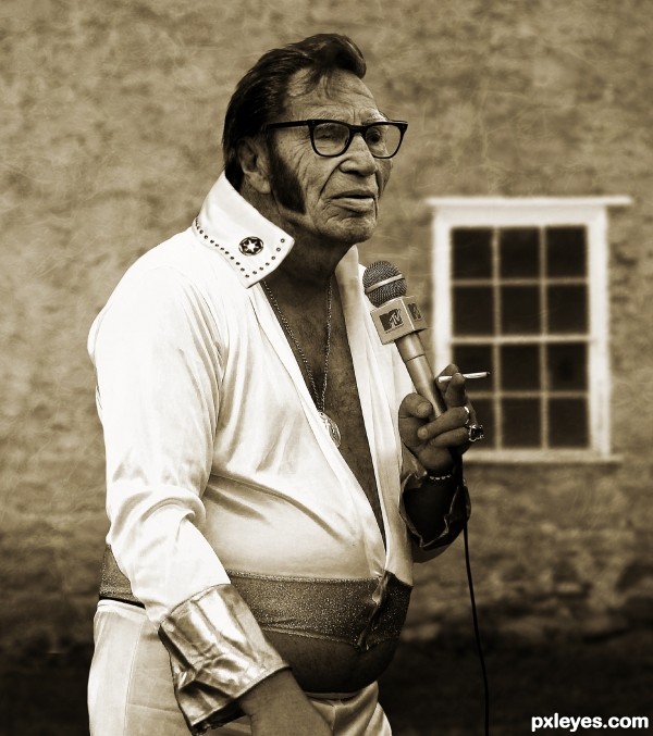
My take on what Elvis would look like in later life.
All images from Flickr and texture from CGTextures.
Critique welcomed. (5 years and 3609 days ago)
Quite good blending and interesting idea. My nitpicks are the light comes mostly from left sides and a bit from right side based on the body (that's not direct light), but on the face the light comes from the right side, so you should adjust the light on his face to be more uniform (increase the light from the left side). Also, the eyebrows are white but the hair is still dark (maybe it's still acceptable since he can colorize his hair lol). The last thing is the stroke around the body and face is still visible in Hi-Res, you need to clean it more (make some hair for him, so the head won't look like cut and paste). Hope this helps and good luck!
PS: if you're able to make the folds on his body skin as the one on his face, that will be great!
Thanks for the suggestion langstrum. Added some hair and used some dodge and burn on the face and neck. Also removed some of the sharpness which caused the halo around him. I hope it looks better now.
Wow...excellent work. Great job, author!
Looks great! Just have the wall behind him show through the glasses next to his face. 
Holy blue suede orthopedic shoes! Hey that "cigarette" looks hand rolled. Could it be... nah. Very convincing image, I expect the tabloids will be running it soon. Excellent work!
Fantastic work author...every single detail look so realistic...u did really really god job here...well done
Really good, the images are very well blended, resulting in a realistic work. 
Fixed the glasses as CMYK46 suggested.
incredible work author!
Fabulous! 
Well deserved win...congrats! 
Congrats! for 1st 
Congratulations! 
Congrats Solkee, what a dude 
Congrats on you win - well done!
Congrats for 1st place..............
Congrats...well deserved 1st place...
Thanks everyone for the comments, faves and congrats. A special thanks to langstrum and CMYK for their suggestions that helped the entry improve.
Congrats for 1st place
Congrats!! Nice work!
Congrats! You earned it! 
Howdie stranger!
If you want to rate this picture or participate in this contest, just:
LOGIN HERE or REGISTER FOR FREE
*H (5 years and 3611 days ago)
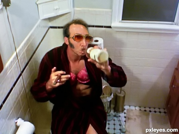
Can't blame you for ticking private comments on this one...
The king fell down! 
not good 
Oh come on .....Private?....Funny
Lame.
Howdie stranger!
If you want to rate this picture or participate in this contest, just:
LOGIN HERE or REGISTER FOR FREE
gradient overlay ,gradient mask (5 years and 3620 days ago)
ahhahah great job author! i love it!
Howdie stranger!
If you want to rate this picture or participate in this contest, just:
LOGIN HERE or REGISTER FOR FREE
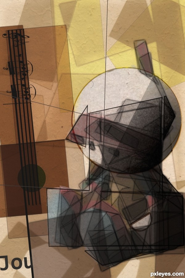
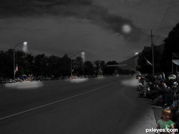
Used the intermediate result of my entry for the original Cubism contest (back in the photoshoptalent days) and made some small changes (mostly keeping the color in, and using a texture). (5 years and 3622 days ago)
I think that's great! Hope I can do half as well...
Very beautiful presentation of Cubism. GL! 
very very awesome1
good entry!
Love the mood you have created here, and the colors and technique. Very well done.
U did fantastic job author...one of the best for sure...best of luck
Great entry and superb use of the doll reference image!
lovely interpretation of cubism.. wonderful work!!! GOOD LUCK!!!
Really creative 
Congratulations for the 1st. place! 
Congratulations! 
Awesome work Dustfinger, Congrats 
congratulations... I loved it...
Congrats on first place - well deserved!
Congrats! for 1st 
Congratulations...Nice!
Congrats on this amazing piece of work...well done...
congrats!!! 
Congrats!!
Congrats!!!!
Howdie stranger!
If you want to rate this picture or participate in this contest, just:
LOGIN HERE or REGISTER FOR FREE
Howdie stranger!
If you want to rate this picture or participate in this contest, just:
LOGIN HERE or REGISTER FOR FREE