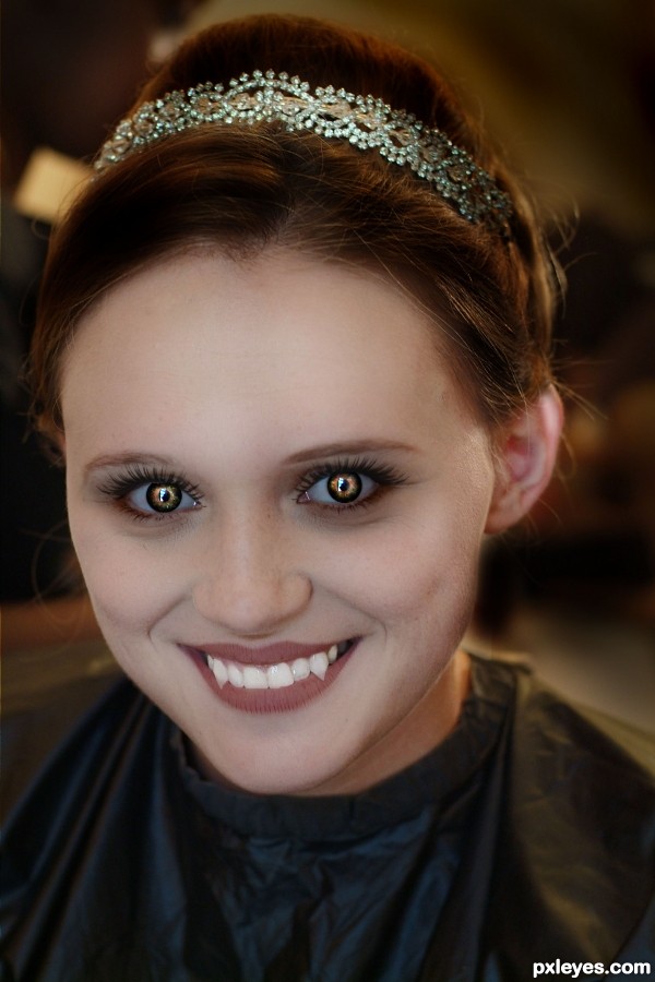
Even the undead still want to feel pretty. (5 years and 3632 days ago)
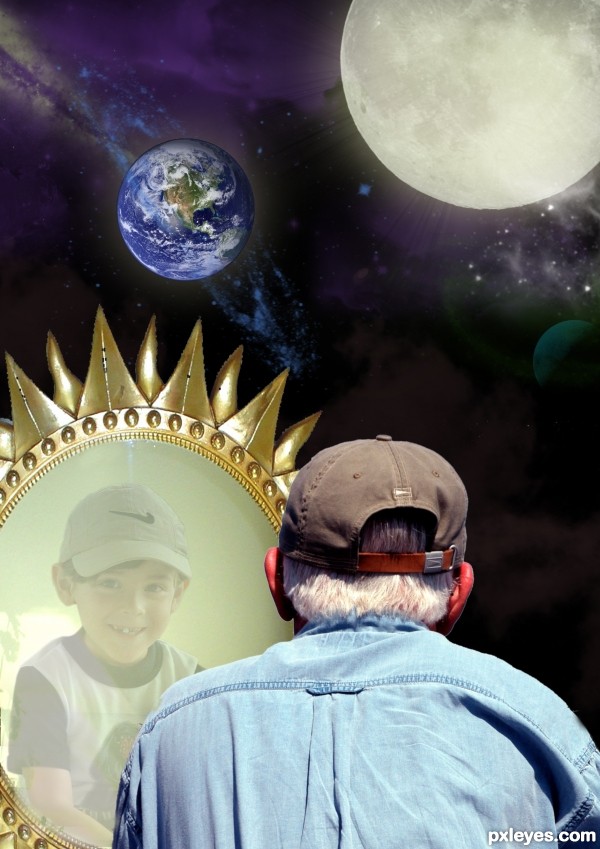
(5 years and 3644 days ago)
this is a great image author! one thing though, maybe flip the child image horozontally to match the old man's perspective of looking at the mirror, other than that, awesome1 author!!!!!!!...

done tucki thanks
awww i found this really cute, great idea best of luck
Ohhh, this is so sweet 
This made me smile. Well done 
Howdie stranger!
If you want to rate this picture or participate in this contest, just:
LOGIN HERE or REGISTER FOR FREE
(5 years and 3668 days ago)
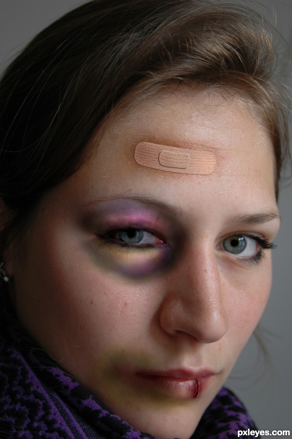
Everything's good but the band-aid...look at a real one for reference. GL.
agrees with both. GL!
i fixed the band aid and tried to make her eye look more swollen, thx everyone for the tips! 
Domestic violence? My wish is doing the same thing to the monster who did that to her!!! Oops, sorry, author! 
Very convincent effects, but band-aid is a bit tiny for me. 
lol erikuri, I did that to her, thank you very much! :P
as for the aid band, don't they come in different sizes?
Re: band-aid. I think to my eye it's the pad that's out of proportion vertically, but it's just a nitpick. You've done a great job on the flesh discolorations...I know, because I got hit over my right eye by a falling ladder a while ago, and my shiner turned all of those colors...good luck! 
@CMYK: hmmm... falling ladder, huh!...  Just kidding!... You must have seen stars!
>CMYK,......yes spinning blurry colored stars,....LOL,.....great work, master...

Looks much better than the first, when using layer effects for things, remember to change the color of the bevel to a darker color of what the color of the thing you're beveling. When you you use black, it tends to have a weird effect. If you use the actual color but darker, it's more realistic. 
thx all for the tips and comments, thx anna (you told me that layer effects thingy before but i forgot). i think the easiest way would be to just replace the aid band i made with a real one. but i don't have the time now. 
P.S. I do believe CMYK's story with the ladder... 
Eye looks perfect,and very realistic,bruise in the corner of the mouth is great too,but the crack on the lips is not that convincing...i will hold my vote author,because i like this work very much and i want to give more points...
i've made some changes to that cut on her lip, i hope it looks better now, thx a lot erathion! 
way better author...now is great...all is very very realistic...high marks from me and best of luck
This is very realistic and this chop draws my eye totally in.
Author I give you high marks for this also 
Excellent idea and choice of source image for this.
Great idea Good luck! 

Very nice job. The cut on the lip looks excellent! The colors on the bruised eye look just a tad too bright (almost cartoonish). Other than that, great job! GL.
Howdie stranger!
If you want to rate this picture or participate in this contest, just:
LOGIN HERE or REGISTER FOR FREE

With thanks to the following:
Cemetery by andrewconn
Tree by kaleff
Poppies by alitaylor (5 years and 3674 days ago)

Howdie stranger!
If you want to rate this picture or participate in this contest, just:
LOGIN HERE or REGISTER FOR FREE
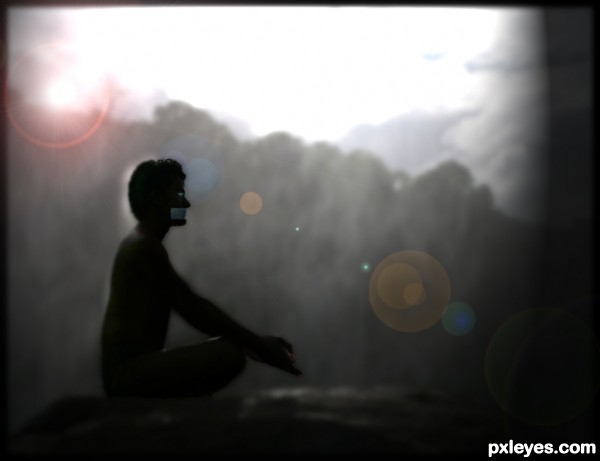
From the idiom "A still tongue keeps a wise head" (5 years and 3693 days ago)
The light area behind his head and back don't really look like they belong there. Also, the inconsistant blur on his body doesn't look right.
I think you've illustrated a proverb/adage/saying rather than an American-English idom. That said, if there's tape over his mouth, then we shouldn't be able to see lips, but rather just a straight up-and-down edge.
Thank you for the comments! I will try to fix those as best as I can.
I like this image....
Just try to focus that man more than lens flair... That character is totally merging in background....
good luck
Howdie stranger!
If you want to rate this picture or participate in this contest, just:
LOGIN HERE or REGISTER FOR FREE
i love her eyes and the teeth was realistic
I have a crush on her, author....bite me and I am yours.....

Pls, post source links! Or a sbs...
I feel fangs are a little transparent, and she needs a paler skin tone... But whole image is very cute, GL!
Good concept, but I agree with erikuri.
well done author! please post sbs or sources
Author, I just removed your comment, because your name was part of the url that you've written. In case the image is your own, please add the original version in the Step By Step guide. If you want to know how to do that, see this page: http://www.pxleyes.com/blog/2009/07/how-to-participate-in-pxleyes-photoshop-contests/
can drink it my blood ! very nice image ! ! g l
very very nice work with the eyes author...good luck
Too portrait of a source to be convincing, IMO.
Howdie stranger!
If you want to rate this picture or participate in this contest, just:
LOGIN HERE or REGISTER FOR FREE