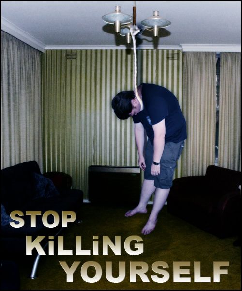
(5 years and 3463 days ago)
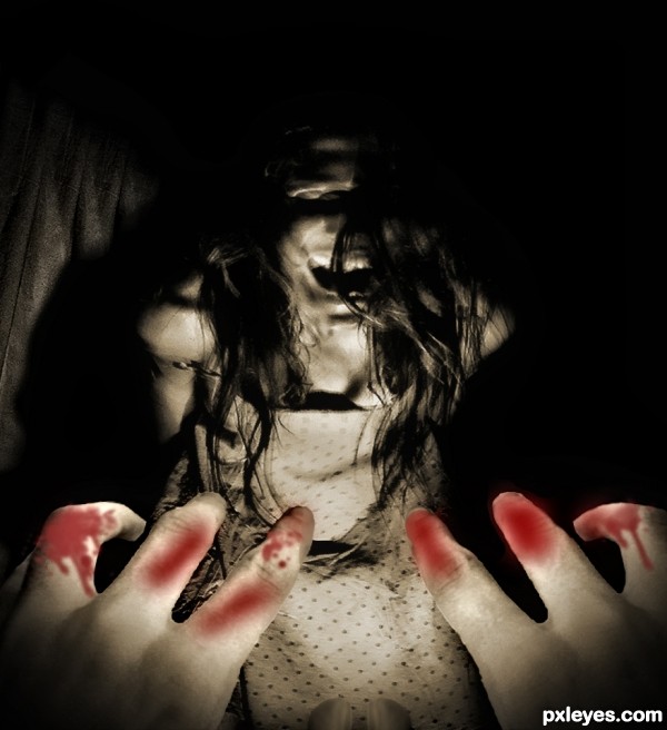
All she ever does is play that piano all the time, non-stop. Every day. All Day. It's driving me insane....Please stop. Please make it stop........
Credit to ~KeReN-R for the blood brushes and jelleprins for the model. (5 years and 3516 days ago)
Very creepy! But blood isn't much convincent... 
agree with erikuri
hands are to bright and blood looks like fake on first sight...But the idea and tittle are very nice,so would be good to make some changes author,because work have a potential...good luck
this scared me.....and in Singapore right now...the hungry ghost festival is on......
Howdie stranger!
If you want to rate this picture or participate in this contest, just:
LOGIN HERE or REGISTER FOR FREE

Make sure to check out high res. No child was harmed in the making of this poster. I have models permission to use this photo that I took myself in this manner. Her mother also is a great support and gave her go ahead as well. It had to be a Stop child abuse poster if I were to use a child in it so I hope this is ok. I used textures that were supplied for a tutorial that taught me some about how to achieve the burned skin look. (5 years and 3562 days ago)
Those things that happen to our children all over the world (violence, pedophilia, child pornography, starvation) must be hardly combatted!
Howdie stranger!
If you want to rate this picture or participate in this contest, just:
LOGIN HERE or REGISTER FOR FREE
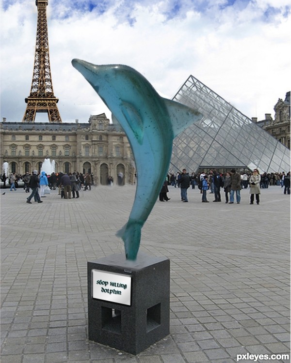
(5 years and 3567 days ago)
Shoot I miss a little Dolphin in my Tuna. Author I like the idea you have. I think it would be better if you spent a little time smoothing and blending the edges of the Dolphin. try using the blur tool small diameter brush.
the eiffel tower seems unnecessary to me but you could keep it if you want :P
yeah dolphins are nice so stop killing them
nice idea
Howdie stranger!
If you want to rate this picture or participate in this contest, just:
LOGIN HERE or REGISTER FOR FREE
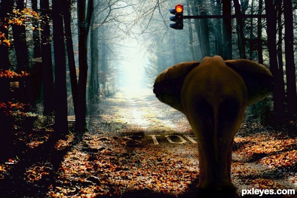
... (5 years and 3623 days ago)
lol.. i love this!!! great job!
Fantastic job! 
very well done and very clever
Very nice and funny . Good luck.
I love it! great job
awesome idea  very well done , great mood !
very nice , my fav for sure 
Fantastic Job, really great idea and done very well. Best one for sure!
Congratulations in advance 
Funny and nice idea! Very well done, author.. gl
Nice Entry.....GL
nice
Congrats for your first place, Ceebeeart!
congrats and well done
Congrats, terrific work 
Congratulations for 1st
Congratulations!
Congrats!
congratulations!! for good work....
Congrats!!!!!!!!!
Congrats!!!! 
Congrats!!! 
Congrats!!
congrats ................ 
thnx for positive comments and votes!!
Howdie stranger!
If you want to rate this picture or participate in this contest, just:
LOGIN HERE or REGISTER FOR FREE
The rope looks like it is around his chin and not the neck. His hair looks a little funny too, maybe try using the clone tool to fill in the missing spot. Oh and a high res would be great...I will hold my vote for now...Best of Luck
something tells me that the lighting fixture would just fall out. He also looks like he could stand up still. How did he get up there anyway? Need to make it a little more convincing.
It absolutly doesn`t make real ! and to be honest i think it`s not a good idea to put this kind of pics even if the message can be usefull.....
Good advice....
why do you put people who were sleeping?
it will be more obvious if the person is in an upright position
While I do see what you are trying to do here, you have to remember that there might be someone who will see this picture who could have lost a family member in that way. Just an observation.
I have to agree with the above comments ... in addition perhaps it is a little bit of the "most obvious use of the source". A bit of a cop out, perhaps? ... IMO
Howdie stranger!
If you want to rate this picture or participate in this contest, just:
LOGIN HERE or REGISTER FOR FREE