
Stop Violence against Women
As you can see, the cut out of the model is not perfect...I wanted it to look like sumone has roughly cut it out with a scissor and pasted it. So, thats all...... (5 years and 3873 days ago)
- 1: Model
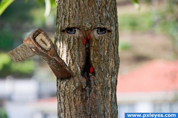
I used two external sources of Axe and Eyes. Removed the text.
Thanks to www.sxc.hu and Authors: Milan6 and Trublueboy
(5 years and 3885 days ago)
lol save the trees nice job
great!!
Hehe, very nice work. Good luck!
Nice idea. As Nator says, I might have pulled out the text too. Also, if you dont fade out the axe blade in the tree but give it a hard edge created by parts of the tree, it will look more that the axe is inside the tree. Good luck!
pretty cool image its very interesting! the eyes just arent getting it for me
thanks for your comments. I removed the text.
Howdie stranger!
If you want to rate this picture or participate in this contest, just:
LOGIN HERE or REGISTER FOR FREE
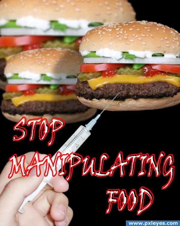
manipulation of food biiiiiggggg
problem (5 years and 3915 days ago)
Nice shadows, good job!
Nice message her, I like what you are trying to say.
thanks for comments
haha
That's one giant burger in the background, there!  Just blur the edge of the shadow a bit...
thanks for comments especialy to CMYK46
good idea, but burgers are in air
one big problem of today's human society ...
good
Its nice to see a positive message getting through in this entry. Altered meat isn't something you wanna be messing with! That said, I think you can do so much more with this topic/piece. Having the three burgers floating in midair just doesn't strike me as all that intriguing (unless they're being injected with helium). The needle is a nice touch, but for this sort of work you need a powerful image to go with your call to action. What you have isn't BAD, I just think it could be better (maybe show the effects of eating "manipulated food" . Nice job, and keep it up!
hopefully don't stop manipulating pictures 
thanks for nice comments, lately i dt have so mutch time but i will do my best
Howdie stranger!
If you want to rate this picture or participate in this contest, just:
LOGIN HERE or REGISTER FOR FREE

Please don't consider this one look in the step by step thank you. (5 years and 3945 days ago)
AHhh! *sigh of relief* I love this one!

 Like the blue the best!
absoulutely different one... Lovely...!! Good Luck.. 
LOVE IT LOVE IT LOVE IT LOVE IT
(favorite part is that you have broken every rule in logo making and it works.. just like Bjork is to music LOL)


soory but i think that logo have to pass messege, and this one only people who know´s pxleyes will know what is about,(my opinion) but i think u did a very good work like BRUNO MUNARY ( italian designer) sad´s " one thing born from one other so very goood tip u gave
cute
just briliant.. 

I LOOOOVE IT! author, you;re a genius!  I think that you should add the link, pxleyes dot com under it, though
  my favourite so far, anyway :x
 ......nice change of pace.....
 ........
LOL thanks my friends!!!!! I thought it was a crap hahah!! Giulia look the sbs the link is visible there 
@Mario: you're right buddy but it's quite hard to design a logo wich tells "we make PS contests, share opinions and bla bla.." I tried to say that we're an eterogeneous group with adults (left) kids (center) and teenagers (right). That's just impossible to be understanded by a casual visitor but...that's my idea 


this is wonderful author, seems like we finally had a winner in this contest, i love the blue the most, i think all of us find PXLeyes familiar and fits more in blue, we won't find any other color comforting before long time passes seeing the different color, besides blue looks so cute, you did very well, no wonder a smiling personality brings out a smiling design
hey i knew it was you  love the characters :-P totally different approach
  although i bend over a more "serious" design for a logo identity...
  but it's a subjective matter... GL
Very cute! It may not be wholly intelligible on a stand-alone basis, but in application with the site name/URL under it (see SBS), it all becomes clear. I think whimsical works well for a site that promotes creativity. A little personality is a good thing.
the logo of the future
very nice!
This is a great logo... It really shows how much fun we have here! Well done! High marks from me. GL
but but but this logo is beatiful
My favorit,different and funny
Same as everyone else, I do really like this, but I am a little worried that its not clear it says pxl
Interesting but it needs something obvious to say what it's about...I can see that it is PXL but it's not obvious...while the characters are fun, I don't think they are logo/brand material.
gl
Thank you very much again!!!! Please take a look at the SBS the final logo will have the url below and it's clear  thanks
while it is interesting and creative, i don't think it is professional enough for a site like this  no offence.
Lol, they look so cute  gj
gj 
very original one of the best
Funny creatures for sure ( I like the blue version the most too), but I'm afraid it wont work as logo. At least not as it is right now, because funny creatures còuld work pretty well (see also all the Olympic games designs). The examples in the SBS are not big enough to have a good idea how it would look like. What I see for now is that the X could do with a bit more X-shape, just as that the mouths from all 3 creatures could be a bit stronger and more visible (be aware that in the small version it wouldnt be as visible as you might think). But well...funny for sure  . Good luck!
Nice n cute...nt sure would work for a Logo...but Cute... Good Luck!!
Sorry folks but where's written that the logo has to be readable text?? The title says it: STOP BORING TEXT  And how can you say this is a serious website LOL we make Photoshop contest we don't do business or sth
 @ Waz yeah the sbs is not in the right size but then it works fine when it's at 100% and with the url below the logo
This is GREAT!!

cute and clever !!! 
COOOOLLLL!!!! i love it!! briliant!! great job author!! 
ahaha, very nice ))) cheery
Greaat!
Congrats G-Man!Way to go!
congrats
Sorry, doesn't work for me...
Congrats! With your "Please don't consider this one" 
looks good- makes sense!
YEAHHHHHHHHHHHHHHHHHHHHHHHHHHHHHHHHHH.. I was right.. it was all me.. JUST KIDDING.. I was hoping.. YIPPPPEEEEEE
Congratulations, see? nothing brings bad luck but bad work
Good job, congrats 
congratulations G-man, great, fun design
Congrats Giallo, well done 
congrats 
Congrats for the win. But I am not convinced, as a logo it's not conveying anything. This may be suitable for a toy company or for child products. This is my view, it may not be correct.
hey giallo U cutie u won WOW  Congrats
Congrats!!!!!
CONGRAAATS!!!!!
Congrats! 
we got a great logo! yay! congrats
Way to go you done good!
Congrats, Giallo!!! Benissimo!
I'm so happy you won! Don't listen to the haters... Great job! Congratulations!
I'm late due to my entries and have not cheque this contest. Anyway Congrats, great logo design, 
Congrats ! GREAT work !! 


Thank you very much for choosing my logo  I'm really happy to made a logo wich fits with most of you
This one is your legacy to pxleyes.com  .
.
a legacy like that is forever..after 2 years looking at this work reminds me a lot the old nice times 
woot!! go get em Bubba "G"
Howdie stranger!
If you want to rate this picture or participate in this contest, just:
LOGIN HERE or REGISTER FOR FREE
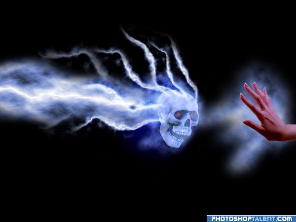
stop the power (5 years and 3951 days ago)
just the skull???????? good luck and welcome back!
hehehehe.. very CHARMED ONES... the fingers are wonderful
Nice - did you use any textures or similar for the trails off the skull? If so you need to list them or at the least you will probably be asked to show a SBS if you made them.. GL
I like the special effect, good luck.
Nice 
tutorial later
Nice.
id like to see the back of the skull a little more blured....GL
Spooky
very cool idea and well done good luck!
Nice idea  Good luck!
Interesting...
Very good job.....
Hault there skull! electric flamming skull! GL
nice 
nice effect
oooh I likey, would be nice to see like a shield barrier stopping the skull but nice never the less 
gl
nice concept. i don't know what could stop that evil skull
good work and good luck
very eyecatching entry  goodluck.
Howdie stranger!
If you want to rate this picture or participate in this contest, just:
LOGIN HERE or REGISTER FOR FREE
Good message, well presented. Good luck.
i think you should have the word "stop" somewhere on the image itself, not only the title. say that this turns into a billboard, it would be unclear what the poster demands (putting context aside, of course )
)
Actions speak louder than words....I mean just look at the hands of the model and you will see a stop sign.....Thats why I didn't give any text saying STOP.........
I agree with Elficho: STOP could have been placed behind the hands...most people these daze are too stupid to comprehend subtlety.
Poignant message! I like the subtlety. Not sure how the 'equal rights' part plays in here...but I like that you don't pander to 'those who might not get it'. Good job!
Congrats for your third place!
Congratulations for 3rd
Congrats!
Thank you...very much. This wouldn't have been possible without you peoples votes. So, all the people who have voted for me... Thanks a lotttttt...
Howdie stranger!
If you want to rate this picture or participate in this contest, just:
LOGIN HERE or REGISTER FOR FREE