(5 years and 2709 days ago)
- 1: thnks polo2

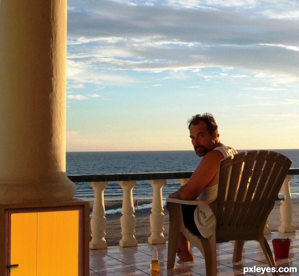
Opened personal photo, cropped and saved as new image. Opened new, opened pxleyes source and selected and cut out door. Pasted door in image Scale, Skew, and Inside glow to create inset look. Selected handle and created new layer from selection. Used Stamp tool to remove old handle and shadow, skewed handle added drop shadow. Burned door layer slightly. (5 years and 3465 days ago)
very clever entry.. (take a BIT of saturation out of the door and it will improve the realism(some burn too.. if you got time)).. I really love the simplicity and the beer bottle throws it over the top... GOOD LUCK
hey thats pretty neat, but the with the thought of a load bearing structure sitting on something hollow i would't be so relaxed....Good Luck 
Drivenslush,nah, they use super brilliant paint down there 
migue1ito, no worries, thats a titanium box... that or too many cervezas. lol
Thanks for the well wishing!
Howdie stranger!
If you want to rate this picture or participate in this contest, just:
LOGIN HERE or REGISTER FOR FREE
Nicely done. It's usually better to include a hi res version as well. GL author.
thanks
I'd like to see a high res and a basic step by step would also help you receive any informed critique based on your own processes.

However I have a few suggestions:
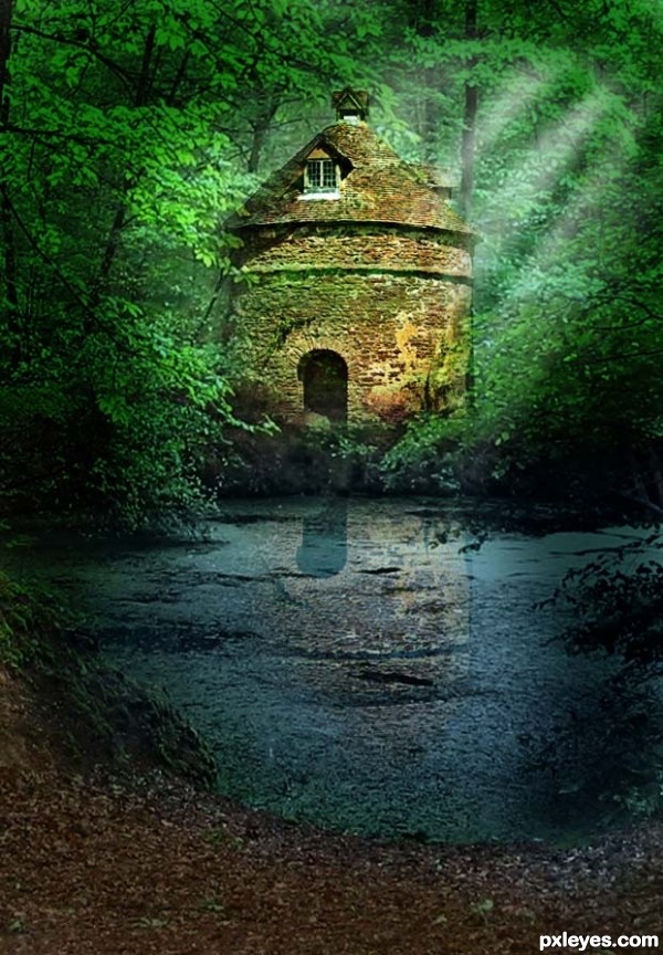
I would be inclined to extend the streaks of light out of the image (at the moment they look to be cut off)
Drop the reflection of the storage hut down a nudge or two and mask off where the bushes are in the reflection, to me it seems as though the storage hut is to noticeable in the reflection where it is meant to be hidden behind the bushes.... the water line area of the reflection would be darker, judging by your overall lighting.
lastly it could benefit from a foreground element to frame and lead the eye into your scene.....
GL Author
wow..
that's why i must learn more
thnks
I think some birds flying out of the top right side of hut would finish it off nicely
hmm..
u r right!
why i not think about that -__-
thnks..
Good work with your entry. I think I agree with oziipop that another point of focus would have enhanced your scene. I'm wondering too about the angle / perspective of the reflection but think you've done a very nice job. Good Luck.
thnks so much
congrats!
thanks
Good job on third
Howdie stranger!
If you want to rate this picture or participate in this contest, just:
LOGIN HERE or REGISTER FOR FREE