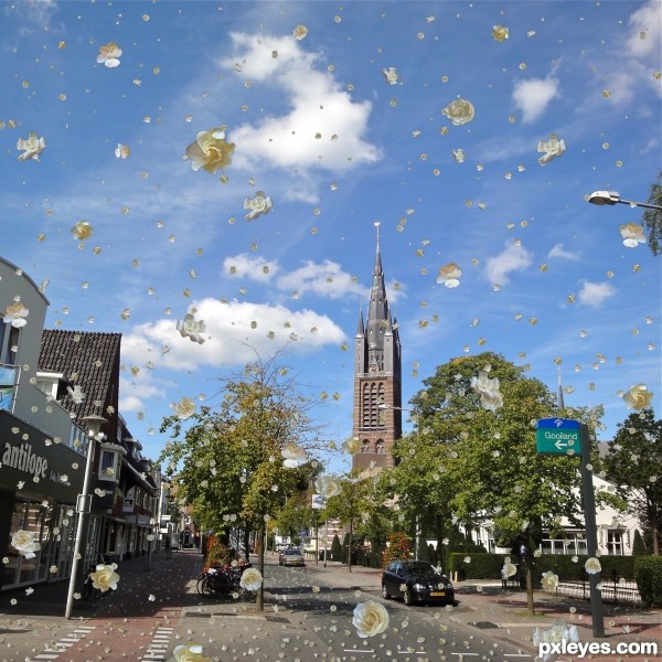
all flowers are my own , from painter 9
No dark clouds just bright white Gardenias falling
sized and multiplied in layers (5 years and 3197 days ago)
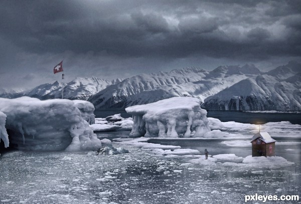
Guys, anything that has to be corrected can not be!
Unfortunately I did not save the PSD and you can not imagine how I am so furious.
Because of this, SBS can not be done.
So I improvised SBS, but will not say much, just where I put each element.
Sorry, I am very upset for having sh@#! (5 years and 3255 days ago)
nice image... realistic and good use of source.. well done author. 
Thank you Scratz .
I'm not particularly happy with the result, I was many hours in front of the computer and over time I was discouraged.
And I am angry for having lost all psd ...

Moderation, all links are working!
Someone else is having trouble viewing??
Thanks!
Looks fine here. NICE image, shame you lost your .psd... Good work!
Thanks for the comment!
I'm already resigned!
Interesting pic but the hut on the ice floe is kinda dumb...
There is a slight problem with the link for Ice 1, probably at PhotoXpress which may not show the image even to members. If anyone has a problem seeing the source image use this link http://www.photoxpress.com/search-stock-photos?q=stock-photos%2Fsea%2Fsky%2Fhorizon%2F332368&searchbtn=search&orientation=all&per_page=25&content_type_id=all&category=all
There's no problem with any of these sources all are fine to use.
cool chop!
wonder how to get back to hut once ice melts.... 
Thank you guys!!!
Thanks, mods!!
Well, who was the idiot who build a house right in that block of ice??
Hahahahahaha....

wonderful work author instant fav
good luck
nice work gl author
Thank you, guys!! \o/
Gosh, this is terrific, great job! 
on second thought, if I am using the hut and the ice melts.... down goes the hut and ..... yours truly ... haha.....
CONGRATS!
Thank you Driven!!!
Thank you guys!!
Congrats, very well done 
Congrats author.. 
Nice Job Congrats
Howdie stranger!
If you want to rate this picture or participate in this contest, just:
LOGIN HERE or REGISTER FOR FREE
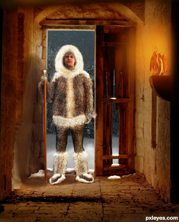
Thanks to these photographers for their work:
truebadour for "The Other Side" (setting)
jasonlemay for "Snowstorm"
and syccas-stock for the warrior (three poses)
(5 years and 3283 days ago)
You know that if instead of that guy you put a chick ( and it should be fairly easy to do so: change face, a bit of warp, a bit of liquify), no one will observe that the fire is unrealistic 
If you then wanna fix the fire, you could try to find a lantern ( like this one : http://www.sxc.hu/photo/500803), and place the fire made out of BG's source in it: it would look more natural, imo.
You have a nice idea and mood here, by the way. 
Love the Puppet Warp work.. excellent job!! good luck
Very funny !
LOL, yes, very funny, greymval!
I could easily have found and used a real fire, but that would defeat my intent to use the source. : )
Thank you, all!
alot of work author.... well done, turned out great 
Great work and nice SBS!
Very nice work, great mood. 
Howdie stranger!
If you want to rate this picture or participate in this contest, just:
LOGIN HERE or REGISTER FOR FREE
(5 years and 3293 days ago)
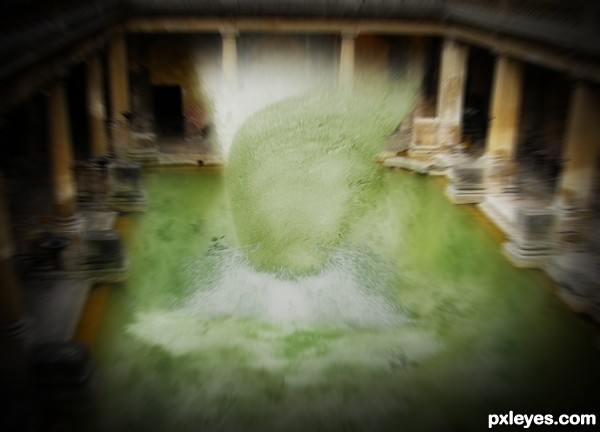
Great splash effect.
thanx a lot.... :P
I'm not sure why the splash is set vertically rather than horizontally (like the original wave), and why the background - the solid building - would have the radial blur effect applied. Water yes, but the pillars and rest of the building, I don't think so.
What i tried to create was a cyclone o something that had a lot of force surrounded around it..... the wave is kinda curved so rotating it kinda made it look like a cyclone... as stated before i wanted to show somethin that had a lotta force thats y the radial blur... somewat like in the movies :P o NFS where when nitro is applied the whole environment seems blured... d same way....... n e ways thanx for the comment guess i didnt potray wat i had in mind the right way......
first impression: "What the ?!"
nice impact on me 
Howdie stranger!
If you want to rate this picture or participate in this contest, just:
LOGIN HERE or REGISTER FOR FREE
(5 years and 3299 days ago)
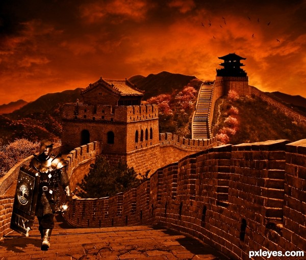
The sun in the sky background does not match the lighting on the wall and the warrior, but a good blend of images.
You should try to add some higher shadows at the walls since the light is intense from right.
like the atmosphere 
I really like this one!!!
Good luck
Congrats!
Thank you for voting on my contest entry 
Howdie stranger!
If you want to rate this picture or participate in this contest, just:
LOGIN HERE or REGISTER FOR FREE
Nice image. Would be better if you had rotated the flowers so they weren't all at the same angle.
really nice, but i have two problems
i think there are a bit too much flowers, you can't see the picture.
and the fact that all the flowers face forward makes it seem a bit unnatural.
maybe you should find some flowers facing other direction and add them as well.
good luck!
You can also use Skew, Warp, and Liquify to vary the blossoms a bit.
The ones in the distance are all too uniform in size, and just look like dots.
Thanks guys , I knew the faults when I made this ,but wow it takes a lot of time to adjust sooooo many flowers. Plus this was just an experiment as I have never tried this before. May try to improve it if I can get the time.
Yeah too much flowers..Any way good work..
Cool concept, but I have to agree about the flowers. Good use of the varying sizes though.
new one is much better because you lowered the amount of the flowers,
though it still bothers me that they are all facing the same direction.
nice image.. love the usage of flowers,,, like that you made some changes.. looks better
Howdie stranger!
If you want to rate this picture or participate in this contest, just:
LOGIN HERE or REGISTER FOR FREE