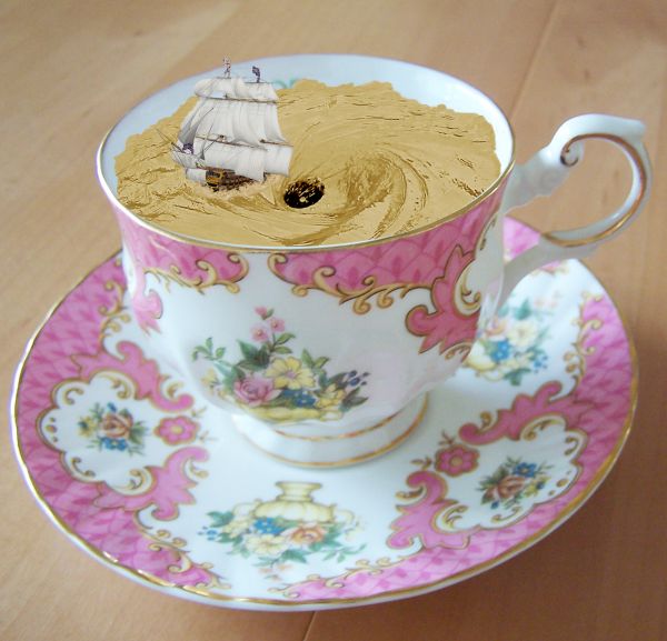
Thanks to arrsistablestock, angelmoon17 and obliteratedstock of deviantart.com for the use of their images. (5 years and 3680 days ago)
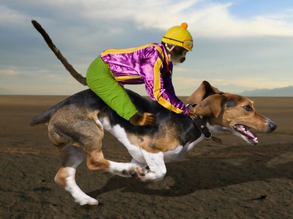
I would like to thank liesie , mcveja and night_fate for the use of thier images.
http://www.sxc.hu/photo/1159561
http://www.sxc.hu/photo/1082371
http://www.flickr.com/photos/mcveja/2909242917/
(5 years and 3681 days ago)

nice
great blend
Howdie stranger!
If you want to rate this picture or participate in this contest, just:
LOGIN HERE or REGISTER FOR FREE
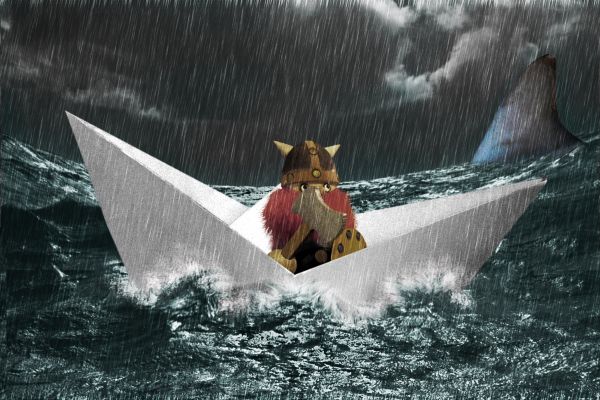
Thanks to krayker, kodakgold & emrld_cicada for the lovely stock images
Inspiration: http://psd.tutsplus.com/tutorials/photo-effects-tutorials/how-to-create-glass-transparency-in-a-cute-photo-manipulation/ (5 years and 3685 days ago)
Nice job...gotta love the Viking! 

Thx cmyk, was gone for a few weeks,.... no inspiration 

the color/bw contrast is very interesting, nice chop. how'd you do the splashes? 
Pearlie, it's simple... i just used the spatter brush with a low opacity with white and a little bit of imagination and voila.... splashes. I first used liquify to change the waves and the used the spatter brush to create the spashes 
Very nice work...i am curious about the splashes too...good luck
Looks like i'll have to make a tutorial for the splashes 
Teach us how to do those cool splashes, pleeeeeeeeeeeeeease... 

Very nice work...
splashes tut coming soon 
Very cute good luck author
lol... brill ... WELL DONE !!
Very wonderful image author.. good luck!!
I can relate with the no inspiration. Glad to see you got some. GL!
looks good.
Good job, congrats
Congrats for your first place, Clinge!
Congrats, awesome work 
Congrats!
Congratulations!!! 
Congrats! for 1st place
Thx all  for the very nice comments
Congrats, very nice work!
congrats
congrats...
[url=http://www.inikesneakers.com/wholesale/Gucci-Shoes-640_p1.html/]Wholesale Gucci Shoes[/url] [url=http://www.inikesneakers.com/wholesale/Jordans-Shoes-62_p1.htmll/]Air Jordans Shoes[/url] [url=http://www.inikesneakers.com/wholesale/Louis-Vuitton-361_p1.html/]Cheap Louis Vuitton Shoes[/url]
yes yes yes yes.. but those sexy shoes.. hehehehe.. congrats by the way.. hehehe
Howdie stranger!
If you want to rate this picture or participate in this contest, just:
LOGIN HERE or REGISTER FOR FREE
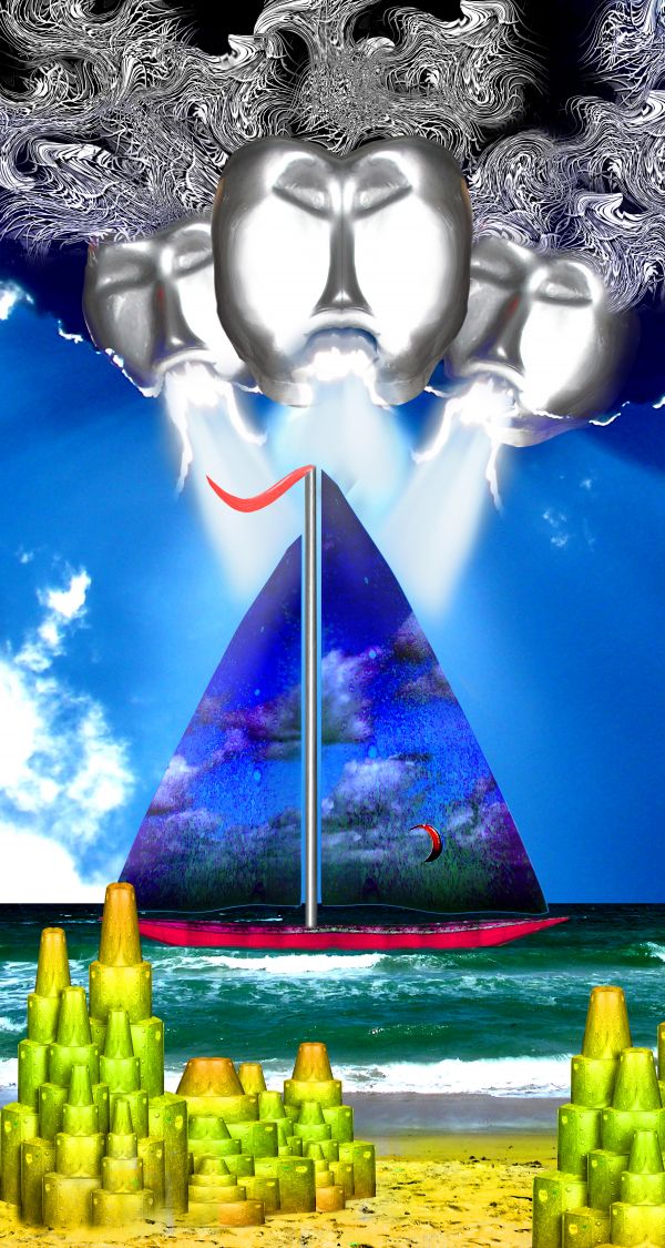
source and my pictures (5 years and 3717 days ago)
Cool compisition 
Nice idea!
Howdie stranger!
If you want to rate this picture or participate in this contest, just:
LOGIN HERE or REGISTER FOR FREE
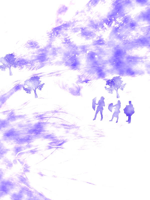
(5 years and 3731 days ago)
I really really really like this, probably one of your best pieces .. so simple yet pretty and the purple was a really good choice.. the only thing is why do they have Umbrellas in a snow storm???? GL!!!!
That is so different...nice thinking  GL
GL
There is no sign of the source in your image...
Well try....
Howdie stranger!
If you want to rate this picture or participate in this contest, just:
LOGIN HERE or REGISTER FOR FREE
nice idea -- the edges of the water (tea) are too smooth the waves and ripples should disrupt the edge -- the colour of the tea seem a bit off (Maybe because it don't take cream) IMHO it would be a better effect if the colour was more tea like
great
Nice agree with alan about the color, it could use some contrast. Cool so far good luck author.
Thanks for your comments and tips guys. Much appreciated. Hope this looks better.
edges are good improvement colour of the tea is still a bit odd. I found playing with this image that using comibination of Curves & Hue and saturation layer set to a hard light mode I was able to get a more tea like appearnce to the water
Or change it into a hot chocolate cup!
Well, thanks again Alan. I really appreciate you taking the time and effort to help me out on this one. I played around with the light modes and this is about as close as I can get it. I think it looks more like the correct colour now.
P.s lol at erikuri. That would have probably been easier
Unique idea! GL!
Howdie stranger!
If you want to rate this picture or participate in this contest, just:
LOGIN HERE or REGISTER FOR FREE