remove mods please!! (5 years and 3647 days ago)

(5 years and 3662 days ago)
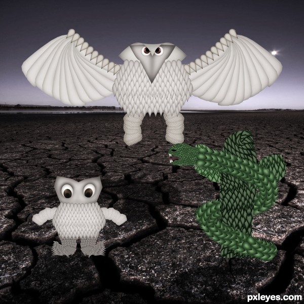
Nice effort! Maybe a brownish color (not so dark) for the snake to make it pop up from the cactus... 
cool...

creative!
Howdie stranger!
If you want to rate this picture or participate in this contest, just:
LOGIN HERE or REGISTER FOR FREE

Thanks to Fantasystock and NightFateStock from DeviantArt
The rest is from SXC
Thanks to Garwee (5 years and 3662 days ago)
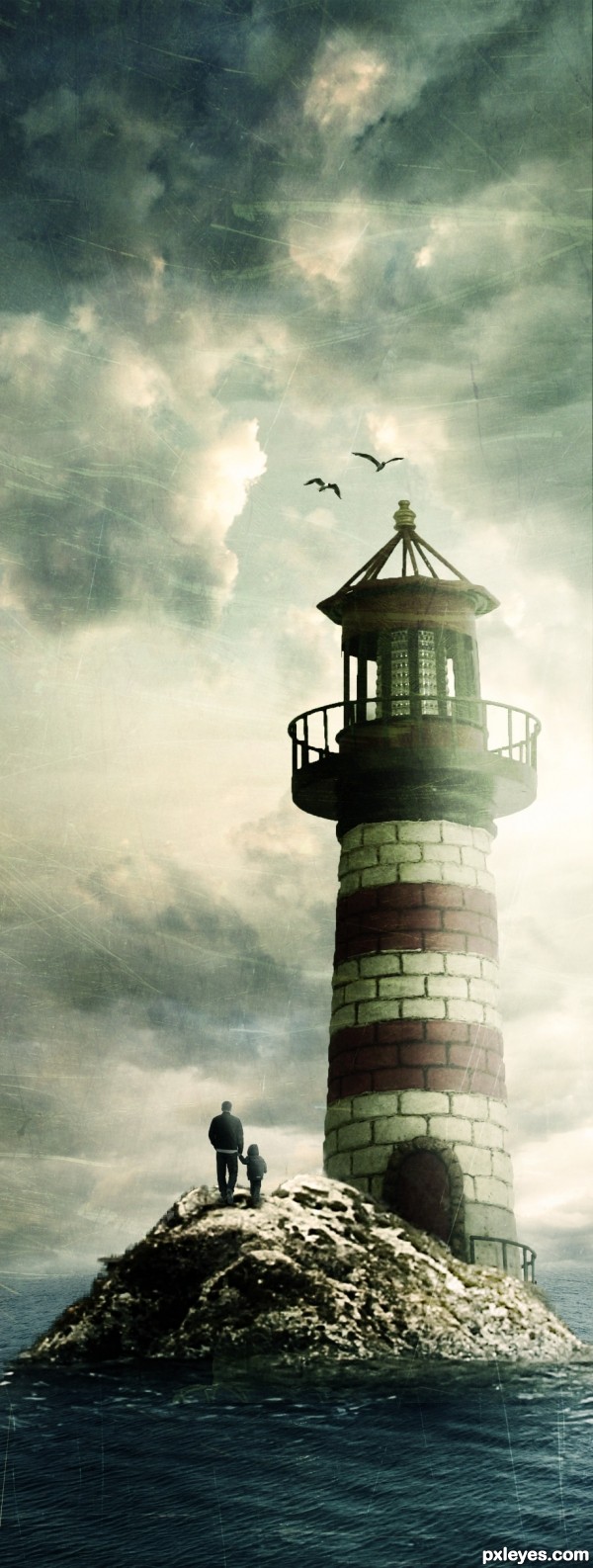
This is very good. I like the use of textures  , Just a suggestion: Erase the part of texture which is on the sea, your image will look much better if the texture is present only in the sky. GL !
EDIT : Considering elficho's comment, I would say that its up to you to decide 
i disagree. it gives a nice grungy feel to the whole image.
Keep the texture through out, looks like an old picture, well done.
I really like this work. Since the texture and final antique coloring are so important to your image, it might be good to add how you achieved them to your SBS. GL
Great looking image, bit light on the how much of the source you used IMO. good outcome from all the images G/L
I like this a lot it’s a superb idea and the textures really do make the image but and theres always a but.......
What you have at the moment ( texture wise) is a little to overwhelming maybe try a texture with less marks.Or flip the one you have no harm in trying
Thank you for your comments everyone.. Lamantine, i very rarely work with textures, and i only use them to blend images together to help match colours. If i only applied it to the sky it would defeat the point of having it in the first place.
Ironcow, in my eyes the source is there to be used however the author wants, the idea came when i zoomed into the high res picture and saw the shape of the source.
Warlock, thanks for the comment, i lowered the opacity on the texture layer (it's the best i could do short of replacing the texture altogether)
I got ya. Fits the image well and looks dead sexy. Was just my opinion  I hate using outside images myself but think I might mess around mixing some up
  . G/L author
Better than this it's impossible! Except if it's another work of yours, of course... 
I agree with erikuri, well done author 
this is a beautiful picture. Just try to sharpen more the rocks. GL!
Nice chop good luck too you
Thanks to everyone!
Siderismaris, i sharpened the rocks 
Love it  good luck
man, this pic is awesome!
Amazing image and very cleverly used texture 
Howdie stranger!
If you want to rate this picture or participate in this contest, just:
LOGIN HERE or REGISTER FOR FREE

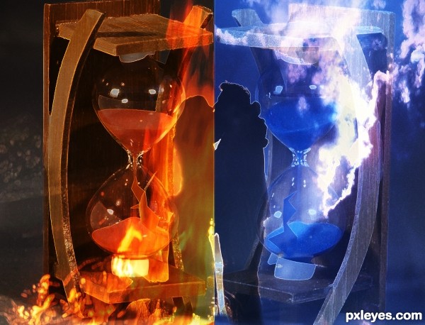
Once upon a time there were two people - called "Fire" and "Air". They met online but were seperated by time and space - after a journey of a 1000 miles they got married.... true story (5 years and 3699 days ago)
very eyecatching at first, however it took me a few minutes to notice it was a silouette of 2 people. i think maybe having a better transition as a divider in the middle would help that instead of a hard line - overall, i like the idea
Thanks for the comment. In a way I agree with you, I also thought to make the transition between blue and red more subtle, but then deliberately chose for the hard line to symbolize space and time and the hard divide between the two totally different worlds the two people were a part of. This was a bit of a personal work inspired by the compitition 
Beautiful story... 
Very touching story! I hope the two live happily ever after!
I agree with maple, I think the hard line works well but maybe if you kept the colors with the people as they reach across to the other side. His arms blue and her arms blue. I think it would look really nice and make them stand out more.
Good work and good luck.
good luck
This sucks I personally think this entry deserved a much better score, it was waaay better than my entry!
Howdie stranger!
If you want to rate this picture or participate in this contest, just:
LOGIN HERE or REGISTER FOR FREE

Only Source
(5 years and 3749 days ago)
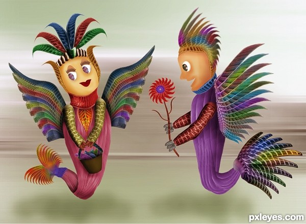
very cute (is she carrying a bucket of fish?!?!?!?!).. good luck author very pretty image
Cuuuuuteeeeeeeeee! 
Drivenslush she is carrying a bucket of fish 
amazing ..gl
Very sweet compostion 
I'm thinking about peacocks, very colorful feathers 
They are so cute...good luck author
nice
Sweet.
amazing XD
Oh How cute is this. Great work and good luck
very cute Author good job 
Howdie stranger!
If you want to rate this picture or participate in this contest, just:
LOGIN HERE or REGISTER FOR FREE
Author, I'm sure that's the original one http://www.pxleyes.com/photoshop-picture/4ac3dab67d5ba/Another-love-story.html, you should mention which work inspired you, but anyhow the similarity is too high...
Good eye, Langstrum!
It's clear that you copied mqtrf's entry, even the title is incredibly similar. It's fine to use another image as inspiration, but at least credit the original author and don't pretend that you didn't know.
Still, it's a good image. You used the source well.
HAHAH! so basically the same source, same idea, same creatures and poses, same title, you used the same parts of the sources (ropes) to create wings and eyes as mqtrf.. you even have similar sbs guides! they have the SAME eyes!! and you're telling us you haven't seen it. come on now author.
i thought this looked familiar...
anyway, i think the image lacks color and energy.. just check the original and see what you can do
This is a lovely gradient, author!
I agree, saw it when first uploaded. tch-tch-tch
Author, author... Unfortunatelly I didn't see the first entry, so I can't comment, but if everybody is saying... I'd just like to give you an advice: I see your work being improved more and more; so, don't throw away everything you conquered 'til now for things you know you can't do.
I like the effect behind the text xD
No one ever copies my entrys lol
lol
Howdie stranger!
If you want to rate this picture or participate in this contest, just:
LOGIN HERE or REGISTER FOR FREE