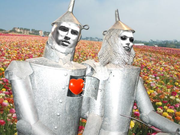
Finally Tin Man got his heart to give it to his Valentine... (5 years and 3715 days ago)
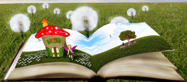
The mushroom house, the grass in front and the fairy are all made out of the cardboard box source.
A special thankyou to :
Nite Fate @ SXC.hu for the background photo.
Sbmdestock@Deviantart for the book photo.
Have edited image a little bit.. thanks to James tips :)
Hopefully now the flaps that push out the pop ups are a bit more noticable in the brown. I also slightly tilted the pop up peices, and tried to give the muchroom house some more depth :)
Thanks for the help James, its much appreciated mate. (5 years and 3739 days ago)
good work.. have to work on blending of colors
what do you mean? it is exactly how I wanted it.... can you be more specific on where I need to blend things???
The only thing I would say is that if something pops up from anywhere other than the middle... that isn't directly attached or a part of the middle element... it usually uses some other form of mechanism that makes it pop up... so technically your book wouldn't work... but i suppose you could have the mechanism somewhere the viewer cant see it  - I do like it visually though! GL
i put those flappy things behind them lol... i thought that is what pop'd em up rofl... im not going to bed for atleast an hour so I will see what I can do, i think i know what you mean ;p
Howdie stranger!
If you want to rate this picture or participate in this contest, just:
LOGIN HERE or REGISTER FOR FREE
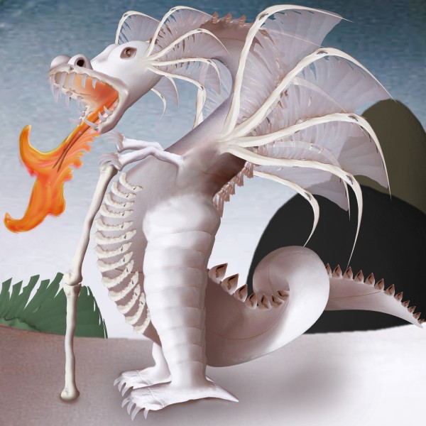
used only source add blue transparant gradient for sky
and photo philter {warm} in the end (5 years and 3782 days ago)
It's very good, but has a lot more potential, perhaps experiment with dodging and burning to create depth
looks cool
Interesting...not sure why it would need a cane...where's the other arm?
Edit: Yep, looks better with 2 arms. 
Neet!
cool
Amazing! Love the wings 
yep i agree, wings are very well done.
nice entry 
Howdie stranger!
If you want to rate this picture or participate in this contest, just:
LOGIN HERE or REGISTER FOR FREE
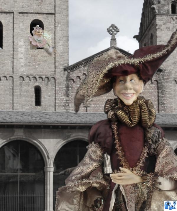
An old time time story of forbidden love or a love serenade? (5 years and 3800 days ago)
Nice idea,but it looks like he's running from her.....;D
Good Luck to you!
i agree with nator, you should add color,gl
nice image. i like you choice of stock photo
agrees with saturation comments but you probably ran out of time.
very nice 
nice concept but its looking very pale
Howdie stranger!
If you want to rate this picture or participate in this contest, just:
LOGIN HERE or REGISTER FOR FREE
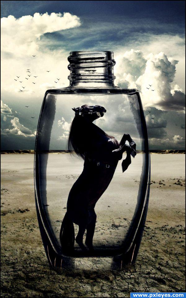
Who doesn't like a story with a happy end? Most of the time we get disappointed or sad if a story ends in a bad way...
Thanks to:
- http://littlenake.deviantart.com
- http://night-fate-stock.deviantart.com
- http://darkresources.deviantart.com (5 years and 3828 days ago)
Love it, everithink looks good, gl
Nice one, but what's the story, why is it an end and not a beginning. Maybe the landscape that we can see through the bottle should be distorted somehow, maybe a spherize.
Err we normally don't like sad endings... it makes us sad as well so giving a sad end to a story fits on this contest.
Nice blend...and cool final result!
I don't get it, but the bottom of the bottle needs an edge...
The bottom of the bottle is a little underground... it's covered with sand.
Great but to look more sucessed word you need to fix the blur in the end of bottle.
I like the image, and i like your choice of sources, but i don;t see how it fits with the theme, but then again i don;t really understand it :p Good luck, and high marks from me.
I added a more solid edge to the bottle's bottom... Anyway i already explained my idea -.- in this contest we have to take the joy of something we like to create a feeling of disappintment in relation to something, so my work represents a sad ending of a story.. what story? well it doesn't matter, what matters here is that the horse is trapped in a bottle in a desert, there's no escape from death.
Actually I prefer a story with an effed up ending (i.e. "Seven, Knowing, etc.) but mainly because those ending are NOT expected. Personally I think if you have to explain it, then it makes it hard to fit the theme. A good entry is an obvious entry.
Beautiful image  Poor horsie, don't want to be on its place...
beautiful image.. surreal in a way.  SO sad to have something so beautiful captured.
WOOOW!!
Congrats for your second place, Akassa
congrats
Congrat Akassa... 
Congrats!!!!
Congrats, Akassa 
Congrats on your win
congrats !! What a lovely entry!!
Howdie stranger!
If you want to rate this picture or participate in this contest, just:
LOGIN HERE or REGISTER FOR FREE
good idea!
Very cool ...
fantastic
Thanks!!!
Really nice choices for the faces!
wauwww!
Beautiful....nice work....
Thank you everybody! GL for all... and for me, of course! ;D
Congrats for your second place, Erikuri!
Congrats!!
Howdie stranger!
If you want to rate this picture or participate in this contest, just:
LOGIN HERE or REGISTER FOR FREE