(5 years and 3068 days ago)

check out high res too... :) (5 years and 3492 days ago)
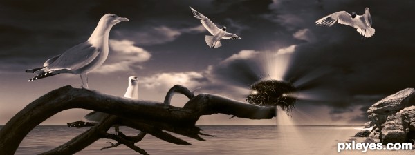
Beautiful... If it wasn't a seagull, I'd say it was the Holy Spirit. 
Nice concept, for some reason the nest seems to be off perspective to me, the first thought i got was that i was really far away, then i noticed it was on the branch, maybe you should remove from of the intense light placed on the bottom part.
awesome entry!
I really like this but I have to agree with akassa the composition makes it look as if the branch is heading miles out to sea (unless thats the intention), maybe a little blur could be used on the parts of the image in the distance to bring the nest back.
thanks for the comments guys...
I have to disagree with the perspective issue. I think it depends on how you're looking at it... but I have made changes to the light on the bottom of the nest, and fixed a few issues with the actual nest re the placing i.e. the bottom left corner... was infront when it needed to be behind the branch...
as always your comments are much appreciated
very nice...
great job, love the color and the mood 
very... very nice job. I realy like it ;D The color balance is perfect and it looks so mythical. Congrats!
Your light sources are all over the place. The bird is lit from the left, there is a sun  on the right behind the rocks, the clouds are lit from above right, and the light rays coming from the nest aren't illuminating anything...Good concept, CLEAN lines, but you need to consolidate the lighting and make it consistent.
MossyB: I think you are getting your left to right mixed up... the rocks are lit from the left hand side with the shadows on the right hand side exiting the frame... the sun is highlighting the central part of the clouds, highlighting the left rim ... assuming the sun is slightly off to the left also... so the lighting direction with regards to the rocks is fine...
so based on the sun being on the high left it's safe to assume that there would be a light source illuminating the birds on the left... if you look at SBS I added light to the face side of the gull as light from the nest... the rocks needed no adjustment as the light from the nest is also on the right... and as for the nest not illuminating anything... its illuminating the branch the gull and the two gulls hovering above... please refer to the sbs guide... step 6 explains the gulls 
Thanks for your comment 
Howdie stranger!
If you want to rate this picture or participate in this contest, just:
LOGIN HERE or REGISTER FOR FREE

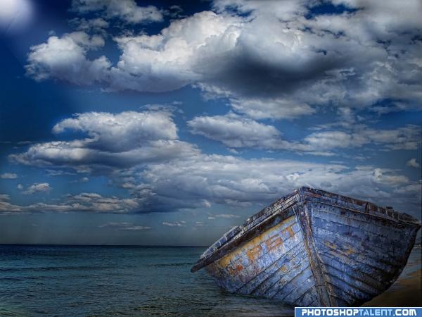
a picture of the unfortunate happening with dear PST! (5 years and 3965 days ago)
nice mood
what??? you know, where is this boat???!!! 
LOL.. great job.
PST!! 
interesting idea good luck!
Can you be stranded WITH permission? 
lol @ cmyk nice blending of the boat in the water, goodluck 
Nice clouds 
good work, but why text "PST" there?
Thank you for your votes everyone!PST because I thought I express the current state of site 
funtastic,i like this arrengment,gl
very nice
nice mood!
Good job.
I like the colors, for some reason the -I guess- bevel/emboss for the text looks a bit off with the rest. What if you'd use these letters but then more painted and that the paint is coming off? Good luck!
Love the blue!!! Very Nice Job and Best of Luck 
Maybe not the most original idea of placing the boat in water, but you've done it so very well. And I love the colors of the boat.
Hi I'm interested in getting this imagne the high resolution
Howdie stranger!
If you want to rate this picture or participate in this contest, just:
LOGIN HERE or REGISTER FOR FREE

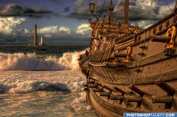
Two pictures made by me combined with the ocean and sky. (5 years and 3966 days ago)
WOW. just throw that big ole ship at me and scare me half to death... LOL.. it's a beautiful image..(Modified, didn't see title LOL) I just love the feel and brightness of it.. good luck
very cool!
nice mood
great image
great mood!
awesome =]
Very Nice...... Good job Author.
Beautiful work!!  Suggestions: Looking at the high res, I notice that the main cut out of the ship seems rather harsh. You might try a very slight blur on all the edges to take away from this harshness. In contrast, where the ship meets the water at the lower, center point of the image, I think that it could benefit from a harsher cut as the ship just kind of fades into the water. These are very minute things, though. Fantastic job and good luck!!
Cool  Good Luck
Very Creative use of the source image  Good Luck
fine
good work
Great!
I like this, very good.
very good  I loveeeeeee that ship
The boat image has alot of holes in the riging. The lighthouse is cool and krisp.
beautiful
Pretty cool boat! Image is nice too. I might have given the lighthouse some blur since it pretty far away and the area around the horizon is also a bit more blurry. Apart from that, give a bit more waves around the boat's front. There is already one splash there and that fits great, but behind that splash the boat fades a bit away in the water. With another wave you could hide that. Good luck!
Thanks Waz , i have changed it a bit.
Congratulations for 3rd
Congrats!
Congrats! Way to go! Great entry!
Congratulations.
Congrats!
Howdie stranger!
If you want to rate this picture or participate in this contest, just:
LOGIN HERE or REGISTER FOR FREE
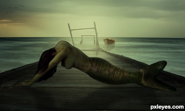
verry pretty
Foreground too dark, figure needs a shadow.
thx for the comment, lightened up the foreground and added some shadow hope it looks better now
Beautiful work!!
Howdie stranger!
If you want to rate this picture or participate in this contest, just:
LOGIN HERE or REGISTER FOR FREE