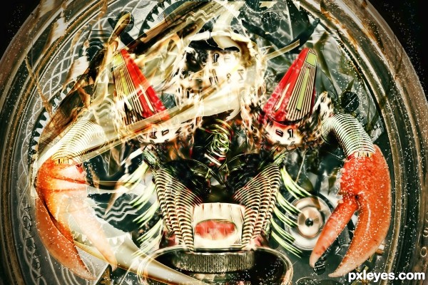
i will update sbs soon
(5 years and 3477 days ago)
- 1: JoLin
- 2: itsallgood
- 3: Eric MATVEEFF
- 4: c

i will update sbs soon
(5 years and 3477 days ago)
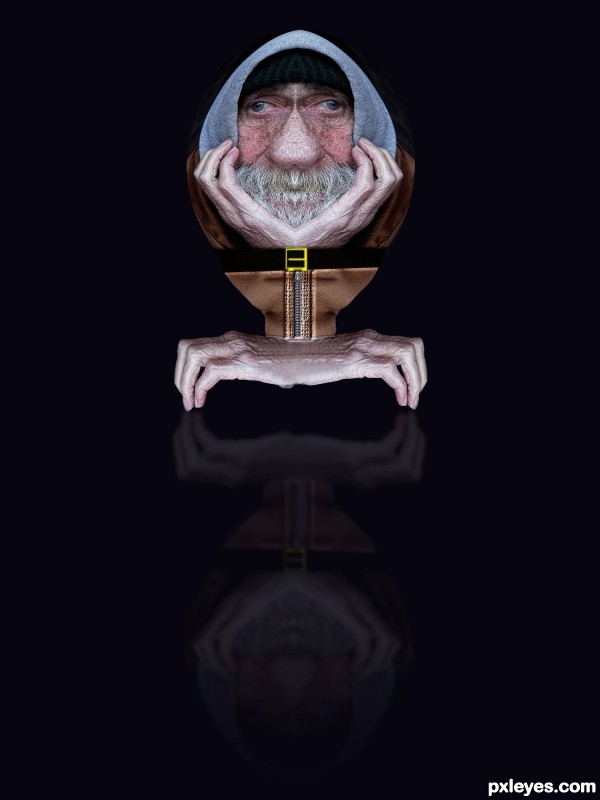
(5 years and 3509 days ago)
very creative, nice idea 
Thank You
Howdie stranger!
If you want to rate this picture or participate in this contest, just:
LOGIN HERE or REGISTER FOR FREE
(5 years and 3526 days ago)
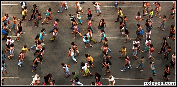
I think it's an anticipation of cloning !
Well blended.
Thanks erikuri.
i think u did a tough job........ nice one ........ 
very nice...gl
nice and cool
Thanks for your nice comments  )
)
GL
Howdie stranger!
If you want to rate this picture or participate in this contest, just:
LOGIN HERE or REGISTER FOR FREE
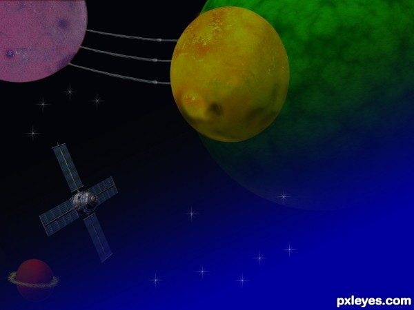
Just used the clone source tool and the distort filter to create the planets. Gave finishing touches with brushes. The yellow ring was done completely with brushes again. Finally added some stars. hope i've done some good work. (5 years and 3536 days ago)
The yellow planet is distorted (oval, not round). When you resize an image, do it pressing shift key, so it small/big without distortion. 
nice idea author...gl
i like it!
hard to see the given source
Howdie stranger!
If you want to rate this picture or participate in this contest, just:
LOGIN HERE or REGISTER FOR FREE
VM Toolbox and VM Natural plug in used Links in source boxes. (5 years and 3544 days ago)
ahahahahahaaha yes, very strange place to land
Links need to lead to individual sources.
CMYK46 It's tells you the name for download on that page it's a plug in. under Visman VM Plug in's
Howdie stranger!
If you want to rate this picture or participate in this contest, just:
LOGIN HERE or REGISTER FOR FREE
The red triangular sections are too translucent, fading away from the rest of the image.
The curved and warped parts of the type ball on the left shows too obviously that you flipped the image - the type is backwards.
The composition is too "mirror perfect" in some areas, and too "non-mirrored" in others, most noiticeably in the lines above the crab claws. The one on the right isn't connected at the end, and is straighter than the one on the right. This inconsistency gives a poor technical visual effect, rather than being a creative part of the design.
plz view in high resolution
cool construction...gl
Howdie stranger!
If you want to rate this picture or participate in this contest, just:
LOGIN HERE or REGISTER FOR FREE