(5 years and 3274 days ago)
(5 years and 3302 days ago)
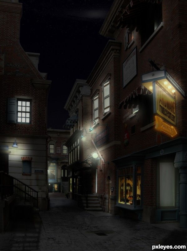
The hardware store sign is skewed at too extreme an angle for the background image, it looks like it is "floating" separate from the building it should be attached to at a 45 degree angle. It is also too warm in tone compared to the other lights in the scene, and does not show any of the "glow" effect of the other lights.
Other than the glaring inconsistency of that sign, this is a very nice image, and a good effort.
Nicely done, but I can't see the light source for the highlight on the small green sign at left.
I like what you've done, but since there is no SBS...I can't see the 'before' scene. Hey...wait...there's no bulb in the one wall light fixture. Maybe add one so that the brightness around it has a source. 
I've solved the lighting on the left, I happened to make a layer mask, the "lamp without bulb" is the same as those of the other wall, have no screen thanks for your comments are very helpful
mossy not you mean well, the poster is an original photo, the arrow is intended as a neon light, and not behave like light from a window or a house, I think
I was talking about the extended glow from the other street light, which all "shine" far from the light. The sign (still crooked and askew - how is it mounted to the wall at that angle?!?) has no real glow at all extending past it. Inconsistent...
Howdie stranger!
If you want to rate this picture or participate in this contest, just:
LOGIN HERE or REGISTER FOR FREE
Headed home from a stag party... (5 years and 3335 days ago)
nice work
gl author
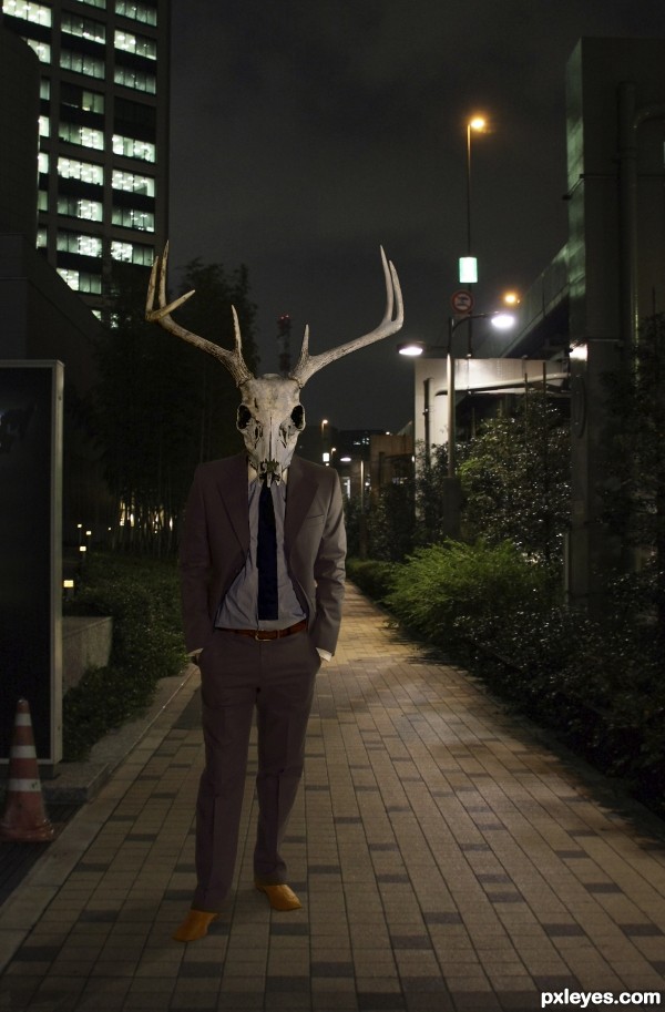
For some reason reminds me a bit of Donnie Darko  . Perhaps I'd make the guy's shadow a tiny bit darker and give the suite a little bit of yellow photofilter. If you want you can give the guy a tiny blur (you can experiment easier with it if you make a smart object from the head and body) and also add a layer (with blending overlay) with some tiny grain noise, so it fits better with the quality of the background photo. Good luck!
EDIT: good improvement imo 
Thank you so much for the suggestions, Waz! A bit of Film Grain really helped. I couldn't get the color filter to cooperate, but using Selective Color and adjusting the neutrals to have a bit more yellow and a bit less cyan seemed to do the trick.
This is looking great. I agree that the shadow of the man needs to be darker. Overall a nice creepy image. Love the description.
Not too shabby. Nice work.
great image, good luck!
Howdie stranger!
If you want to rate this picture or participate in this contest, just:
LOGIN HERE or REGISTER FOR FREE
(5 years and 3391 days ago)
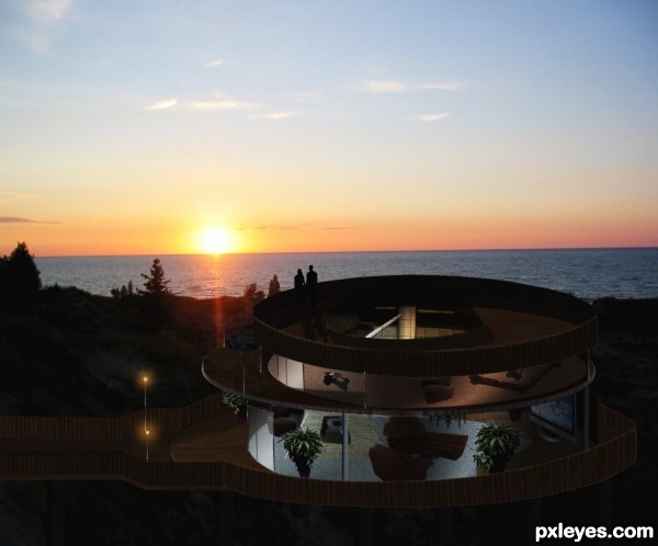
did you only use the source for the shape? If so, you can get that shape from anything. I really can't see where you used the source---sorry.
A lot of work went into this I see though, so I commend you on your time.
True K5683, this entry was for the Threaded Art contest, but I was too late, Pxleyes won't let me upload. Im going to redo most of the house and use more of the source. So if you want to vote guys, you can Waite till I finish redoing the house.
House redone with more of the source, did my best with little time.
very nice construction author...this could be created with any source but i love how u handled small details...good luck
Very True Erathion and K5683, I could use any source for this entry, If I wait for the perfect source, I would never construct the house that I had in mine for almost 2 years now. I guess in this case it's the Photoshop skill and creativity what counts, and goes for all of us Photoshopers of Pxleyes. I could have done this entry years ago when I remember seeing a donut and a cigarette lighter as sources. I appreciate the honesty and comments, and please do vote for what you think this entry deserves, thanks guys.
and i did author...i think this is great work...u did very very nice things with small details and u created one great construction...so in that way this is great piece and i give u high marks...
Howdie stranger!
If you want to rate this picture or participate in this contest, just:
LOGIN HERE or REGISTER FOR FREE
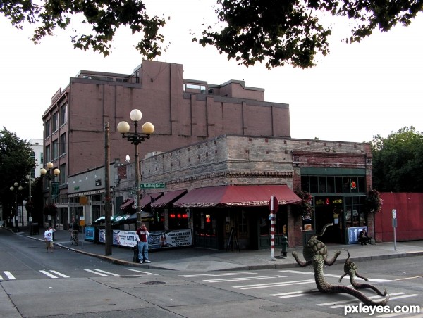
all my sources (5 years and 3486 days ago)
Great interjection author...love the feel on your work...how human being's casually walks and talks on the phone...best of luck man
NICE! Aliens gotta shop too! 
Very subtle! This embodies the theme very well. Good luck.
he.., he.... Author,.....As usual, ur enteies makes me smile. And this one toooooo 
they look so normal in this city , nice work author 
very well done indeed
Howdie stranger!
If you want to rate this picture or participate in this contest, just:
LOGIN HERE or REGISTER FOR FREE
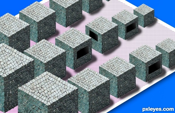
suggestions:
1) improve shadows, if light source from top, the shadows should be alittle bit..
the 'houses' look like floating now
2) add people, since it is a street
3) add a dark to light color for the floor too
Howdie stranger!
If you want to rate this picture or participate in this contest, just:
LOGIN HERE or REGISTER FOR FREE