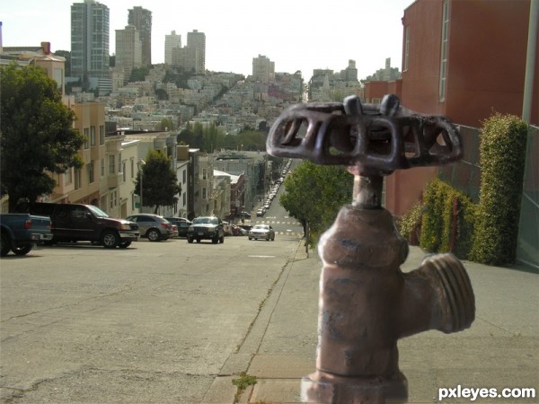
Old Fire Hydrants back in the DAY day. (5 years and 3411 days ago)
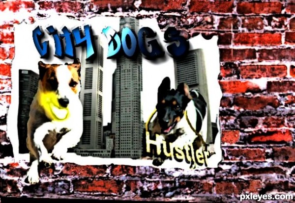
Gangster dogs (5 years and 3429 days ago)
Nice image, the but "nuclear glow" mouth is a bit distracting...
Yeah, it's the cartoon effect i used that exaggerated the neon glow.
You can use displacement map to make it look like it's posted on the wall ( you can find tutorials online about this). You might have to make some adjustments manually.
Howdie stranger!
If you want to rate this picture or participate in this contest, just:
LOGIN HERE or REGISTER FOR FREE
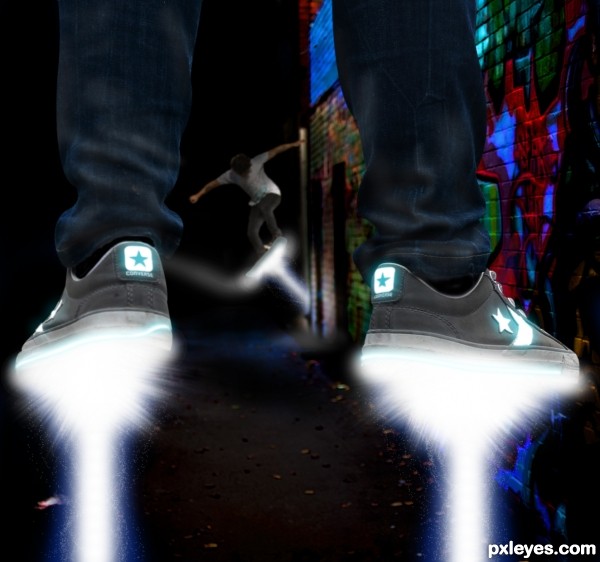
(5 years and 3449 days ago)
like the light
cool lighting effects...
This shot has so many awesome atributes to it!!!! 
I like the way you used colors and light... good luck
 GL!
GL!
Howdie stranger!
If you want to rate this picture or participate in this contest, just:
LOGIN HERE or REGISTER FOR FREE

(5 years and 3548 days ago)
hahahaah i like this one!
The pole would benefit highly from being masked with the pen tool. The soft edges, dark background and hard light don't go together. Fix the edges and you have a nice piece. Good Luck!
haha this is cool  good luck
!!! i am Ready !! ............. very nice . g l
You could add some ropes on the other side of the pole too. 
nice idea author...gl
Howdie stranger!
If you want to rate this picture or participate in this contest, just:
LOGIN HERE or REGISTER FOR FREE
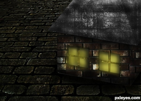
Credits go to ~WardLarson , ~nexus35-Stock and ~Aqiil from DA. (5 years and 3578 days ago)
Author, work on the perspective of the texture you used on the wall, and this entry will be nice! 
Good job. I like the textures you used, only the bricks on the house aren't in the proper perspective.
the prespective is a bit out... great idea...
i agree with Erica,maybe u could use some other texture for the floor,then house will stand up more...gl

yeah perspective is off but great image!
Howdie stranger!
If you want to rate this picture or participate in this contest, just:
LOGIN HERE or REGISTER FOR FREE
thats a good point. ill try it.
The tap needs a bit more of sharpening to blend better with the image. It looks too blurry right now.
very neat chop...extra points for the realism...good luck author
Why not make it a little smaller and red, like a fire hydrant?
i thought about that but it kinda takes away from the source photo.. plus i edited out the old fire hydrant and it doesnt look too good in all parts so i made it the same size that it was when i chopped it out. plus the red woulda faded out becuase in the description it says fire hydrants back in the old old days

 haha
haha
Howdie stranger!
If you want to rate this picture or participate in this contest, just:
LOGIN HERE or REGISTER FOR FREE