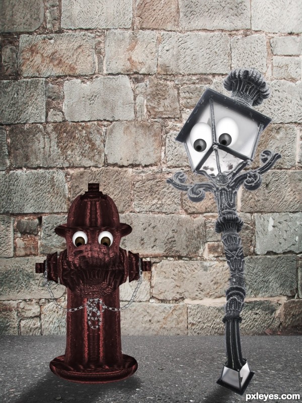
Thanks ashztock for the pics (5 years and 3592 days ago)
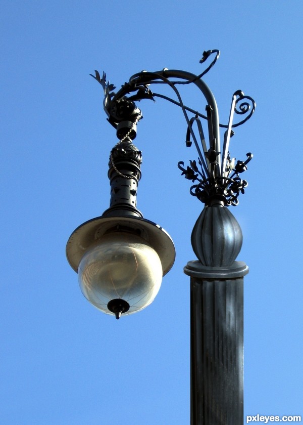
(5 years and 3618 days ago)
Wrong perspective on lamp post.
Agrees with CMYK - the perspectives don´t match
Gud luck....... 
I agree with the above comments on perspective. Also, maybe some level adjustments would help to match the pawn to the metal look of the lamp
I like the idea and the lamp portion of is done really well, its a shame the perspective on the post is so far out. I would consider reworking that bit and you may have a serious contender
Still wrong perpective
Still wrong perpective
I really wish I knew enough to put it right - but I don't. Comment appreciated even so....
Your source image for the streetlight shows you the perspective. You're looking up at the light, notice the rings on the piece above the light, you only see the underside of the rings. Look at the pole you created, you're looking down at the tops of the rings. The angle of the rings should be the same.
I love the idea so much,but entry demand more work.Source have to be way darker and u could add a bit more metallic shine.Also perspective issue is to obvious....Work a more on this author and this will be fantastic entry...best of luck
Just keep trying author, you'll get it. 
GREAT JOB

nice job
Nice idea......GL to you!
Howdie stranger!
If you want to rate this picture or participate in this contest, just:
LOGIN HERE or REGISTER FOR FREE
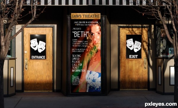
(5 years and 3624 days ago)
Good job bubba 
thanks Pappa Bubba.. hehe
nice entry..........
 you missed to add the number.......
Great work...good luck
@anoop, you have to go to the box office to get it 
YESSSSSSSSSS! 

Jaws theater?  Nice touch.

nice work, good luck 
Howdie stranger!
If you want to rate this picture or participate in this contest, just:
LOGIN HERE or REGISTER FOR FREE
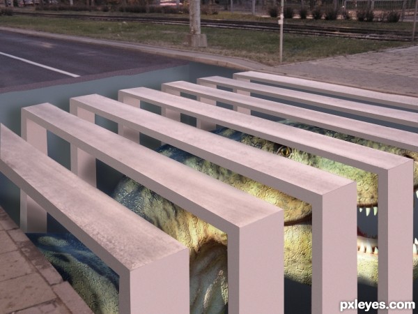
(5 years and 3655 days ago)
great idea !  but , isn't the dinosaur image premanipulated ??
thanks, Lamantine.
The dinosaur image is not pre-manipulated. if you check the source you will find that the dinosaur is a statue in a park 
OMG - I´m very impressed. I would probably hesitate to cross that street.
Great idea! Really seems like something Edgar would make. 
nice work
glad to know that its not pre-manipulated  good luck !
Great idea! Different perspective than most. I like it.
Nice work.....GL
Howdie stranger!
If you want to rate this picture or participate in this contest, just:
LOGIN HERE or REGISTER FOR FREE
(5 years and 3656 days ago)
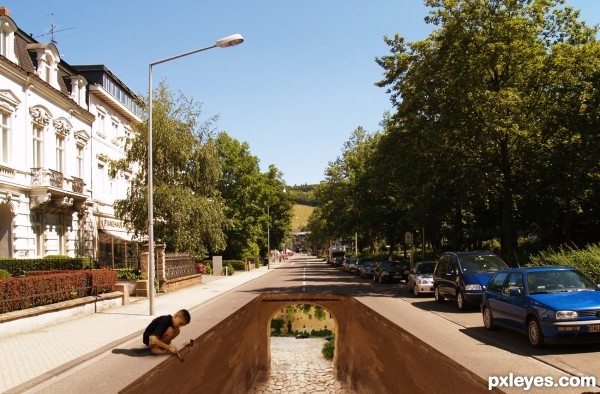
Very realistic pavement painting! The boy's shadow needs to be a bit darker (notice cars shadows). 
Thanks erikuri, increased opacity of shadow 
Liking this a lot!
Great job author,one of the best in the contest.Just few minor observation,boy shadow is a bit blured,but if u look to other shadows u will see how they are sharp defined.Second thing are white stripes over the tunnel hole.IMHO it would be better and more realistic if u remove them.At any case high votes from me and best of luck.
Best of the contest so far...
Thanks erathion for great suggesstion, updated. Thanks to you all for your comments, votes and support. 
Maybe boy needs some lighting in his upper front, because of the sun... 
great imagination ! great idea ! great entry ! wondeful job ! 

very good.
Fantastic job!
kids will be kids  great job!
Nicely done. Love this entry, GL!
congrats! 
congrats on ur win
great JOB!!!!
Congrats, beautifully done 
congrats 
congrats 
congrats 
congrats, well done.

Congrats!! Well done!
Howdie stranger!
If you want to rate this picture or participate in this contest, just:
LOGIN HERE or REGISTER FOR FREE
Very cute!
Funny idea!
GL
Well done.
cute work
hehe :LOL2:
The face expressions are amazing!
Howdie stranger!
If you want to rate this picture or participate in this contest, just:
LOGIN HERE or REGISTER FOR FREE