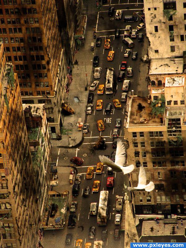
* Note* : I´ve added the pigeon´s url.
Thanks for view and comments. (5 years and 3940 days ago)
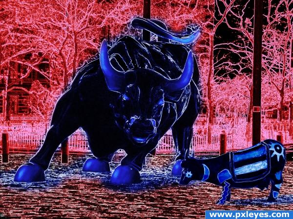
I thought a blue cow must have a boyfriend (5 years and 3994 days ago)
where's the source?
Ummm... I was thinking that too... Or perhaps submit it in the demon animal contest, by adding a few more edit... This bull looks menacing enough lol...
No sign of the source pic here...
Donde esta la foto original? Es interesante, pero necesitas hacer eso claro, porque si no gente no va a parar de preguntarte eso. Buena Suerte!
dunno wheres the source spanish?? PONTI??
Donald Estrada Lay a PHOTO On the ORIGINAL Pregnant Parkay See Margerine?.. dern it..what the cheese?.. no source.. will be pulled (JUST FUNNING YOU PONTI) giggle snort
Excellent fix author.. Now I can give you a much higher score !!!! 


I don’t know what is happening; I can see the source next to your cements in the thumb view, and next to the guide in the full view. Can anyone help me? The guide also has the source in step 1.
No se que esta pasando; yo puedo ver la fuente luego de los comentarios cuando estoy en “thum view”, también la puedo ver luego de los pasos de la guía cuando estoy en “full view”. ¿Alguien me podría ayudar con esto? La guía también tiene el link en el paso #1.
i like this a lot... it has this power that is comming out of the screen... very nice colours used...
No te entiendo, cual es el problema? Habias usado la fuente en tu imagen? Perdon, estoy usando un teclado ingles entonces to tengo tildes o acentos.
Haha GolemAura - close enough xD
Besides the no source I think you really went overboard on the filters, eventhough it's not a reason to get your image pulled you won't get high scores using just filters... try to put some of your creativity in it 
The source (in this case) is the image on top of the contestpage, the statue of the blue cow. You'll need to use that image in your entry in some way, not inspired on, not as a reference but it needs to be in the image you create.
Think you confuse 'source' with the images you used, yep they are sources too but the blue cow on top HAS to be one of your sources in your image.
author, what there refering to is the source image you were suppost to photoshop, not the image you did photoshop. this contest is to work with the image on the top of the page , not just select any picture  nice work thoe
Sorry guys, it was my fall; I just didn’t like the final result that was why source image wasn’t there. Here it is anyway. Sorry again it will not happen again
Mejor, pero pienso que el estilo que usaste con el toro lo deberias usar con la fuente - (Much better, but the style you used with the bull should also be used with the source.) Buena Suerte!!
Thanks ponti55, I guess they now have something…
This is much better now.... good work
Mucho mejor. Me gusta arto ahora.
Glad you added the cow. I like the blue "shadows." It looks like their footsteps are causing the ground to turn blue rather than casting shadows. That's cool.
Howdie stranger!
If you want to rate this picture or participate in this contest, just:
LOGIN HERE or REGISTER FOR FREE
(5 years and 4005 days ago)
author.. you really should up load a Step By Step.. as I realize that this is a pretty simple chop, this makes the SBS even more valuable to people who are impressed by your work and would like to do something similar themselves.. (this would make and Awesome tutorial).. very good job on this.. (the best way to learn is from others who already know what to do..hehehe.. good luck and good job
Well GolemAura the SBS is ready I was just doing it when you commented.
good work 
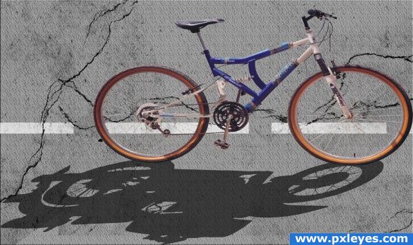
A good idea author. The perspective between the road and bike are way off though. From the angle we see the road at, we should be looking down directly on top of the bike, and not a side view as you have showing. I would skew the road, place it on the lower half of the image and then add some scenery in the background. I think by doing this it would improve the image imho. Good luck
Great idea, nice result!
lol, nice idea 
wrong direction of shadows......the light source is frm top left....then shadows should be towards bottom right.....
really cool
Nice idea!!! good luck 
The road texture looks too uniform and has no perspective. I found an easy way to make road texture is to start with the gray color then add noise for texture then use gaussian blur to give some blending to the texture. I agree about the perspective problem. One thing that would help is to angle the ends of the white line, as it is now the lines appear to be viewed from directly overhead. Concept is great worth spending a little tweak time IMHO. 
Howdie stranger!
If you want to rate this picture or participate in this contest, just:
LOGIN HERE or REGISTER FOR FREE
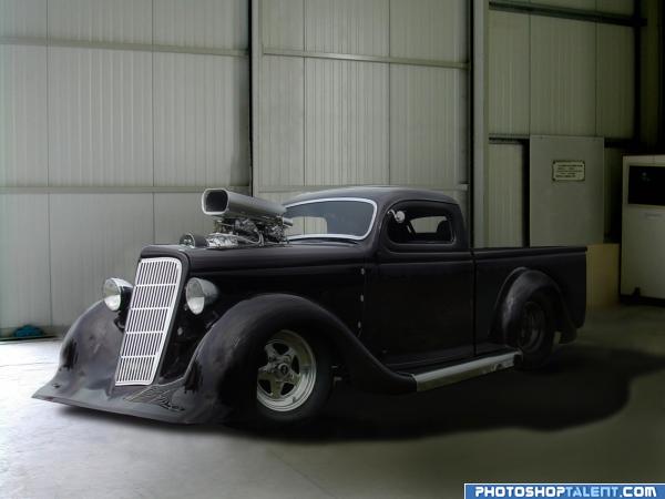
This truck was made with the lower half of the source truck bed and background plus one of my own photos. No other sources. (5 years and 4024 days ago)
nice! 
intellegent work.......GL
looks really good, just clean up the bottom left part of the vehicle. i see some artifacts 
Good eye, elficho! They're gone now. 
OH MY.. vroom vroom vroom.. fun fuN fUN FUN.... zooooooooooooom
I like this but I think the shadow looks kinda funny. Not sure why. Also, a sweet ride like that would certainly have matching hubcaps.
Chaplain, I studied the shadows some more & I think they were too short for the light source, so I changed them a bit. As for the wheel rims, you just cant see the matching center because the tires are so wide(about 18" ), and the center is sunken way in.
Edit: I went back to step 12 & re-worked some things that I wasn't happy with. But I'm done now....really.
super cool
Cool image very nice work!!
very nice work
very nice work 
i want one !!! very nice change good luck!
Nice job, but the shadow is too big, look at your source and if you look at the original also wrong direction, look at the walls
Good Luck 
awesomeness
Congrats! Well done!
Congratulations for 3rd
Congrats!
Thanks!
Congrats!
Congrats!!
Howdie stranger!
If you want to rate this picture or participate in this contest, just:
LOGIN HERE or REGISTER FOR FREE
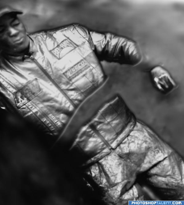
Street Performer
I placed him inside is own body
doubt if the high res will help, he was so far away when I took the picture, but he was great, little kids would get real close and he'd move and they would run screaming, great crowd pleaser, but I couldn't get close enough to get a good pic, but I loved the memory (5 years and 4034 days ago)
ok:l
gl
not look like a fossile. It's like a metal statue.
ah Gopan, ever hear of Mineral Displacement when it comes to petrification.. it's also a fossil.. I'm sure it wouldn't happen this cleanly on earth, but in an atmosphere void of water it could happen as the carbon leaves the body.. think outside the box
Howdie stranger!
If you want to rate this picture or participate in this contest, just:
LOGIN HERE or REGISTER FOR FREE
nice!
Excellent chose of source and well done the aging effect!! the birds make great sensation!! congrats and GL.
..perfect
nice done i like it
Great representation and imagination in what it would look like... Nicley done! g/l
Nice job! I think if the cars looked more scattered and abandoned it would help the realism more. Right now, they are lined up as if waiting in current traffic.
I´m agree with you. But I had got not time enough for improve this entry. I´m sorry. I´ll try to get time and improve the cars. Thanks for the comments.
I think I remember this one, great job.
Glad to see this one again
great job.gl
Wonderful job! Using the pigeons was a brilliant idea! They add something like hope in all this chaos. Good luck!
Congrats for our first place, DML!
Congratulations for 1st, great
Heyheyhey!!! enhorabuena amigo
Congrats!
congrats
Congrats!!
congrats
Howdie stranger!
If you want to rate this picture or participate in this contest, just:
LOGIN HERE or REGISTER FOR FREE