Please see SBS. (5 years and 719 days ago)

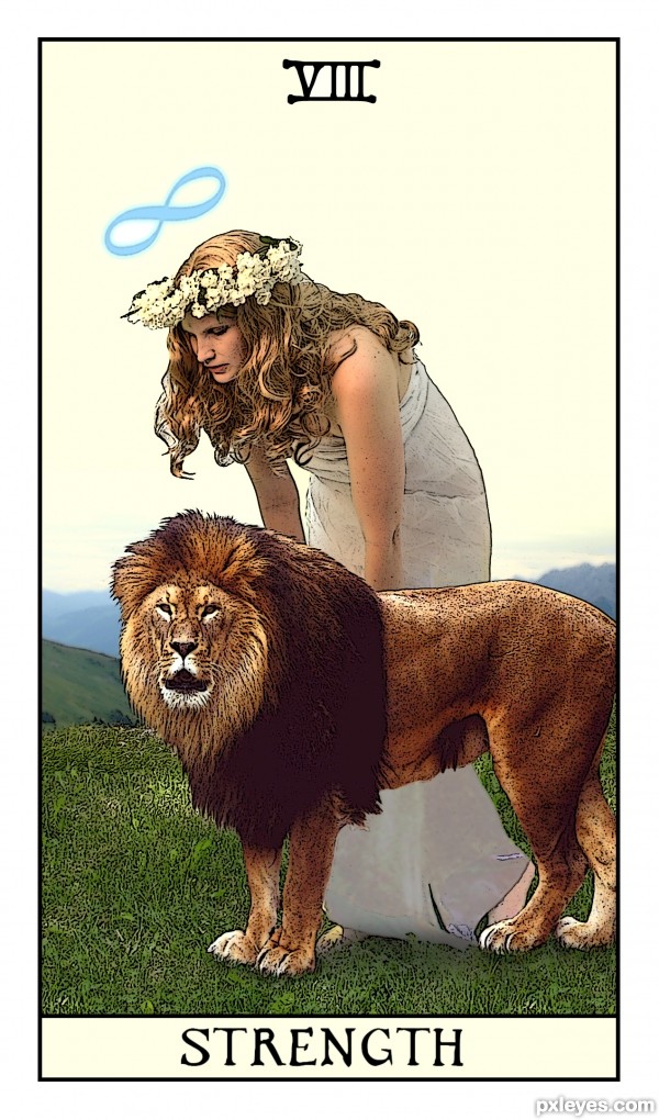
The symbology of the lion is common to Strength, and aptly so. The lion is the "beast within", the raging inner desire inside every one of us that must be controlled or it will be set free to manifest in the world. The image of the woman opening the mouth of the lion shows both courage and patience; she must not fear the lion, and she must wait for it to tire before she can exert her own will upon it. This is not an image of compassion in any sense of the word; how can forcing a creature to obey your will be seen as compassionate? Forgiveness and nurturing are likewise not to be seen anywhere in this image. There is just the purity of the maiden and the power of her inner beast that she is attempting to control. (5 years and 2645 days ago)
I like how you matched the card ,,, the work with posterized look was nice choice,,,Just do not like the fact she is looking at ground ... great job ...good luck
This is the way cards should look.... good work my friend.!
Poster edges and paint daubs is two of my favorite tools. I would have created two layers, one with poster edges, and one with paint daubs. Then I would have erased her inner skin on poster edge layer reviling the creamy paint daubs layer and leaving a poster edge outline. Just a thought. ïŠ Looks good! And it looks like a tarot card.
Thanks! Gotta try that some time. That's what I love about Photoshop...there are so many different ways to do stuff! 
I am not big on artistic effects filters but this looks pretty good for this contest. gl
Thank you all!
Howdie stranger!
If you want to rate this picture or participate in this contest, just:
LOGIN HERE or REGISTER FOR FREE

(5 years and 3610 days ago)
I like this 
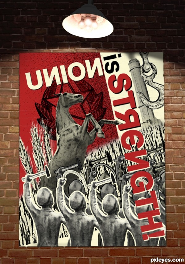
Pretty well done in style of Rodchenko and the Constructivism period. I might have made the star a bit bigger and place the center of it exactly behind the horse's head. Also the horse itself could be a bit bigger so it's even more overwhelming and powerful. The use of red color is ok, the stencil style too. Good luck!
great idea
Well done! 
Howdie stranger!
If you want to rate this picture or participate in this contest, just:
LOGIN HERE or REGISTER FOR FREE
Real cool shot this
^
https://media1.giphy.com/media/glmRyiSI3v5E4/200.gif
Thanks photonut
Thank you very much CMYK. Getting a thumbs up from you always puts a smile on my face. )
)
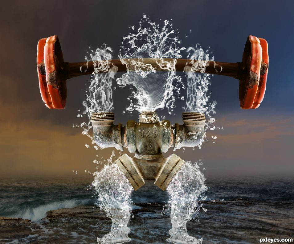
It is your creative and playful mind that shines through this professional looking upload. Your SBS is clear, the title further enhances the joy of the view. I'm looking for realistic blending, telltale lines that give away your process and I see nothing. This, along with your other chops and uploads is simply bamboozling to my mind! Top of the shelf!
Thank you very much Olga.
Wow some really high scores for the top 2. Really good work SA. Amazing what we can create from a mundane water spigot.
Thanks BWR.
Congrats on this win. I LOVED IT....
Thank you
Congrats !
Thanks Lolu
Howdie stranger!
If you want to rate this picture or participate in this contest, just:
LOGIN HERE or REGISTER FOR FREE