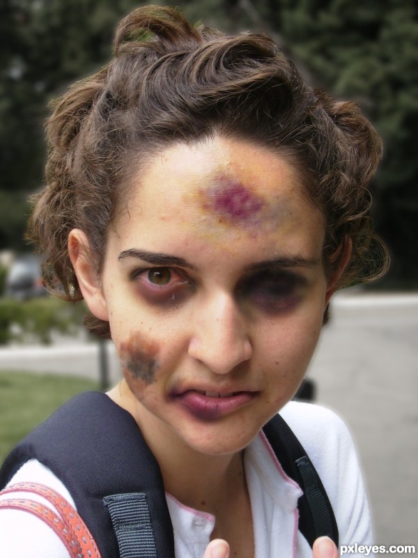
thanks to Quasic @ Flickr for the photo i kicked the crap out of (5 years and 3584 days ago)
- 1: source1

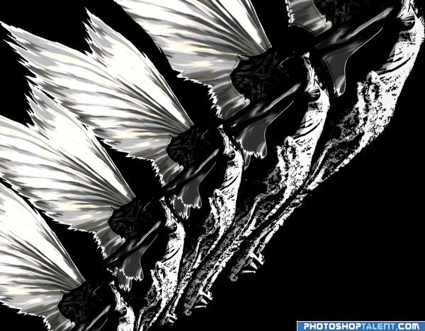
transform in draw then copy,transform erase (5 years and 3955 days ago)
something about this reminds me of the movie Xanadu lol
IMHO I think this image would look better without the original girl at the bottom... now it kinda looks like she doesn't fit in or maybe you could lower her "opacity" a bit. I love the wings and the feel of the transformed copies. GL
thanks good tip
Black& white image's beauty is there, but need perfection
Howdie stranger!
If you want to rate this picture or participate in this contest, just:
LOGIN HERE or REGISTER FOR FREE
I think you blackened her eye a little too much. It doesn't look very realistic. I would try just using a closed eye source and making it blend to the face but the rest looks pretty good. GL!
was trying to make her eye like it isn't there anymore.. ya know.. like it had to be removed
Nice colour.. I like the way it blends into the face... GL
The tear seems to drip from the wrong way, and if you do a darker line by her "lost" eye so it appears to be closed and badly beaten that would make the whole pic more realistic. IMO
Howdie stranger!
If you want to rate this picture or participate in this contest, just:
LOGIN HERE or REGISTER FOR FREE