This week we transformed our gargoyle models into naked batterflies for this studio shots. (5 years and 1650 days ago)

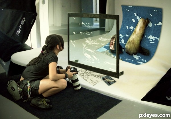
With the violence of today, some adventurous are choosing to do indoor expeditions. (5 years and 2949 days ago)
Nice idea and good source find. Only thing for me is that the seal looks a bit too cut out. You wouldnt prefer to keep the body from the seal as how it is in the source (head has a good transformation!)? Good luck!
thanks my friend, i will make the changes.
Congratulations on the second place 
Thanks!!
Congrats!
Thanks!!
Congrats!!
Thanks!!
Howdie stranger!
If you want to rate this picture or participate in this contest, just:
LOGIN HERE or REGISTER FOR FREE

(5 years and 2988 days ago)
Fun image! I'd desaturate her a bit though, since it's a night scene. 
This is pretty cool.
I really like this image. Nice source finds and really nice imagination. 
this would've been really good if you blurred the background to give it depth but still a nice chop
Howdie stranger!
If you want to rate this picture or participate in this contest, just:
LOGIN HERE or REGISTER FOR FREE

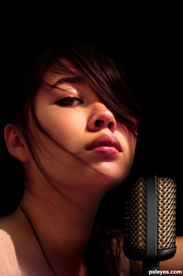
What can I say... I just love music... (5 years and 3517 days ago)
Very creative use of source! I do feel the microphone edge by her cheek should be more visible/less shadowed. Actually, having the microphone ever so slightly overlap her face would increase the feeling of depth and be more interesting IMO.
Nice!
Great job author...
indeed ur love to music is visible...beautiful ..entry....and a well made SBS guide...
Very nice entry! I have to agree about the shading of the mic.
Wow great work with the mic.
Very clever! GL!
Congrats on a well deserved first place!
Congrats nice work 
Congrats...
Congrats!
Congratulations!
Congrats!!
Howdie stranger!
If you want to rate this picture or participate in this contest, just:
LOGIN HERE or REGISTER FOR FREE
Scandalous!
Howdie stranger!
If you want to rate this picture or participate in this contest, just:
LOGIN HERE or REGISTER FOR FREE