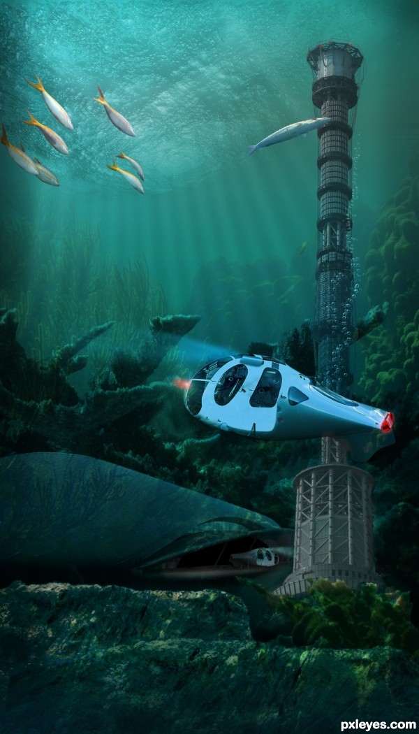
The evolution of future submarines for military use will be driven by the trend to use smaller, autonomous, and unmanned vehicles to perform missions both under and above the sea. (5 years and 2851 days ago)

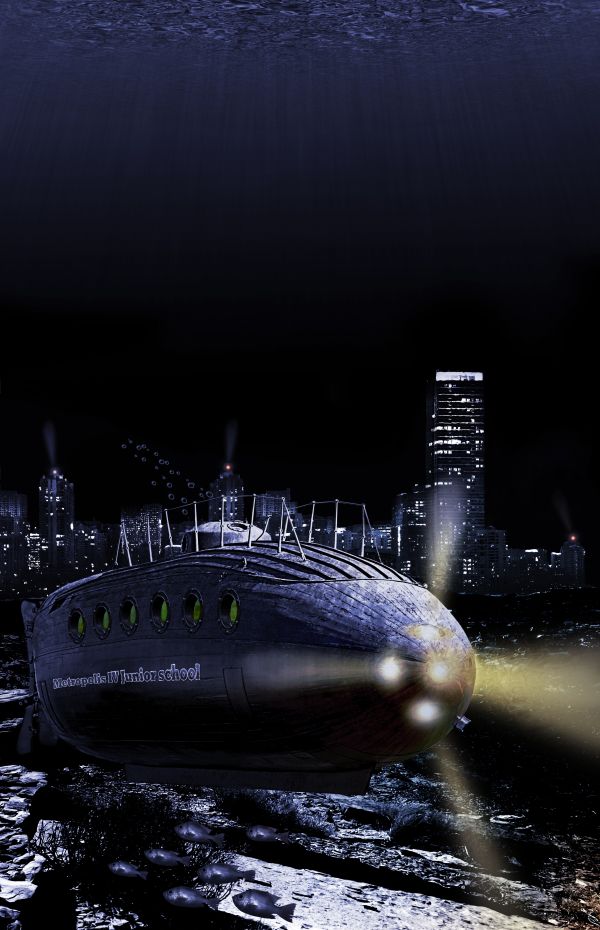
2027, The kids from the 'Metropolis IV Junior school' located in the underwater city 'Sub Metropolis IV' are having a field trip today to explore there new world in the school submarine...
Thanks to Antonio Jiménez Alonso, Ken Lund, ben kaye-skinner, Robson Oliveira & Renato Sakamoto for the great stock :-) (5 years and 3753 days ago)
Nice looking pic, but remove the supports underneath the sub! (And maybe make the conning tower a bit more blue to match the rest...).
I agree with both cmyk and Nator. Also front of sub is very badly chopped in high res. You used magnetic lasso too or magic wand, didn't you? Adjust the contrast if you want to use magic wand but I would have just used polygonal lasso with a 2px feather. It will give you a better chop. There are vague children’s faces in the window rims. Are they from a source or your own creation? I'd just try to make them looking through the glass. You should put the “School Sub IX†back, it was a nice effect. 
Thx for advice, i wil try to fix them. There are no children in the window rims. I used the source without changing it. 
Well put some in there then. 
EDIT: I see you added lights but you should at least remove the stilts. They just don't look right if it's a sub underwater. It would not need them. Remember realism is the key to this contest.
Voila, it was a lot of work, but i think it's ok now ?? 
You got your work cut out for ya because it looks MUCH better. Glad you decided to put a name back on the sub, fix it's edges and remove the stilts. Glad I held off on voting. I can give you a better vote now. 
Thanks jawshoewhah 
Lots better. 
I will not be surprised to see you place because you decided to use our tips, you have quite a contender.; 
Great image... looks very apocalyptic.. very nice take on the theme. Good luck.
very nice 
Very good, You seem to have a put a lot of effort into the sea floor (which i liked) at the beginning of your SBS and i dont see it anywhere, how come?
Thx for comments all  . PhotoRepair the first ocean floor was just a stock photo and i just pasted it in, but i did not like the combination with the city. It was a bit boring for my likeing
Congrats on your placement. It should have been 1st.
Congrats for your third place, Clinge!
Congrats
Howdie stranger!
If you want to rate this picture or participate in this contest, just:
LOGIN HERE or REGISTER FOR FREE

(5 years and 3776 days ago)
Very odd, but i like it! When looking at high res it's quite easy to see a white border around some of the areas, remove those and you'll have a great image!
nice work with the hands
Thanks ponti55 I think a got all of them
Absolutely bizzare  Wicked-cool use of the imagination. GL!
Nice deviation...good job, author!
Congrats!
Congrats,
Congrats!
Howdie stranger!
If you want to rate this picture or participate in this contest, just:
LOGIN HERE or REGISTER FOR FREE

3ds max 2009+mentalray, and photoshop.
Thanks paulus62 for the clouds.
see links for textures.
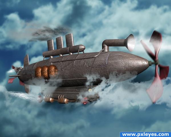
It has taken me 4 days just to model this and texture it. I wish I had more time to complete the model, I wanted to add brackets for the pipes and work on the texture some more. (5 years and 3913 days ago)
I love how you used a veriety of 3D and 2D programs, but that the end result doesn't look like a bad CGI film... fantastic work. Good luck!
Very well done author...also very clear image...good luck
great finish touch...
awesome work author.. mind blowingly awesome!!!
OMG.. I just realized that I think I had that Propeller thingy on a hat when I was a kid.. one of those twirly beanies... LOL.. I got hit a lot 
oh WOW!
Up until 2/3 from the left the image looks great, the 1/3 on the right has got some perspective problems. It looks like it's bend. The angle on the propellor and the tube on top are wrong. Could be an easy fix.
Looks fantastic too me I like the way the propeller looks and also the way the hull detail is ...very nice overall 
WOW!!! great image!! i like! Very good 
author you so brainy  .. I used to fix those lens bends from my 35 mm.. so I know what robvdn is talking about.. now that you've explained how the 3d max does it.. it truly is amazing (I'm just learning how to use the dern burn tool, I"LL NEVER GET TO 3d MAX LOL)
Good concept, but it looks half finished. Too many textures make the result look disjointed...the hull texture is too heavy.
Great entry. I know this distorsion effect, it dissapear when use a lens camera between 85 and 135 mm.As a suggestion : raise the distance between camera (hope is a target camera) and your object and use a lens around 100 mm. To not modify the angle select Camera, right click on Select and Move tool, open Move Transform Type-In dialogue and in left down corner raise the value for Look at - Dolly. But I'm sure you know all that, good luck.
I want 3d programs too.... if this is what you can produce. this is a wonderful creation author well done...
excellent job!
Some very cool elements like the sub itself. The lack of any portholes is a but disconcerting, however. The three miniature smoke stacks (with rather modest smoke output) seem inconsequential compared to the odd inhaler horn on the front of the sub [which I would personally delete]. I wish the front and back propeller blurs were more rotational.
wow ... aweosme imsge! the prop ias aweosme too!
Very nice lots of work...lets hope that it is appreciated....
very nice!!
should have been in the top 3....
Howdie stranger!
If you want to rate this picture or participate in this contest, just:
LOGIN HERE or REGISTER FOR FREE
Terminal building is transparent, base of tower too.
Good observation, I might think so at first, too, but some of those are reflections, Bob. Made some edits, though. Thanks!
Those fishes seem giant, they're as big as the helicopter. Otherwise it's quite good, good luck.
Thanks, Akassa, except it's not a helicopter in this image.
underwater scenes always weird me out, like I can't breath, so this must work LOLOLOL (when it doesn't look real, I don't get all claustrophobic ) GOOD JOB!!!
By all means, please breathe!! There's plenty of air in the UUV and bubbles if you run low. Thanks, Ernie!
very nice author especially cute mil submarine
Thank you, Kush!
Lovely work
Thank you, Valerie!
Very nice image, I think your bathyscaphe has sprung a leak though...it's bleeding air.

Just a UUV-Bubble test, A-OK. Thank you, Loyd!
Congrats!!
Thank you, Rein!
Congrats Pearlie.
Thank you, Roberto!
Howdie stranger!
If you want to rate this picture or participate in this contest, just:
LOGIN HERE or REGISTER FOR FREE