(5 years and 3157 days ago)

Coming soon to a theater near you. (5 years and 3569 days ago)
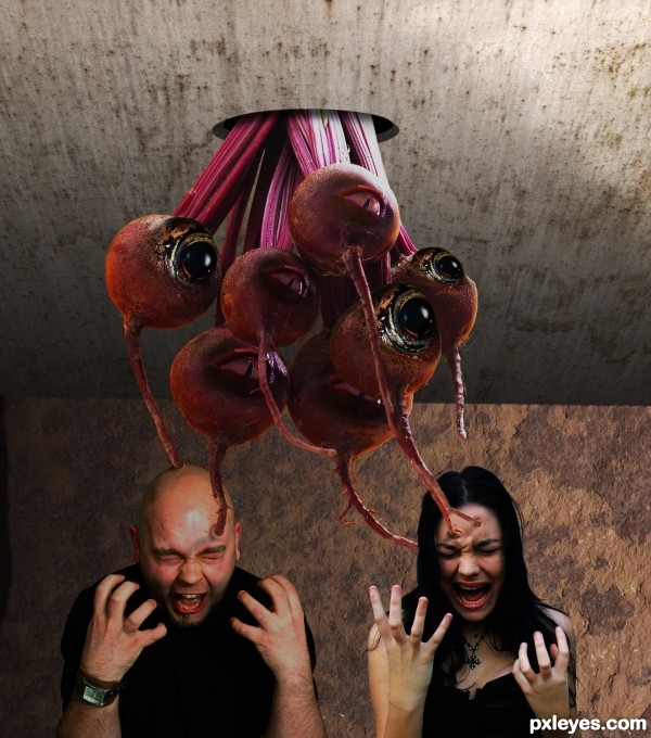
Neet idea is some shadow problems. as far as I am seeing most of the guys head should be in the shadow of the sucker thing, also would remove the glare off the right side of his head (his right that is). last thing I see is the girls right hand and arm has no shadows looks off. would all fit much better if that was fixed.. 
Thanks Ironcow, removed the glare from the side of his head...looks better. 
No prob at all.  lookin good. G/L.
This is very impressive and creepy!... 
I prefer the eyes looking at different sides, but it's up to you. GL! 
Very clean work! The eyes were blended really well, and i like the idea. Erikuri also makes a good suggestion, the brain suckers may look a bit creepier if they were looking in different directions.
Overall a great job 
Edit: Always an answer for everything author 
Boy, you guys sure don't seem to know much about brain suckers! First, the ones with the big black eyes are males, the ones with the cat looking eyes are females. Brain suckers are phototropic, which means they all look toward the light. Anybody who has watched B movies about brain eating monsters would know this. 
Great imagination and man that's creepy....good job
Oh, Gosh... they have gender!?... 
Movies with brain eaters... hmmm... only zombie movies, sorry! 
The holes where the tentacles goes into the head is actually pretty real, so gl! 
lol! i know nothing about brain suckers but great chop!
Howdie stranger!
If you want to rate this picture or participate in this contest, just:
LOGIN HERE or REGISTER FOR FREE
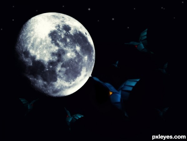
Too dark. You can't make out much of the contest source, the moon is over dominating the image.
same author for "Night Eater"? ... too dark again

try use a gradual (gradient) fill with varying opacity, may improve this
Sweet mood, love the highlights on the moon.
Howdie stranger!
If you want to rate this picture or participate in this contest, just:
LOGIN HERE or REGISTER FOR FREE