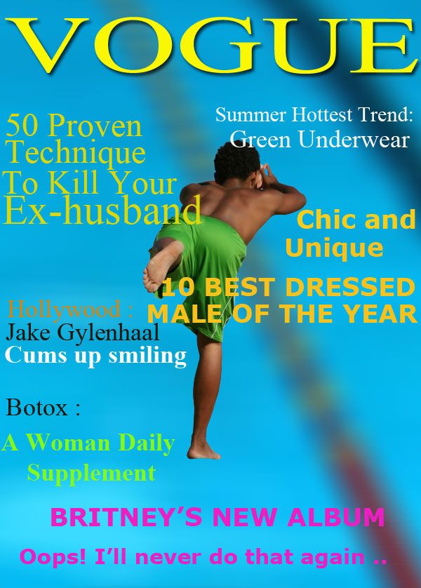
Green underwear (5 years and 3824 days ago)
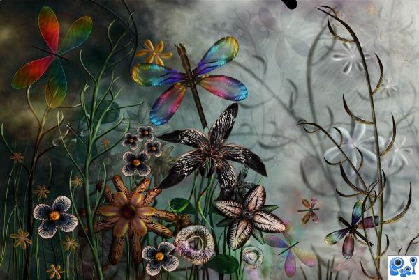
Only the source image used (5 years and 3881 days ago)
Beautiful composition. I really like the neutralish background behind the vibrant, sharp color. Nice work, author!
How do you do it?? Great job 
Beautiful and lots of work here. Very nice author  . Winner
 Simply amazing!
Beautiful, just that....wonderful...gl author.
Excellent work, very polished.
Your work boggles my mind. Well done.
I love it! Great work!
amazing 
agree with Pixelkid ,, just visually beautiful .
Just lovely... as always!
The lines in your SBS are all very wiggly... tsk tsk tsk...... giggle snort 


Love the transparency in the wings
Great!!!! Good Luck Author.
Fantastic work!!!
Thanks to all for the nice comments and favs 

CONGRATS!!! Beautiful entry 
Congrats for 2nd and 4th my friend.
congrats
Congrats, beautiful colors!
Very beautiful! Congratulations!
Congrats!. Beautiful work 
Beautiful and congrats on the 2nd place
congrats Cornelia
congrats! 
Congrats!!
I was going through your portfolio and remembered this one and wondered why I had not already faved it? belated congrats BTW. 
Howdie stranger!
If you want to rate this picture or participate in this contest, just:
LOGIN HERE or REGISTER FOR FREE
(5 years and 3882 days ago)
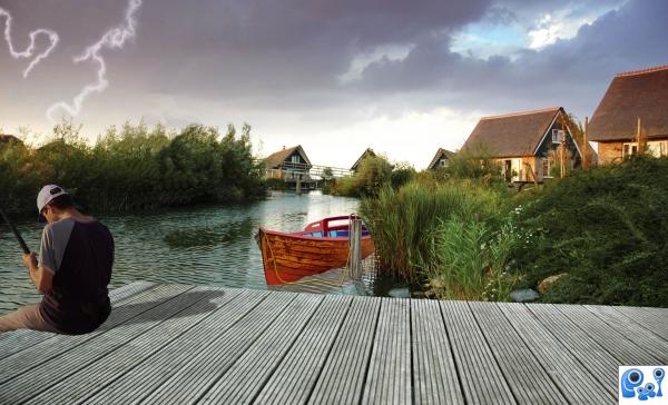
Ummm...how does he get to his boat? (Which looks a bit small...).
Light source in original pic is from left, so try to adjust the shadow...
Ok, fixed the shadow and adjusted some proportions. Better? As for getting the boat he grabs the rope and pull it to shore, or wades in after it which I wouldn't recommend in a lightning storm...
Boat is still to small,fix this before contest is finish...and gl....
Howdie stranger!
If you want to rate this picture or participate in this contest, just:
LOGIN HERE or REGISTER FOR FREE
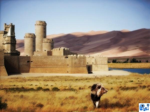
Summer is just around the corner, for this reason the somewhat hot landscape, and I've been reading The Chronicles of Narnia, hence the lion :-) (5 years and 3890 days ago)
Nice, warm feel to this image.. good luck!
very nice image! gl
It is a nice image indeed, my only suggestion is that the main idea of your work, should be the castle. You have two objects on the foreground, a lion, that looks ok, but the bush, is like a dark spot in this image, and it is taking my view away from the castle. Probably, coloring a little, to go with your image, you have lots of browns, and ochres, it is up to you author. All the rest is nice! Remember this is just a suggestion. Good luck.
Thanks George  I agree, I should have gotten rid of that bush before
looks better author.
Beautiful dreamy image 
Something is not ok with the ligting....u cannot have dark on the dunes and light on the grass,both are on the same side....but whole composition is very very nice...gl author
Thanks for your comment Erathion! If you take a look at the original Sand Dune source image, you'll see that the grass and the dunes belongs to the same image. Dark on the dunes is just the shadow of clouds somewhere above 
clouds make sence. GL nice work
glad i waited to vote on your image. I like the changes you have made since i first looked at it. 
Howdie stranger!
If you want to rate this picture or participate in this contest, just:
LOGIN HERE or REGISTER FOR FREE
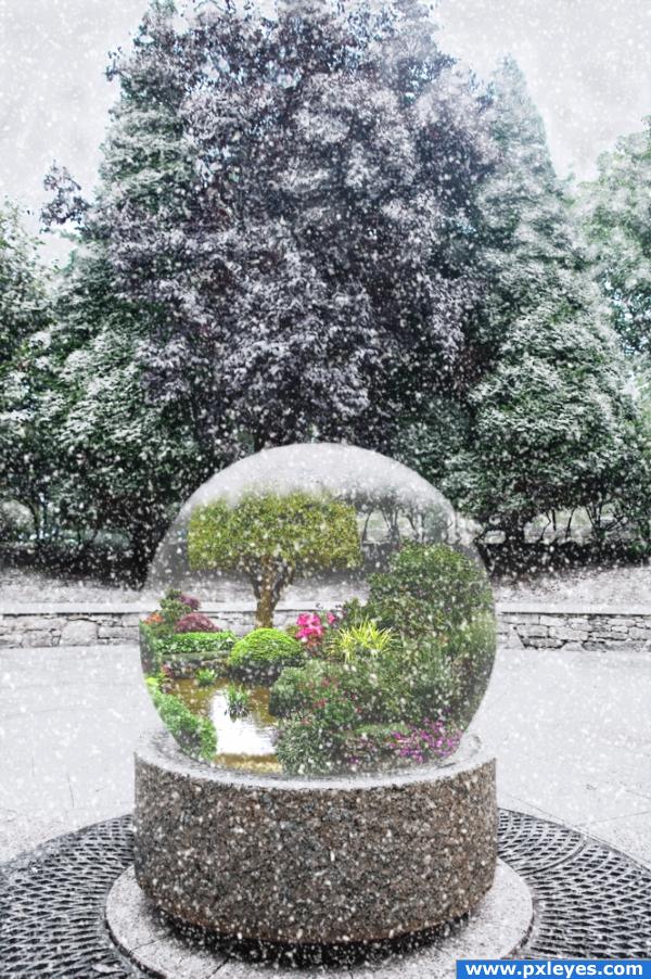
Thanks to edgeplot and **Mary** for the garden pics. Thanks also to Jeff Huang for the snow tutorial and Steve Patterson for the falling snow tutorial. (5 years and 3997 days ago)
NIce idea! Great job on creating the snow. The globe looks a little cut out. You could try a white inner glow to soften the edges.
love the image, but i agree the globe looks a bit flat... still i like it, looks like it took some work 
Thank you, thefinalcut. I wasn't completely satisfied with the way the globe looked and your comment gave me just the push I needed to fix it. Used the blur tool as well as inner glow. Thanks again!
Nice work -- like the creation of the background as well as the work in the sphere
great idea  you could try to give the glassbowl more depth or glasslook with tecnics like here http://www.pxleyes.com/video-tutorial/photoshop/3340/Creating-Glass-Orb.html Thats not the best tut i think, but it can guide you the way a bit

i love the idea.. good job.
Beautiful.
awwww there goes my idea LOL nice work 
There should be snow on top of the globe...the edge looks too round there.
Nice ideea and good work !
really nice idea! its cool and aweoms!
nator: do you take a look at what your looking? 
gl
Beautiful composition and idea! That's for sure a different kind of a snow globe  Good luck!
Thank you for your comments. Solaris, thank you for the link. I may try that next time.  CMYK, that is snow on top.
  Nator, if I put snow in the globe, my summer garden would die, doncha think?
  Thanks again for the comments. I appreciate them.
it is snowing... very cousy...
looks great.
good job on the snow effect...GL
Howdie stranger!
If you want to rate this picture or participate in this contest, just:
LOGIN HERE or REGISTER FOR FREE
50!?!?!? That's great. You might want to change that thing about Jake G. It's not appropriate here.
can do better, this one is good,
Aside from the fact that VOGUE is copyrighted and the entry will probably be removed, this is not exciting...
well it says Vogue but it doesn't mimic the original logo.. at least it isn't like this entry below..(font nightmare) but beauty and creativity is in the eye of the beholder
http://www.pxleyes.com/photoshop-picture/4ae377dbdfdbd/Resurrection.html
being honest and truthful.. in my nature
lol
You should have changed the name of the magazine. CMYK is right, it will get removed.
Howdie stranger!
If you want to rate this picture or participate in this contest, just:
LOGIN HERE or REGISTER FOR FREE