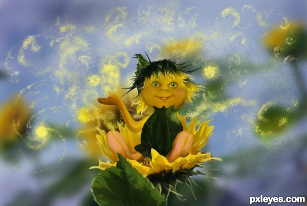
Only source photo used and brushes are my own. (5 years and 3447 days ago)
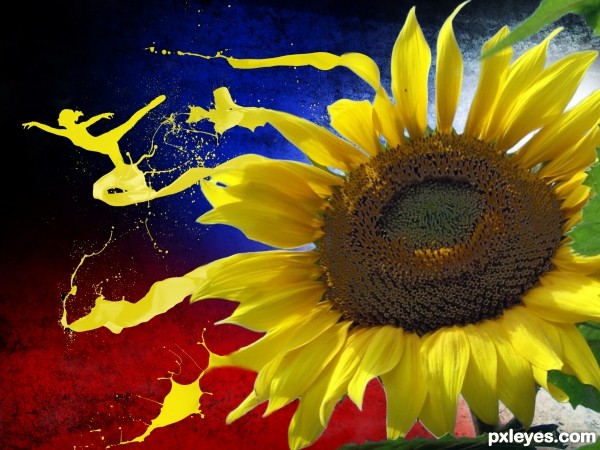
This is a substitution of my previous entry because i have a problem with my source. (5 years and 3449 days ago)
Nice. But if you match the colour of splashes with sunflower petals, it will look more dynamic & realistic.
I agree with velkanx. Good idea velkanx. Great work though author.
Excellent concept and execution. I too, agree with velkanx. Make the paint all match the sunflower.
really cool! Great idea! GL! :P)
like the idea
this is so cool...best of luck author
Howdie stranger!
If you want to rate this picture or participate in this contest, just:
LOGIN HERE or REGISTER FOR FREE
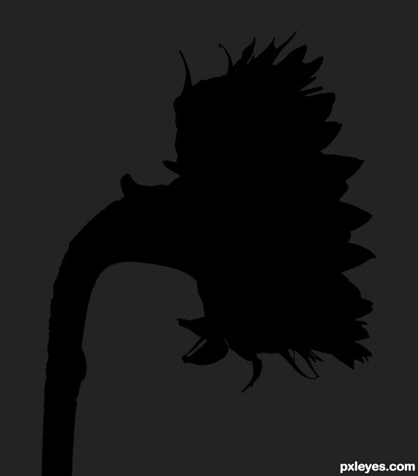
Suggestions and comments are appreciated!
Thanks to CGTextures for the sunflower image.
(5 years and 3509 days ago)
Cool... 
I'm not sure the lighting makes sense (harsher on the lit parts for greater contrast between the light and shadow portions might be better) or that this really fits the contest theme.
nice job ......... 
I wish there was a little bit more contrast, but other wise very nice.
its nice good luck
great work!
great job !! g l
Nator, Unfortunately I had to remove the remaining color to the flower per the "rules" of the contest. I personally liked it better with some highlight color but rules are rules 

very nice work author,u could use some lighter background to achieve better contrast...good luck...
Howdie stranger!
If you want to rate this picture or participate in this contest, just:
LOGIN HERE or REGISTER FOR FREE
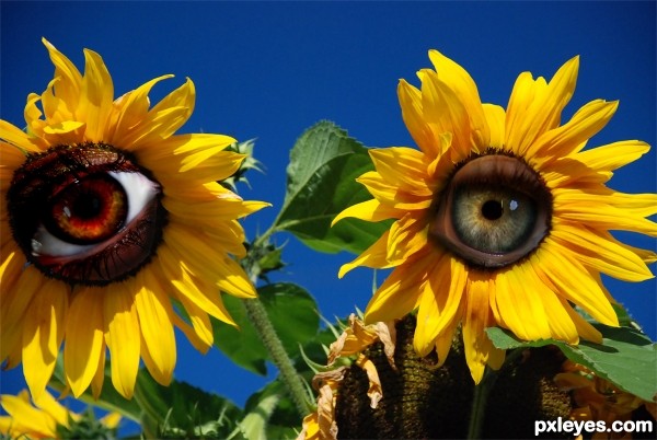
I chose the idiom "A fresh pair of eyes".
I started with the pair of sunflowers and cut the centers out of them. I used two different eyes to fill each flower. I duplicated each eye layer and adjusted the blending options for each. I used the smudge tool to help blend the eyes. I used the paintbrush at a low opacity using black to darken the areas that needed burning to help blend.
Kind of a crazy interpretation but I like how it turned out!! Hope you like it =)
All source images have been notified of use. Thanks to ~clarksie112, penywise and `Sugargrl14!! (5 years and 3601 days ago)
was there a reason the one eye has white and the other doesn't? Just wondering.
Chalty I liked the contrast of them =) I tried it both ways but I liked the effect of the contrast!
very funny ! good luck
Just wondering, great blending and nice finished product. Best of luck!
good luck
Howdie stranger!
If you want to rate this picture or participate in this contest, just:
LOGIN HERE or REGISTER FOR FREE
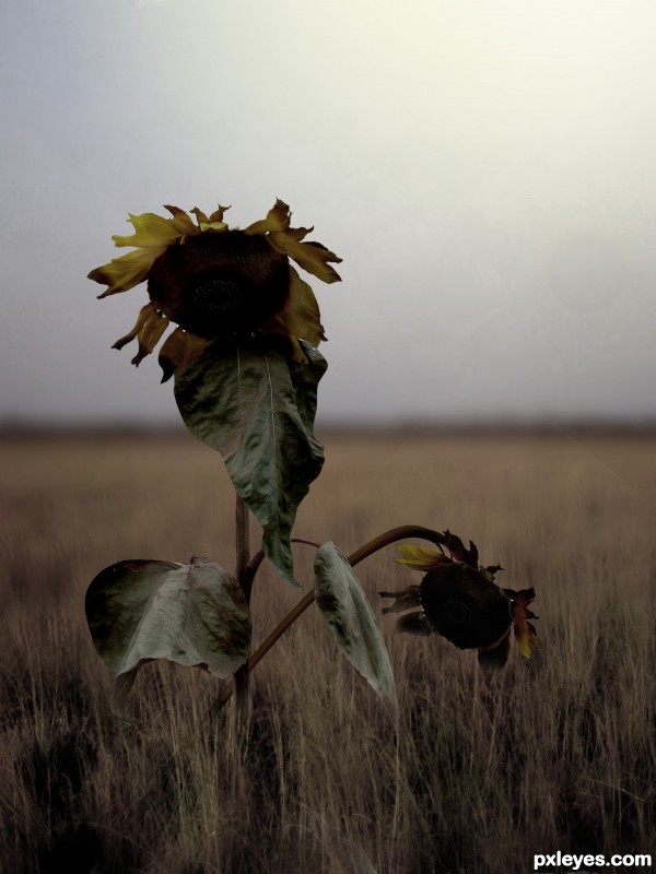
a lot of masking, cloning, healing, all kinds of distortions, etc. (5 years and 3609 days ago)
How sad they look! Good effort though, very good.
A high res image & SBS would help...
Hmm, I agree with both. I'd like to see the processes, and the details... 
Great using of burn tool...good luck author
Lacking a high res and sbs, I can't give the kind of vote I would like to. GL though.
very sad feeling .................... 
well done . looks very realistic 
nice effect
pretty good blend. GL!
Howdie stranger!
If you want to rate this picture or participate in this contest, just:
LOGIN HERE or REGISTER FOR FREE
What a wonderful little guy!
very cute, good luck!
So cuteee, nice blending!
awww, cute
lovely image
cute work
good work..different...
so fantastically cute...well done author
Very sweet, nicely done.
Howdie stranger!
If you want to rate this picture or participate in this contest, just:
LOGIN HERE or REGISTER FOR FREE