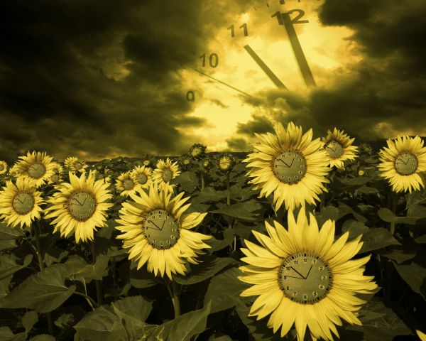
Eva Schuster-http://www.sxc.hu/profile/eschu1952
Julia Starr-http://www.sxc.hu/profile/night_fate
Thanks guys for the great images... (5 years and 3691 days ago)
- 1: Sunflowers
- 2: Sky

Eva Schuster-http://www.sxc.hu/profile/eschu1952
Julia Starr-http://www.sxc.hu/profile/night_fate
Thanks guys for the great images... (5 years and 3691 days ago)
(5 years and 3732 days ago)
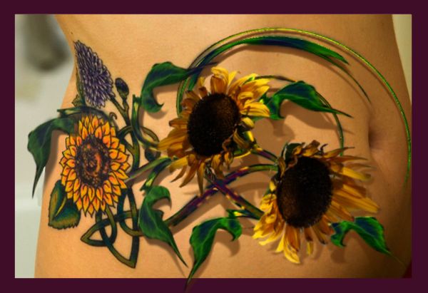
Good idea but I don't think the border is nesessary.
Good work... lose the border 
Howdie stranger!
If you want to rate this picture or participate in this contest, just:
LOGIN HERE or REGISTER FOR FREE
Only Source image used (5 years and 3827 days ago)
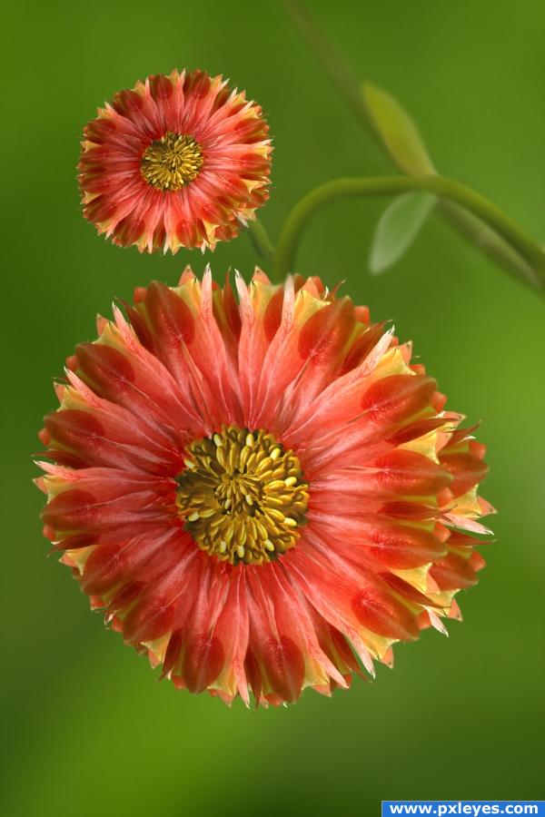
wonderful work author... just an IMHO.. maybe thicken the Stems like a real Sunflower? you know, to show the heaviness of blossum,,, right now the stems look a bit weak to hold such an enormous seed chamber (Just thinking about the realism of the image) Not really necessary (just trying to help)... GOOD LUCK!!!!
EDIT: AWESOME with the thicker stems..now they look secure...  great job author!!!
nicely done -- looks very real
Well done. Nice image 
Fixed stems. Thanks for your comments.
great work.gl
great job 
nice transition
love the changes.. more realistic now. a lovely image.very natural
Howdie stranger!
If you want to rate this picture or participate in this contest, just:
LOGIN HERE or REGISTER FOR FREE
(5 years and 3924 days ago)
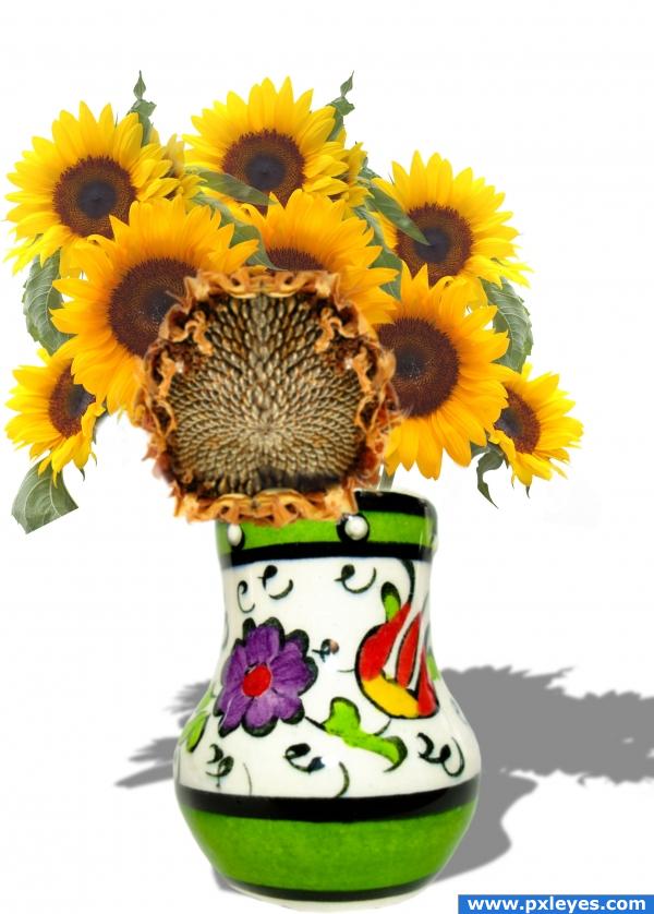
very neat author.. I work with sunflowers all the time and unless your vase has about ten bricks in it, it's going to fall over..hehee.. You might want to get a more matching Sunflower back.. they are new growth and the the one in front is at harvest.. not that that's a bad thing.. just very peculiar.. you seldom get them in tandem... but very nice image.. good luck
I suggest you lighten the top of the shadow furthest from the vase...blur a bit more and remove the part showing near left base of vase. Give it a setdown shadow directly underneath the vase too. Not too dark...Good job, author.
really nice
mmmmh.....the colors of the original sun flower are more red than the others flowers. Can you adjust it? Now seems only 3 different photos one over the other.
real nice
Nice idea, but to me the stock image doesn;t fit in witht he other sunflowers, it seems a little on the red side, but like i said, the idea is very nice. Good luck!
Nice pic
Howdie stranger!
If you want to rate this picture or participate in this contest, just:
LOGIN HERE or REGISTER FOR FREE
This is a striking image that caught my eye right off the bat- good use of color and it's a strange concept. I like it.
Beautiful, I love sunflowers...
Excellent job with this very different and lovely entry. Way to use your artistic imagination. GL
Congrats, lovely work
congrats on first place!
Congrats for your first place, Erathion!
Congrats !
!
congrats erathion!
Congrats!!
Congrats!!
Congrats on this erathion...very nice picture
Very nice work, my friend. Congrats. (sorry for the belated congrats. saw it in the spotlight )
)
Congrats
so beautiful
Howdie stranger!
If you want to rate this picture or participate in this contest, just:
LOGIN HERE or REGISTER FOR FREE