free transform, stroke, layermask,brushtool, eraser (5 years and 3535 days ago)
- 1: source1

(5 years and 3725 days ago)
Clean up the edges of the figure and post your source links...
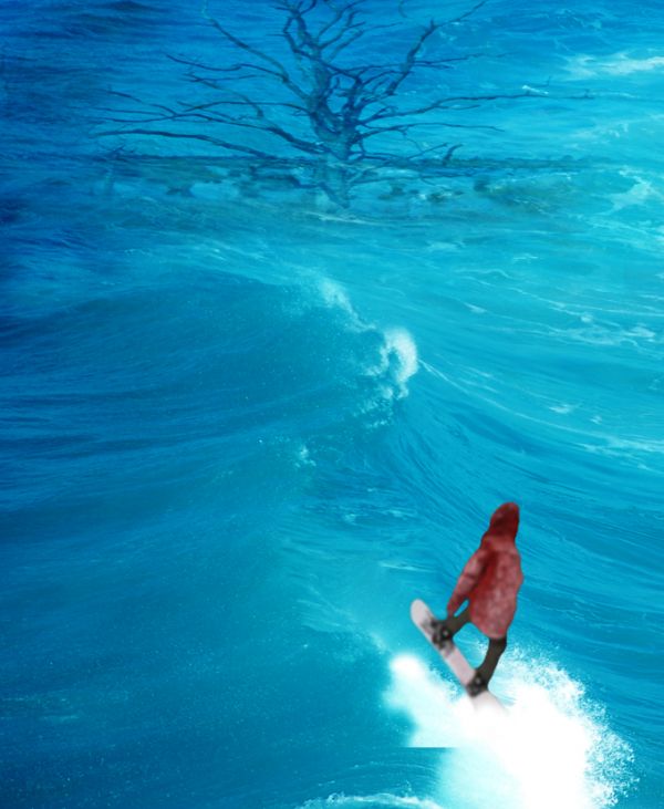
umm why is there a tree underwater? and why is the water so clear but the snowboarder is fuzzy?
You blurred the figure too much, and i can still see a black border around him. Try to mask him out again.
Howdie stranger!
If you want to rate this picture or participate in this contest, just:
LOGIN HERE or REGISTER FOR FREE

(5 years and 3828 days ago)
very funny!!
*LOL*
fun image ...
funny  nice job
Howdie stranger!
If you want to rate this picture or participate in this contest, just:
LOGIN HERE or REGISTER FOR FREE

Thanks:
http://commons.wikimedia.org/wiki/File:Surfing_in_Hawaii.jpg
Surfing
cpl Megan L. Stiner (5 years and 3849 days ago)
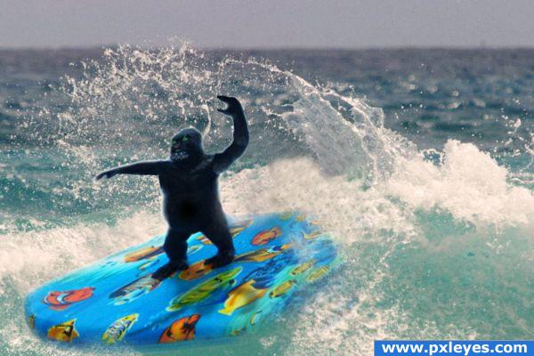
Very nice idea, but i think the ape looking a bit over liquified.. i suggest adding a shadow on the board, trying to fix the white outline around the gorilla's arms and head and maybe a high resolution image. I realli like the idea though. Good luck!
Hahah!  Awesome job! High marks!! GL
nice! gl
I can see the gorilla's borders in cyan
Howdie stranger!
If you want to rate this picture or participate in this contest, just:
LOGIN HERE or REGISTER FOR FREE
very nice work
Yes, it's very cool, but a different background it would make the image pop up more.
Good action, nice blend!
 Background looks fine to me.
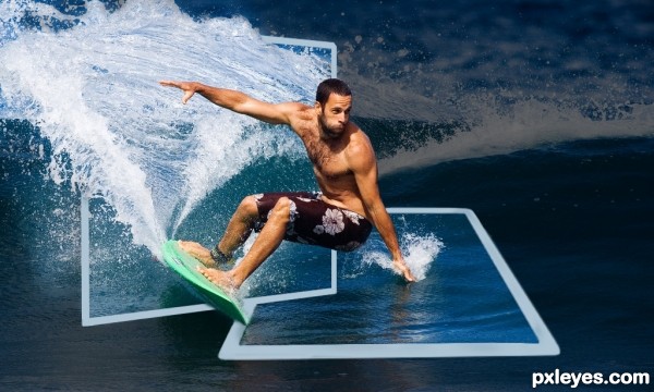
Great work with the splashes and with the left hand...well done author,this is really cool OOB...good luck
it is very good work ,good luck
thx for the comment and compliments
Agreew with erathion - great job. I would probably darken the background just a touch more to make it pop. Good luck.
Nice idea, but if he's supposed to be surfing out of the vertical picture (with maybe the tail of his surfboard still inside that picture), then all of the frothy wake behind him should be inside the vertical picture's frame (which would leave the entire top and left edges of the frame completely visible). As for the background, it's totally irrelevant so the darker the better so it doesn't distract from the two pictures and the guy surfing between them.
well done author.... very convincing
Howdie stranger!
If you want to rate this picture or participate in this contest, just:
LOGIN HERE or REGISTER FOR FREE