
I was inspired to create this when I saw something similar in a tutorial.
Wanted to take it a step further by creating the glass purely from the source image
Please view high Res, Thanks :) (5 years and 3072 days ago)
6 Sources:

credits and thanks:
http://somadjinn.deviantart.com
http://night-fate-stock.deviantart.com
http://raindroppe.deviantart.com
http://montague.deviantart.com
http://www.cgtextures.com
http://just-nate.deviantart.com
http://wcs-wildcat.deviantart.com (5 years and 3206 days ago)
That's a lot of sparkly foo foo stuff ! Great in a Kids room  !
!
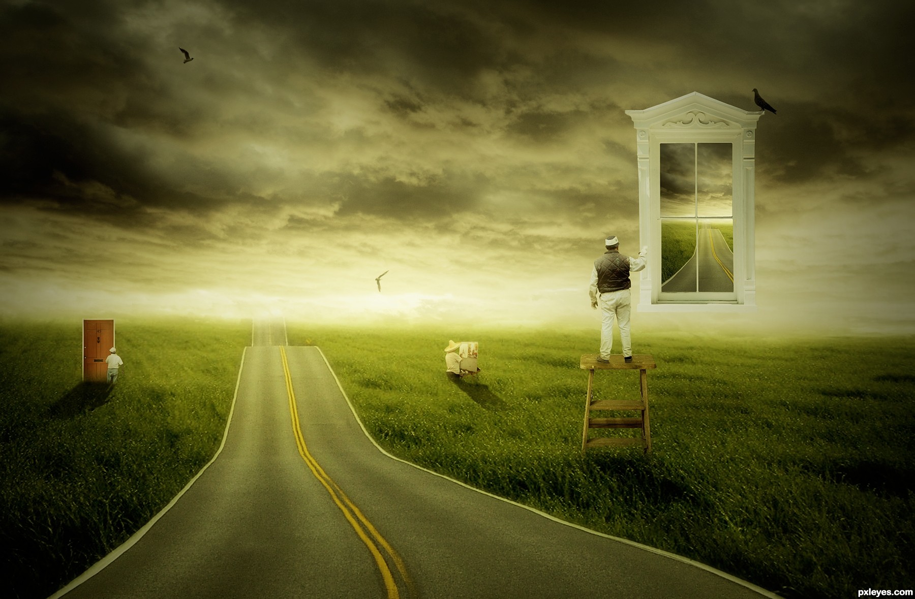
If it's winter, why are there green trees? Perspective on the building is off...the lines on the walls should point to the horizon.
A happy entry, try fixing the persp, the rest works pretty well.
It's visually busy, that's for sure...
very pleasant for the eye!!! feels like a fairy-tale! 
Great mood, what a pity winter season is not that warm looking and full of happiness
Lovely concept and surreal world you have created! Bravo.
I love the happy mood of this creation... GL
Congrats, lovely fairytale place
congrats for the first place... I knew it...
Superb work! just love it! Congratulation!
thanks all for all your votes and nice compliments! have a nice and creative week!
Howdie stranger!
If you want to rate this picture or participate in this contest, just:
LOGIN HERE or REGISTER FOR FREE

:-) Enjoy (5 years and 3208 days ago)
Flip the moon so the light source matches the lighting on the wall & the monk.
EDIT: Better now.
the monk is too huge. the whale can be much much smaller, and jumping over the moon may be better?
Awesome!!! I love it..... GL author
The light on the whale (above) does not match the moon (beneath) or the monk (shadow beneath) or the wall (shadow to the left).
Consistency of lighting is a basic, yet very important consideration to a good chop, regardless how "surreal" the concept may be.
The light on the whale (above) does not match the moon (beneath) or the monk (shadow beneath) or the wall (shadow to the left).
Consistency of lighting is a basic, yet very important consideration to a good chop, regardless how "surreal" the concept may be.
The light on the whale (above left) does not match the moon (beneath) or the monk (shadow beneath) or the wall (shadow to the left).
Consistency of lighting is a basic, yet very important consideration to a good chop, regardless how "surreal" the concept may be.
Howdie stranger!
If you want to rate this picture or participate in this contest, just:
LOGIN HERE or REGISTER FOR FREE
(5 years and 3226 days ago)
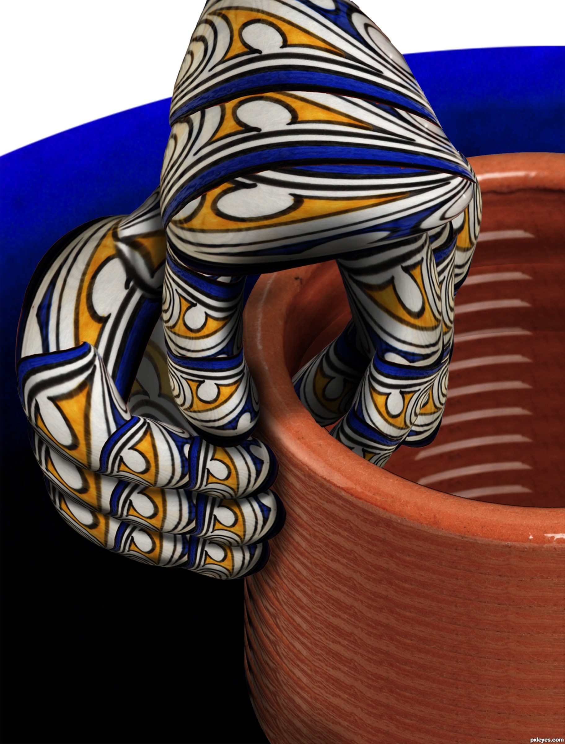
fantastic work author...hand construction is perfect...well done
Fantastic coil construction - and some interesting tats! 
High marks for your ingenuity. Great piece here!
wonderful!!!!
Great chop Author.  excellent idea
I hat to say this author that when I saw this, I knew my entry is in grave danger... GL
Nice chop + great idea = Winner! GL!
fantastic work author ..GL!!
Love the way you warped without distorting the design! But I'm scratching my head over the role of the dark blue curve in the background; are the hands really supposed to be that disembodied? There doesn't seem to be enough room for the hands to be working. Maybe I'm missing the surreal part of this, lol.
Congrats!
Congrats!!
Congrats
Congrats, very nicely done
Congrats!...Job well done
Congratulations, Drivenslush!
thanks everyone
Howdie stranger!
If you want to rate this picture or participate in this contest, just:
LOGIN HERE or REGISTER FOR FREE
(5 years and 3233 days ago)
Congrats
Congrats mate !
Congrats mate
Congrats, very nice work
Thanks mates for your support!
Congratulation!
congrats! 
amazing picture... congratulatuions...
Nice Job on your first plae Win Congrats
Howdie stranger!
If you want to rate this picture or participate in this contest, just:
LOGIN HERE or REGISTER FOR FREE
Photography and photoshop contests
We are a community of people with
a passion for photography, graphics and art in general.
Every day new photoshop
and photography contests are posted to compete in. We also have one weekly drawing contest
and one weekly 3D contest!
Participation is 100% free!
Just
register and get
started!
Good luck!
© 2015 Pxleyes.com. All rights reserved.


like the composition -- nice owrk
very nice OWRK.. hehehehe...I know I know. its Work.. but I love typos that are funny LOL.. good luck
I think the lower edge of the glass' feet should be darker (compare it to the reference image). But apart from that it's a very good job.
Wonderful! The glass is a beauty to look at. A few things (yeah I'm just nit-picking now) the edges are too dark for a "glass", but who really cares, it was a god freakin' stylus before that!
Good luck
Thanks for the suggestions, I will make some changes
nice work -- (lots of work!)
Very creative manipulation, great detailed sbs!
Howdie stranger!
If you want to rate this picture or participate in this contest, just:
LOGIN HERE or REGISTER FOR FREE