(5 years and 636 days ago)
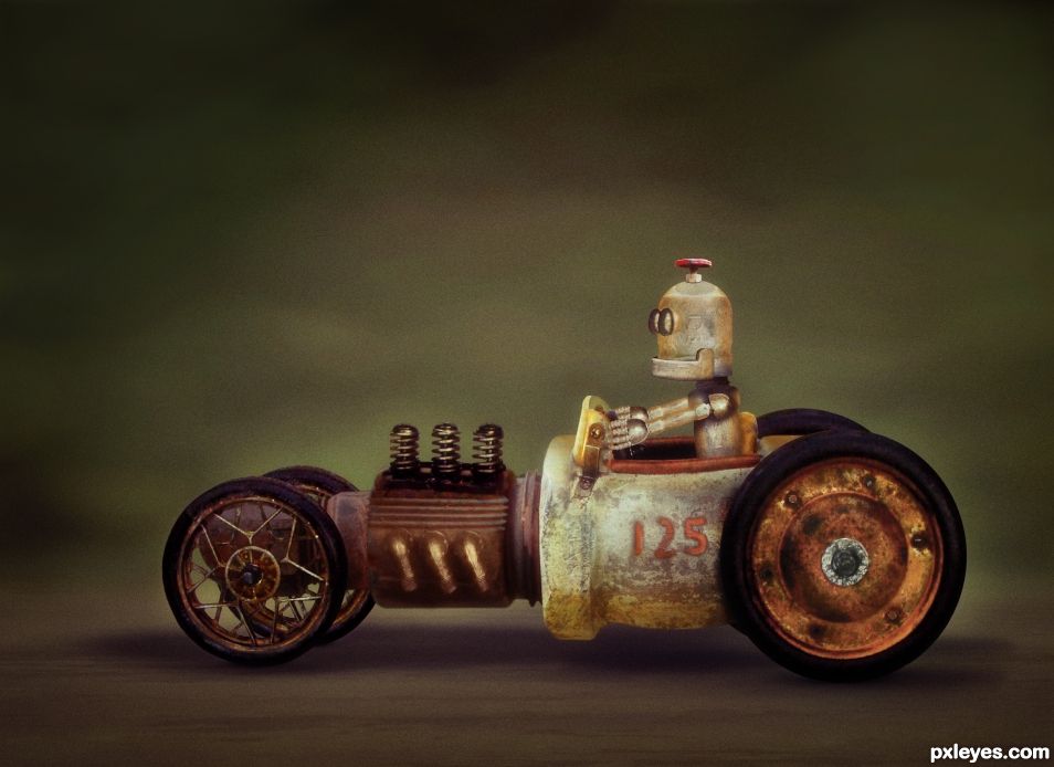
All source except for the wheels, seat, engine springs and exhaust. Even the Robot was created entirely from source. See SBS (5 years and 724 days ago)
Great, love his face! 
Thanks CM. Simple but effective. 
Sigh, I have just spent the last 10 minutes reading and thinking about your SBS, simply mind-boggling and the end result is just incredible. I have recently been educated by a master chop and photoshop manipulator on some of the finer things to look for when reviewing work on this side of pxyleyes. Your shadows are realistic, your blending is splendid your SBS is educational and dear author, you get high points from me. THANK YOU for being here.
A question: How do you make your work look like it is NOT PASTED ON. When I do PS my stuff looks pasted on. Thanks
That is a very difficult question. This Chop had some difficulties but also had some good things going for it. The main problem was the car external source was underexposed, and had lot of lost detail. Due to loss of detail, I probably could not "lighten" the car parts to match the source pipes, so I decided to darken the "source" pipes to match the car parts. You can see this in the engine block, the heat-fin thingy, and the front end part in steps 7, 8, and 9. Color Match worked good as a start (which took a bit of finagling) and then some lighting/color adjustments to dial it in.
Cutting things out properly is vital too. I generally use a 1px feather when cutting things out but sometimes that is greater or even much much much greater. The enemy is a "hard edged cut out" that looks like a cut out. If the 1px feather doesn't look good you can always re-mask and re-feather it as you already have your "base-line" cut out. Also cleaning the edges from **ANY** fringing, to me, is key. Even something minor like these "yuckies" on this spring should be taken out IMO https://image.ibb.co/dn0nr8/springs.gif. This is rather easy to do. Clip a layer on top of the springs. Sometimes I use Multiply, Hard Light, Overlay, but this time I kept it at a Normal Layer. Then just clone in some matching color from the springs to cover the yuckies and it will lessen that "cut out look".
Also when blending something in, remember that you do not always have to use a 100% brush while masking. A lot of the time it's best to use a lower opacity soft brush (22%-44% in my opinion but u can go higher or lower if needed) and just keep brushing from the outside to the inside which will create sort of a feathered mask. It takes time, but your blend can come out WAY better. Don't forget you can change the hardness of your brush so sometimes a harder brush will do better, but this is not usual.
Get used to your Pen Tool when cutting something out and make sure you can set your mouse/tablet to a lower DPI to make it move slower when using a Lasso or even while painting/masking. Use Smart Objects when you can, and also use Clipping Mask layer adjustments. You shuold almost NEVER work destructively.
Beyond that the brightness and color should matching, which is a whole 'nother ball game. Sometimes you may even have a bright/dark "spot" on something that needs to be taken care of, so that will have to be masked (generally with soft feather)and adjusted accordingly.
Proper shadowing or lightening of areas is also vital. A lot of the times you should use several layers when making a shadow. Make a darker one on top (this one will generally be smaller in size), and get lighter and lighter towards the bottom layers (these I generally make larger and lager). You want to do it this way because if you put the lighter shadow layers on top of the darker one, it may make the dark shadow layer TOO dark. You can change your brush shape with F5, so a lot of the times it's best to use an "oval" brush when doing this.
I'm probably missing a million things, but these are the ones that popped into my head while sitting here. Watch YouTube videos. Besides looking at other's work, it's one of the best ways to learn. Hope this helps.
"Hope this helps."
Hey, do bears fart in the forest?
YOU BETTER BELIEVE THIS HELPS. Thank you so much. I have faved this and will have it in my files to refer to, thank you again for your talent and generous heart.
Great work.
Thanks SA. It all fit together nicely. I had two final versions and basically after a coin toss, I decided on this one. The other one didn't have that "old fashioned" look but it was definitely awesome too. Sometimes nothing is good enough, but this time I had two to choose from. Not a usual situation.
You could have put both in the contest if they look different enough. You are allowed more than one in a contest.
Congratulations BWR. A well deserved win.
Mahalo seestah. My score surprised me. Didn't expect that high.
Congratulations BWR. It was the winner all along mate. 
It all came together pretty easily actually. Once I found that source car, it was destiny. 
TY BTW.
Congrats on this well deserved win! 
CONGRATS FOR FIRST PLACE
Howdie stranger!
If you want to rate this picture or participate in this contest, just:
LOGIN HERE or REGISTER FOR FREE
(5 years and 807 days ago)
I'm sorry to tell you that source 3: Light bulb - Pedro Fiallegas is copyrighted. You could try and contact the author for permission but you don't have much time.
Oh damn. That sucks. I doubt he will let me, but I did send him a message on his Flikr account.
Very often photographers will give permission for use of their images in these situations where they are credited and there is no monetary gain for the work. We will keep your entry up as long as possible while awaiting the author's reply.
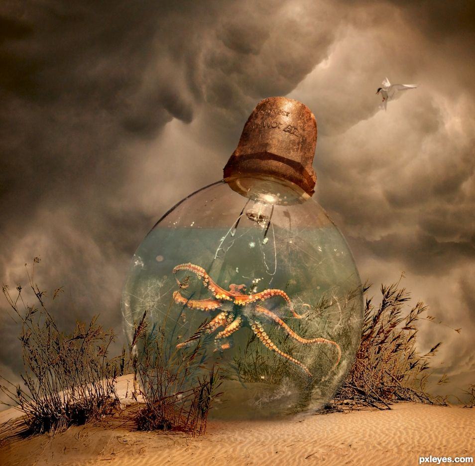
OK, it's fixed. Added a new light bulb. What a chore. Also, you guys are slipping. I didn't put the octopus and rust sources in and you all didn't catch it. Shame on you.
It's added now.
No we're not slipping. We have many ways to check sources even when links aren't provided by authors. I checked the octopus image myself and found it was from wikipedia, the rust was obviously just a texture many of which are readily available. I didn't bother to mention you not posting them since the pressing issue was the copyright of the light bulb, posting the missing links (which I already knew were acceptable) could have been done right up till contest end in a comment.
Thanks. I hope you know my above comment was in jest. Love you guys/gals. 
Reminds me of this:
https://www.youtube.com/watch?v=R6bUOsaGdvo

On the desert is an octopus, brilliant. I really love your colour palette as well with good light in center of softly vignetted image.
Thx. Always a challenge to get the right coloring. In my interpretation, that is a sand dune at the beach. 
Congrats BWR, fabulous work 
Mahalo nui MM. 
Congrats BWR! 
Congrats !!
Howdie stranger!
If you want to rate this picture or participate in this contest, just:
LOGIN HERE or REGISTER FOR FREE
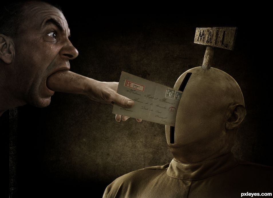
The guy on the right was smoothed out with a technique called "Frequency Separation". The cracks under the mail sign were made using his eye wrinkles. Letters for mail sign were copy/pasted from the "mail sign" source image and rearranged. (5 years and 870 days ago)
Nice work. Just put a 1 pixel blur on the sharp edges, and include a link for the hand.
what do you mean by "sharp edges"? specifically where?
This is an interesting interpretation on the contest theme. I like where you are going with this.
In MHO i think you could fix the shadows where the hand makes contact with the letter and where the letter is entering that slot. Maybe the tone/density of the shadow around those points might help. Just seems a little flat at the afore mentioned places. Pretty cool though.
Thanks man. I will try.
Also, nice lighting even if is coming from everywhere. lol
All edges, but especially the face. The lighting looks consistent to me.
Sounds interesting. Let me see if I am understanding you. Select the man. Select > Modify > Contract by "X" Pixels. Select > Inverse. Now I will have the outer edge of the man selected. Then apply a 1 Pixel Gaussian Blur? If this is correct, how many pixels should be selected around the edge? Can this be done faster by Select > Modify > Border?
First of all, the default setting on my lasso or pen tool is always set to a one pixel blur so I don't have sharp edges to mess with later. But all I'd do is select the outside of the face, expand 1 pixel, and then Select/modify/feather 1 pixel and clear.
A one pixel "feather"? Got ya. was confused by the term "blur".
Something wrong with my Photoshop. Think I have to re-install.
Well done. The only thing I would get rid of is the highlight on the bottom lip. It would be in shadow with the arm coming out of the mouth. 
Thanks SA. Good suggestions.
Now this is weird. The colors get messed up in anything I open in Photoshop. I tried to edit my entry's Photoshop file and the colors and lighting are weird. Even if I save the file in PS, and try to view it in another programs, the colors are weird. It's like PS changes them once it gets opened. I tried a hard reset with Ctrl+Alt+Shift to reset Photoshop and it didn't work.
I made a printscreen with PS on the left and the same exact image opened in MSPaint. See how different they are? It should look like the one on the right which is much more vivid. Both of these were copy/pasted from the hi-res version of my entry.
https://i.imgur.com/VWF4kco.jpg
these are my color settings which really shouldnt matter https://i.imgur.com/RfJTF55.jpg
I have no idea what was wrong with my PS but it seems back to normal. Tried resetting PS and rebooting my computer and nothing worked. Woke up this morning and all is fine. Weird.
Anyways, I think I did everything you all suggested. Took out that lip highlight, reworked the shadows on the thumb and letter, and smoothed out the hard edges. Here is the old ver. for reference. Thanks for the help everyone!!
https://i.imgur.com/5CUA0zf.jpg
Good grief, this is top notch. Love the message, and the photoshop work is sublime. Thank you for describing the process, it is good for newbies to learn.
Thank brother or sister still. I made two versions and here is the other. I made a disclaimer in a post below about the bad guy that is in this image. It was taken care of in the final version.
Well done. Great win!
Mahalo Rob Van Dam. that's my nickname for you because that's who I think of every time I see your name.
Congratulations on the win. Superb work.
Thank you thank you. It was hard to choose between the two versions. (see my post a few posts below for the other version)
Congrats, well done 
Ahh.. MM. Thanks seestah. Seems like i haven't seen you in a while. Or we just haven't crossed paths.
Congrats BW 
There's my girl. Always there with a smiling face. 
Congrats on your win, you are some artist! 
Haha. I struggle with almost every Photoshop I do here.
This was another version. It was so hard to choose which one. This one with the woman is mostly done but doesn't have the finishing touches.
I worked on this Photoshop for a couple days before I realized Hitler was on the stamps. OMG!! I liked the way the letter looked so that's why I had to use a separate stamp source for the final version to cover him up. I just wanted to show this other version, so please don't be offended that he is still on this stamp as I had not yet noticed.
https://i.imgur.com/m7WDFQZ.jpg
Howdie stranger!
If you want to rate this picture or participate in this contest, just:
LOGIN HERE or REGISTER FOR FREE
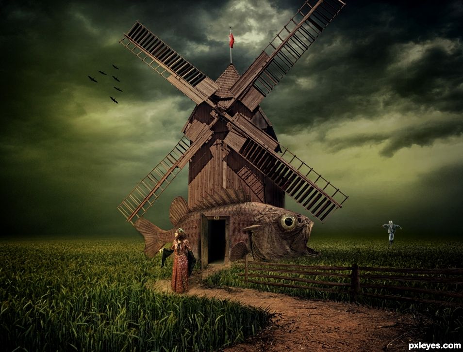
Ive always wanted to live in a fish. Umm.... not really :).
Put the path on the grass and made her a lovely fish to live in. Added a sky, flag, birds, and scarecrow too. (5 years and 877 days ago)
I like it 
TY my friend. 
Really nice, but check the woman's shadow! (Probably wouldn't be much of one with a sky like that...). Holding vote.
I think you're right as per usual CMYK. TY.
Just to be clear, it's more the angle of the shadow. Look at the shadows of the windmill blades to see the light source.
It's a tricky light source IMO. In the source image, the shadows on the bushes are going to our right. On the small wood posts on the right side of the source, the shadows go to our left. On the windmill... I dunno. Gonna do what I can. TY for the help CMYK.
Did what i thought was best.
Looks good to me now. 
My kinda photoshop creation....simple and strong with good blending. Top notch.
Mahalo still26 
Congratulations on 2nd place. Great work.
Thanks SA.
Ahhhh marvelous , simply marvelous. Congrats. 
mahalo still26
Congrats again BW 
TY z
Howdie stranger!
If you want to rate this picture or participate in this contest, just:
LOGIN HERE or REGISTER FOR FREE
Another wonder, wow!
Thank you thank you. I try really really really hard. I pour my soul into these things.
I can tell
Congratulations another excellent creation
Thanks Majkman.
Congrats ! very good chop
Sorry I am late but thanks lolu!!
Congrats B, you deserved to win I believe, but I did, can't believe it
A good win for you Z!!!
Howdie stranger!
If you want to rate this picture or participate in this contest, just:
LOGIN HERE or REGISTER FOR FREE