(5 years and 1309 days ago)
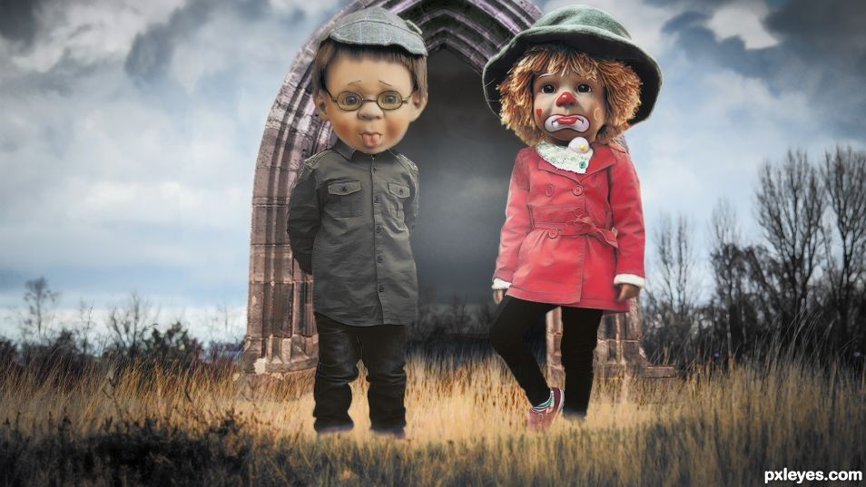
- 1: Children
- 2: Sad Clown Doll
- 3: Doll Boy
- 4: Arch
- 5: Meadow Bull
(5 years and 1314 days ago)
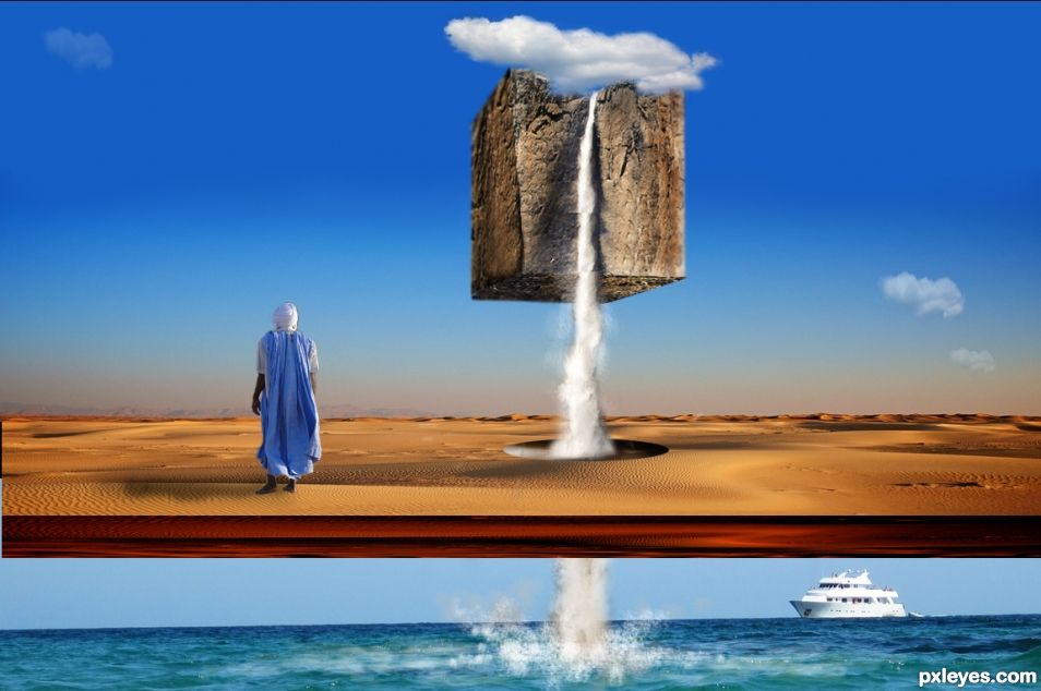
I see what you are doing here author, my only suggestion is to get rid of the water spray around the sand water hole to give the water a better feeling of passing through the desert floor. At the moment it looks like the water is splashing all around but has no reason for being there. As it is a surrealistic image, it really doesn't matter but I find if the water looked like it was shooting straight through the sand it would make more sense and not just look like two photos on top of each other. ONLY A SUGGESTION.. It's fine just the way it is, but I'm just thinking of continuity. Good luck.
Right my friend. I like your idea, and I will take the water spray. Thanks....I like suggestions....
Howdie stranger!
If you want to rate this picture or participate in this contest, just:
LOGIN HERE or REGISTER FOR FREE
Deep inside me there is a spark that makes that can not always be fire...
Good Luck for All!! (5 years and 2951 days ago)
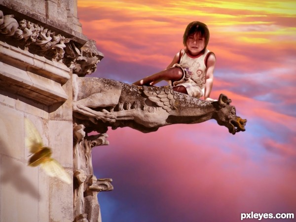
The light on the kid and the light on the wall are opposite.
Cool, of course I did notice... it's surreal, is it not?
Bom ter mais um compatriota por aqui!
OK Erikuri, you win, I turned the child to correct the direction of light. 
Cool idea - I might be scared if I'm placed on that spot 
Howdie stranger!
If you want to rate this picture or participate in this contest, just:
LOGIN HERE or REGISTER FOR FREE
Good luck for all!! (5 years and 2952 days ago)
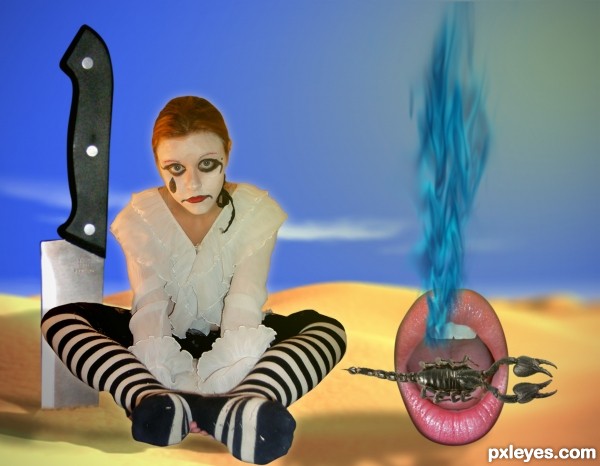
Surreal for sure, you may want to spend some more time on masking the girl. It looks a bit off, compared to the rest. Good luck!
issues in the blending factor, doesn't feel like a complete palette, but that could just be me, just doesn't feel like its one image,, but as always IMHO
thanks guys, i'll make the changes...
I made the changes. and really enjoyed it more, thanks 
Howdie stranger!
If you want to rate this picture or participate in this contest, just:
LOGIN HERE or REGISTER FOR FREE
(5 years and 3349 days ago)
Very good... but where is the authorization or the SBS?! 
Very very cool work author...Very nice blending skills...gl
Very cool, I really like this one. = )
Super pic, great job
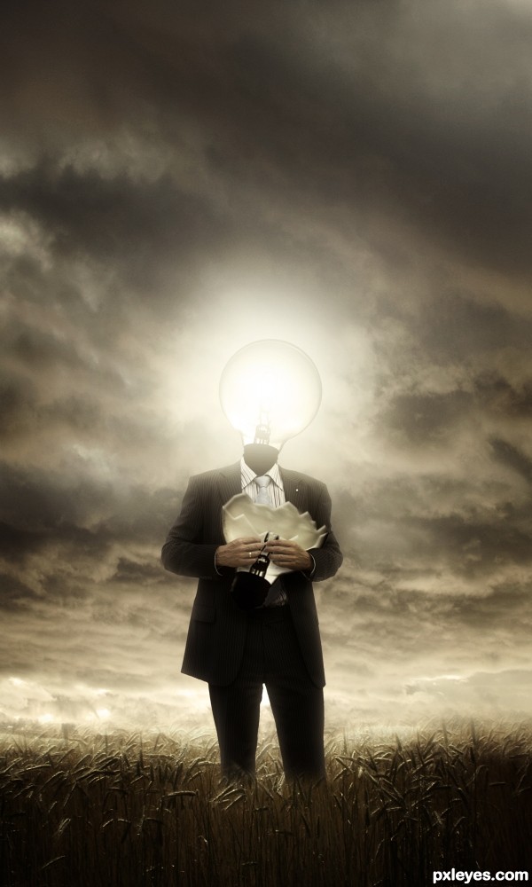
I think the whole piece wold look much better without the broken bulb, as it lacks depth, the actual bulb part isn't shown between the front and back parts of the glass...
It might not be perfect but I wish I could do moods like that, epico-dramatic. Where did you learn that stuff ?
Great mood piece and the lighting is wonderful!
Congrats for your first place, Dreamboy! I'm always amazed to see, what people do with my stock images 
Congrats for 1st
Congrats for the 1st place, dreamboy!
Congratulations!!
Wow..I'm glad all of you liking it my friends. Thanks everyone.
@greymval : from internet my friend.
Congrats, very nice work 
congratulations...
Congrats!!
Congrats, this is such a cool piece of art work = )
Howdie stranger!
If you want to rate this picture or participate in this contest, just:
LOGIN HERE or REGISTER FOR FREE
Love the title great job author.
Howdie stranger!
If you want to rate this picture or participate in this contest, just:
LOGIN HERE or REGISTER FOR FREE