This image is based and created on my own pictures, and I have all rights reserved but still under PxLeyes.com's condition. My image may therefore not be reproduced in any form without my written permission. (5 years and 2550 days ago)

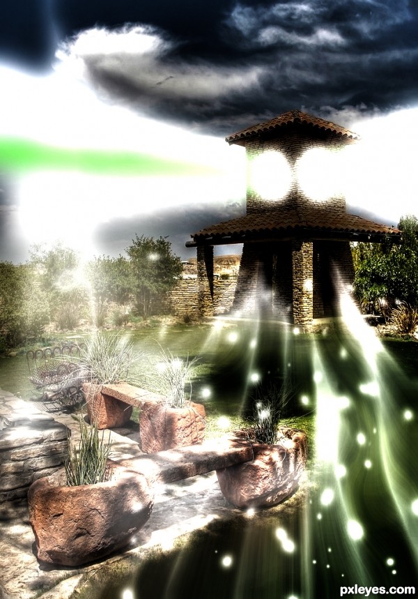
majorly used the maximum and radial blur techniques. (5 years and 2930 days ago)
Nice magical touch.
thnx akassa!!! 
Howdie stranger!
If you want to rate this picture or participate in this contest, just:
LOGIN HERE or REGISTER FOR FREE

(5 years and 3868 days ago)
wow, thats why i loose vote power. i voted very high here cause idea is excellent. but is not on PXL taste. I want to make something similar in 3D, once again congrats for your good idea.
Howdie stranger!
If you want to rate this picture or participate in this contest, just:
LOGIN HERE or REGISTER FOR FREE
You might want to smooth/blur a few hard/ jagged edges.
Author, you need to post each of your photos uncut in a step-by-step guide. (SBS).
5.3. Use of Personal Images as Source: If you use your own personal images, the uncut source must be placed in the step by step with an explanation that it is your image.
Please take time to read http://www.pxleyes.com/guidelines/photoshop/
Thanks! It has all been fixed by now.
I can't see the images in your sbs... just a progression of your work.
you should place each original image uncut as a seperate step, this way it's much clearer.
Sure, I will show you as fast I reach my computer, I'm at work you see.
Clean up looks good, nice work overall!
Thank you so much Spaceranger!!
Good job author, good luck
Well thank you very much James, I hope for the best!
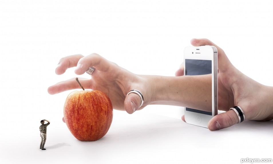
Clearly Photoshopped per the contest requirements, but I wish I understood the point of the image. The title makes sense without the little you. Alternatively, a little you also reaching for the apple with a new title could be intriguing (and more fun).
Given that the title references the iPhone, it should be crisper to stand out more.
I think replacing the variegated apple with a more-solid-colored red delicious or golden delicious apple would add a smooth texture and a stronger focal point.
The shadows are too strong IMO. The little you has a much more intense shadow than the apple. The slightly vague arm/apple shadow (that inexplicably extends far into the bottom left corner of the image) is way too expansive.
Thanks! I Well, I did not figured out any good name so it end up with this.. If you have any ideas, please, feel free to share them!
I just did turned up the colors on the apple a bit but I wont do it more then so since it's gonna look to extreme.
Yes, I agree with you that the shadows were looking to strong and therefore I did changes them, how about now?
Great take on the theme... I love the abstraction
It's nice to hear that you like it, Bob, thank you so much!!
Congrats!!
Thank you so much!!
congrats .....
Thank you!
Howdie stranger!
If you want to rate this picture or participate in this contest, just:
LOGIN HERE or REGISTER FOR FREE