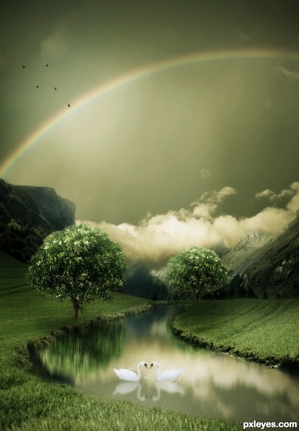
(5 years and 3247 days ago)
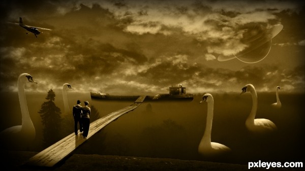
(5 years and 3285 days ago)
Interesting concept. The execution is lacking on several levels. GL author.
The overall lighting is too dark, with the birds on the RH side exceptionally so.
The dark shape between the two birds on the left (a tree, perhaps?) is so dark and undefined as to be visually confusing.
The couple are so dark that it appears that they only have 2 1/2 legs between them.
The "star" blobs in the sky are inconsistent, and illogical being in front of the clouds, but Saturn suffers the same confusion...
This is a really nice concept, but the execution seems rushed and not well thought out. Even for a dream, it leaves a bit to be desired.
Howdie stranger!
If you want to rate this picture or participate in this contest, just:
LOGIN HERE or REGISTER FOR FREE
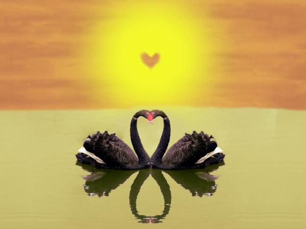
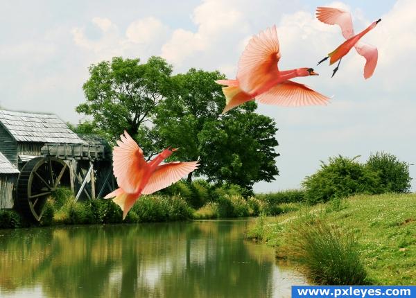
Lovely swans ... (5 years and 3657 days ago)
Nice image, but please try to staighten the horizon...
Romantic... 
agrees about the horizon. The sky could be improved as well.
aahh...  I had this in my mind.. but as you have entered this, a good one, I just have to come up with something new.. hhmm.. by the way.. good luck author..
I'd like to reduce opacity of reflection .
simple ... but nice... well done
Howdie stranger!
If you want to rate this picture or participate in this contest, just:
LOGIN HERE or REGISTER FOR FREE
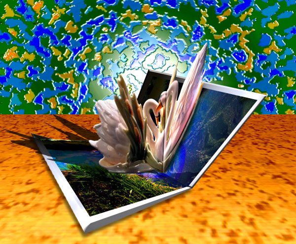
All my sources (5 years and 3723 days ago)
the background is pretty distracting... dare i say that it's more 'on theme' than some of the others... ???? gl
yes, would you dare?
Yes I believe I have! 
@JamesD.. I'm still giggling about you being called a DONK..WTF is a DONK?.. hehehehe
Foreground & background are both distracting...the focus should be on the contest elements, which are somewhat confusing...
color from background borrowed from the water images... color for the table borrowed from the swans beaks.. print version looks fabulous.. so I'm going to keep it as is...
(the 11x15 print version has no back lighting.. so High Res isn't really what the image looks like)
My first thought on 'donk' was the character in Crocodile Dundee... the dumb looking strong guy... lol.
Donk is short for Donkey, widely used around the poker scene, quite fitting imo 
Thanks Barnacle 
My pleasure 
we should bo polite for each other.we should learn always to be better.
Howdie stranger!
If you want to rate this picture or participate in this contest, just:
LOGIN HERE or REGISTER FOR FREE
Edic Kouzmik,Erin Calaway-Mackay,Flavio Takemoto,Cheryl Empey,Bev Lloyd-Roberts,Michael Robson,thanks guys for the great images...
(5 years and 3809 days ago)
quite cute!!!! they look like chubby swans mated with flamingos and a bit of pigeon as well.. very very nice author.. good luck
GolemAura... what?! xD I agree with him, very nice, different work.
Imaginative! I like it. 
nice
nice iomage, gl
do you have a sbs?
The integration of the mill is pretty good, but it needs a reflection. Might have been better if you had left it out, but the birds aren't bad...good luck! 
great use of source.author, original idea. They are magical swans GolemAura. Sit and watch them change.. i recommend you sit for 6 weeks :p 
nice
great job 
Howdie stranger!
If you want to rate this picture or participate in this contest, just:
LOGIN HERE or REGISTER FOR FREE
cool work, author! best of luck to you!
Tree reflection is too blurred compared to swan reflections, but this is still a nice piece of work...GL author.
Edit: Thanks CMYK46 to point out.
Too cool execution author...Very very well done!
so mystical, good luck!
Very, very pretty work, author!
Best 1 in the entry..good luck
Lovely view........Great job and good luck Author.
congrats!
Congrats for 1st, nice
Congrats, lovely work
Thanks friends..love you all!
Congrats for winning!
Congrats!
Congratulations for 1st place win....this is awesome work.
Howdie stranger!
If you want to rate this picture or participate in this contest, just:
LOGIN HERE or REGISTER FOR FREE